On Thursday I talked a bit about how the Adjustments panel introduced in Photoshop CS4 fits in with the team’s larger vision for the product. Now I’ve asked my fellow Photoshop PM, Bryan O’Neil Hughes, to elaborate on some of the design goals that informed the effort. Bryan drove the development of this feature, so I thought you’d like to hear his perspective (in this post’s extended entry).
Continue reading
Category Archives: User Interface
Adjustments & the future of the Photoshop UI
The new Adjustments panel in Photoshop CS4 is a polarizing feature. Some people love it; others, not so much. My job is to help improve things as we move forward, so I want to hear your feedback.
Just asking for comments in a vacuum, however, isn’t going to produce useful results. Therefore I’m planning to publish three related posts:
- The bigger picture of where we’re going with the Photoshop interface, and why
- An overview of the advantages Adjustments provides right now
- Some ideas on how to improve it in the future
As for feedback on this post, for now please focus on the big picture. The subsequent posts will provide a chance to gather specific, actionable feedback about the current & future versions of the panel. Preamble aside, please read on in this post’s extended entry.
Drive Photoshop with your iPhone
Oh, now this is cool: PhotoKeys is a $4 app that lets you drive Photoshop (switching tools, nudging layers, running actions, etc.) from an iPhone. [Via Jesse Zibble]
I’ve taken it for a spin, and it works as advertised. Setup proved to be a bit more time-consuming than I’d expected (involving installing a simple free server app, killing off my VPN connection, restarting the iPhone, and assorted trial and error), but all told it wasn’t bad.
It’s funny: thinking about the dearth of unused keyboard shortcuts in Photoshop, a bunch of us were talking about just such an idea the other day. Cool to see that someone has already beaten us to the punch.
Of course, what’s really in short supply is another modifier key (a la Shift, Cmd/Ctrl, and Opt/Alt) or two. Having another way to modify commands would open up exponentially more possible combos. It would be brilliant if an app like PhotoKeys could add such a thing, but I think the bottleneck would be Photoshop. That is, the app needs to open up a more flexible, general purpose way to accept inputs. (How about MIDI, so you could hammer saturation with a whammy bar? ;-))
Out of curiosity, if Adobe were to create (or work with a hardware company to create) a simple, inexpensive hardware device, would you be interested in it? What would it need to do/look like/cost in order to be interesting? (This is one of those ideas that’s come up for years, so I’m just tossing it out there for consideration, not hinting at anything specific.)
Optional plug-in disables trackpad rotation
During the CS4 development cycle, the Photoshop and Bridge teams worked closely with Apple* to support the multitouch gestures supported on MacBook Air and newer MacBook Pro systems. As a result you can zoom and rotate documents using three-finger combinations.
The rub is that especially on the latest systems (with the enormous trackpads), it can be too easy to zoom or rotate accidentally. Unfortunately Photoshop doesn’t ship with a preference that would govern the behavior. Therefore we’ve released an optional plug-in that will disable zooming and rotating via the keyboard if you’d like. Just drop it into your Plug-Ins folder, restart Photoshop, and you’ll be set.
* Next time you hear someone start in with a bunch of “Adobe doesn’t care about the Mac” crap, I’d like you to think of this. People here go the extra mile because they do care. Deeply.
Paving the cow paths: Auto-build panels?
People sometimes feel overwhelmed by Photoshop & other large applications: the tools and commands they need seem buried among a bunch of irrelevant stuff. We want to improve matters.
Configurator lets you build your own interface panels, grouping your essential tools and commands for easy access. Configurator is ridiculously easy to use, but actually building a useful panel might take more effort than you’d expect. You have to give some thought to how you work and to what, exactly, you want to accomplish.
So here’s an idea: What if Photoshop could watch how you work, then suggest panel configurations? In other words, the app would become smarter, adapting itself to your specific workflows.
PS would collect data on your usage patterns & feed it to Configurator in order to auto-build a panel containing your most-used tools and commands. Thinking aloud, I’m imagining something like this:
- PS would ask whether you want to enable the data-gathering process (invisible, with no impact to performance).
- If you opt in, you’d work for a few days without interruption.
- At some point PS would say, "Okay, I’ve gathered some data on how you work. Would you like to assemble a panel containing your most frequently used items?"
- If you say yes, Configurator would appear and present a list of these items, letting you uncheck unwanted ones. (For example, maybe you don’t need a button for New Document if you’re always going to hit Cmd-N.)
- The remaining items would be laid out automatically on a new panel. You could of course tweak things from there, or you could start running the panel as-is in PS.
Unlike Microsoft Office, PS wouldn’t try to be clever & modify your work environment on the fly (e.g. hiding menu items you haven’t used recently). Rather, it would just present you with some info & give you the opportunity to take action. If you’re game, great, but in any case it won’t be sneaking around, doing stuff "for" you while you’re not looking.
Thoughts?
Thanks,
J.
PS–Re: the title of the post: "Paving the cow paths" refers to streamlining existing behavior without trying to change it. A panel of most-used tools wouldn’t change the tools you use; it would just make it easier to group & access them (and by extension to hide the rest). Going beyond cowpaths–helping people discover "best practice" ways of working–is another can of worms that I’ll address in a separate post.
PDF containing all Lightroom 2 shortcuts
Rick Miller from Adobe’s education field team writes, “I’ve recently had requests from users who would like a PDF reference guide that covers just the shortcuts in Lightroom 2. So I’ve created one…enjoy!”
Scrubby sliders & more
You may well know about "scrubby sliders" in Photoshop–the little finger-with-arrows icon you get when your cursor hovers over the label next to a numerical field, such as "Opacity" on the Layers panel. (Here’s a screenshot borrowed from Photoshop Essentials.) With scrubby sliders you can click and drag on the text label, moving left and right to adjust the field’s value up and down. You may not have discovered a couple of nuances, however:
- Holding Opt/Alt while scrubbing makes the values change 10x more slowly. This is great for fine-tuning a value. Conversely, holding Shift while scrubbing makes the values change 10x faster. This is great for making an audience sick while demoing canvas rotation. (Open a really big image, zoom out, hit R, and then Shift-drag over the Rotation Angle text on the Options Bar. Entreat your viewers to stare at the center. Watch them become your willing thralls…)
- Some fields don’t have text label next to them, and it therefore seems that you can’t use scrubby sliders with them. Ah, but that’s where holding down Cmd/Ctrl while mousing over the field comes into play. By holding the modifier while dragging, you can use a scrubby slider on these fields. (Adding Opt/Alt or Shift works as you’d expect.)
On a related note, when you put focus on a text field in Photoshop, you can nudge its value up and down by using the up/down arrow keys. Holding Shift while arrowing naturally makes the increment of change 10x larger.
It’s all these little custom behaviors that help make moving Photoshop from Carbon to Cocoa a rather involved affair. The app has developed a lot of little tweaks (e.g. holding down Opt/Alt in dialog boxes to turn Cancel into Reset) that don’t just come along for free. It’s also an illustration of why custom widgets are sometimes desirable. I’d like to see Photoshop and other CS apps make scrubby sliders much more universal/discoverable via something like the Adobe video apps’ sliders (screenshot). [Update: See also the ones in Flash CS4.]
There’s one other related thing, which I hate to mention as it’s a bug, but I can offer a solution. In CS4 if you click on a text label to highlight a field, then use a mouse wheel to adjust values, you may notice that the field stops changing. The workaround is to keep your cursor over the text label, or anywhere outside the field itself. Sorry about that rough edge.
Layer-related shortcuts you might want to know
Based on some recent comments (e.g. “Please add a way to navigate through layers via the keyboard”), I get the impression that many people don’t know some/all of the following:
- Opt/Alt + left/right bracket keys change layer selection, selecting the layer above/below the current one.
- Those shortcuts plus Shift extend the layer selection. For example, to select the layer above the current one while keeping the current one selected, hit Shift-Opt-]/Shift-Alt-].
- Shift-Opt-,/Shift-Alt-, (comma) selects the the current layer and all those below it. Shift-Opt-./Shift-Alt-. (period) selects the current layer and all those above it.
- Opt-,/Alt-, selects the bottom layer. Opt-./Alt-. selects the top one.
- Cmd-G/Ctrl-G groups layers into a layer group (aka layer set, aka “little folder thing”). Shift-Cmd-G/Shift-Ctrl-G ungroups layers.
- Cmd-Opt-A/Ctrl-Alt-A selects all layers.
- Shift-Cmd-N/Shift-Ctrl-N makes a new layer. Add Opt/Alt to do so while skipping the layer options dialog box.
And while we’re at it, you can also change blending modes via the keyboard:
- Shift-plus (=) selects the next blending mode. Shift-minus (-) selects the previous one. Note that the target of these changes depends on what tool is active. If you’ve got a painting tool (Brush, Clone Stamp, etc.) selected, the changes apply to the tool’s blending mode. If you’ve got other tools selected, they’ll apply to the blending mode of the selected layer. (My rule of thumb is to tap V to make the Move tool active before applying blending changes to a layer via the keyboard.)
- Shift-Opt-letter/Shift-Alt-letter will set the selected tool/layer to a specific blending mode. For example, M is Multiple, N is Normal, and H is Hard Light. A fairly complete list is here (scroll down).
If you find this kind of thing useful, check out Trevor Morris’s list of PS shortcuts, or Michael Ninness’s old but useful Photoshop Power Shortcuts book. (I updated it for PS7.)
[Update: See the comments below for more good suggestions.]
Expanding Smart Objects
Thanks for all the great feedback regarding ways to manage complex documents. I should probably toss in the inevitable disclaimer that we’re just gathering feedback, none of this is a promise/hint about future work, void where prohibited, blah blah.
A couple of people have mentioned the idea of expanding Smart Objects back into the layers that formed them initially. That is, you’d be able to select multiple layers, turn them into an SO, do various things to the SO, and then explode the layers back out into the main layer stack. It’s a great idea, and of course (you knew this was coming) it’s really hard to make work, which is why it’s not supported today. In case you’re interested, let me explain why.
Smart Objects let you apply a variety of transformations to the selected object. You can scale, skew, perspective-transform, warp, and filter them. The trick is, how would you turn the transformed content back into layers while preserving its appearance?
In some cases the job would be easy. Let’s say you put four layers into an SO, then scale it up & want to expand the layers back out. That seems pretty straightforward: apply the same scale factor to each layer, then move it so that the positions match. The same might go for skewing & distorting, though I may be overlooking some cases. But what about warping and filtering? It gets tough, if not impossible, quickly. I’ve made a little illustration (read it left to right) that may help illuminate the challenges.
The upshot is that expanding Smart Objects back to layers could be made to work some times and not others. Addressing at least the simpler cases would be a worthwhile effort, though that task would have to jockey for position relative to other SO-related enhancements.
For instance, if PS offered an option not to save the composite data of an SO in a file, the SO wouldn’t add file size above and beyond the layers it contains. That would in turn open the door to PS creating SOs automatically when transforming layers, which is essential to getting more people using this feature. The consequence would be more time spent opening files, however, as SO composites would have to be rendered on the fly. That in turn adds new requirements to other PSD-reading apps–e.g. that they be able to run filters on the fly in order to preserve appearance. The whole thing becomes a quasi-religious argument about format compatibility and trading one kind of performance for another. There are many cans of worms here.
If you’ve read this far, my fellow geek, you may be interested in previous entries about The Secret Life of Smart Filters and the closely related Simplicty vs. Power in Photoshop. Nobody ever said progress was gonna be easy. 🙂
Feedback, please: Managing complex PSDs
Designers–and Web designers in particular–create some of the most complex, intricately layered Photoshop compositions possible. How could we make the management & navigation of these files more efficient? I’d love to get your take on the following ideas:
- Layer panel search/filtering:
- Photoshop could offer a small search field at the top of the Layers panel. As you’d type in text, PS would narrow down the display of layers (e.g. typing "b-u-r-r.." would hide everything but the layer called "burrito"). Searching would also find custom tags applied to layers. Hiding layers in the list would have no effect on the appearance of the document.
- Separately, PS could offer buttons on Layers that would let you filter the view so that you could, say, show only type layers, or only type layers and bitmap layers, etc.
- Layer sorting: Photoshop would offer the ability to sort the Layers panel by layer type, layer name, etc.
- Symbols (i.e. reusable objects that enable "edit one, update many"): Photoshop already supports this concept to some degree via Smart Objects. You can convert a layer to be an SO, then duplicate the object, edit one copy, and have both copies update. The interface could be made clearer, however (e.g. through adding a Symbols panel for managing objects).
- Linked files (place a file, update it externally, and have all placed copies updated in PSDs): Again, Photoshop already supports linked files in a couple of ways. If you double-click a Smart Object placed from Illustrator, PS will open a copy in AI. You can also choose Layer->Smart Objects->Replace Contents… to have an SO replace with a file on disk. Oh, and video layers are always linked to external files. The raw materials for a traditional linking implementation are there, but PS would need to add things like a Links panel.
- Type styles: As you can in Illustrator and InDesign, you could assign a style to type layers in Photoshop, and when you changed the style definition, PS would update all layers that have the style attached.
- Other? Anything I haven’t mentioned? Anything you like in other apps?
To gather feedback I’ve created a very quick survey, and of course your comments (below) would be most welcome. (And in the interests of sharing ideas freely, you can browse others’ responses, too. Note that I can’t edit/reply inline to suggestions posted via the survey.)
Thanks
J.
Photoshop Subvertising
Artist-vandals in Berlin have rather brilliantly hacked a set of subway posters, overlaying them with stickers showing the Photoshop UI. [Via Mark Stern, Serge Jespers, Jeff Lietz, and others]
I have a soft spot for the trippy impromptu public art projects that subway posters often become–everything from Van Dycks & puke lines to political commentary. I got an unreasonably big kick out of a Bourne Identity poster in the NY subway that featured three images of Matt Damon on which someone had scrawled, respectively, “Loner… gun owner… stern taskmaster.” (Told you it was unreasonable.)
[Update: Kottke links to more photos on Flickr. Apparently the project is called "Don’t Forget…" [Via]]
[Previously: Real-world Photoshop.]
The MacBook Wheel
“One button. Endless possibilities.”
I look forward to hearing that Adobe is “dragging its feet” for not abandoning keyboard shortcuts and fully embracing The Wheel by noon yesterday. ;->
[Update: Reader Don Tardiff points out that the Simplex typewriter was doing the wheel thing a century ago. (“Notice no screen, hard drive, or battery.”) Reached for comment, Jonathan Ive said, “That’s. How. We. Roll.”]
SNL Multitouch
Being kind of hyped about multitouch user interfaces, I loved seeing Saturday Night Live spoof the TV channels’ infatuation with flashy but often meaningless info displays. Skip ahead to 5:20 or so to check it out:
If for some reason the embedded video isn’t working, you can try it (and see stills) on this Engadget page.
It really is kind of hard to satirize just how dorky people can look when filling live TV time with these things.
XD responds to user feedback
A brief note: A number of folks have questioned the XD team’s decision to render their new INSPIRE publication through the Flash Player. I passed the feedback along to the design team, and now XD manager Ty Lettau has replied.
New Adobe XD pub, thoughts on CS4 UI
The Adobe XD (Experience Design) team has launched INSPIRE, a new online publication in which team members can share thoughts on how, why, and what they design; gather feedback; and more. Among the good bits:
- Julie Baher has posted some thoughts and background on the CS4 user interface overhaul (see previous)
- Julie Meridian discusses challenges faced in designing spinning interfaces (canvas rotation, 3D) for Photoshop CS4.
(Apropos of nothing, both designers are among a similarly named group of "me Julies," which seems like it should be British slang if it isn’t already.)
iPhone GUI bits
- The guys at teehan+lax have created a slick, well organized iPhone GUI PSD file. Geoff Teehan writes, "We created our own Photoshop file that has a fairly comprehensive library of assets – all fully editable." Nicely done! [Via Joel Eby]
- Felix Sockwell offers a detailed walk-through of how he developed icons for the NY Times’ iPhone app.
- Vaunted info-design expert Edward Tufte critiques iPhone interfaces in terms of their info-to-overhead ratio. [Via]
Marginally related at best, but too good not to share: the highly unique unboxing video for the Samsung Omnia. [Via Russell Williams]
Photoshop.next UI hints on CNET
If you’ve read this blog for any length of time, you’ve heard me talk ad nauseam about the need to better manage Photoshop’s complexity. We need to give you the power to make the app “everything you want, nothing you don’t.” Last week Stephen Shankland from CNET asked what kind of progress we’re making, especially in the context of the more task-based interface of Ligthroom. I disclosed some details that appear in his article:
Adobe is taking a page from the Lightroom specialization playbook for Photoshop by trying to make it more customizable to specific users and tasks. But in contrast with Lightroom, company is trying to do so without sacrificing the software’s general-purpose nature, said John Nack, [principal] product manager for Photoshop.
“We want to make it possible to be everything you want and nothing you don’t,” Nack said. “One of the tough things has been dealing with the enormous breadth of Photoshop. We end up presenting same interface to architects as we do to Web designers as radiologists as prepress folks.”
To achieve that goal, Photoshop’s interface will become more open-ended and even programmable, he said.
“You’ll see some of the things we’ve learned about Lightroom–making things browsable and less modal–come into Photoshop,” Nack said. In other words, it’ll be easier to shift Photoshop from one task to another.
With a “Configurator” application that should be released by Adobe Labs within a month or two of release the next version of Photoshop, Adobe will let users create and share their own Photoshop control panels written in Adobe’s Flash programming language, Nack added. “Our goal is to make it possible for expert users to reconfigure the environment on a task-by-task basis and share those workspaces with other people. You don’t have to write code. You can knock together an interface and make it sharable.”
As I’ve written previously, using Flash in the Suite isn’t about slathering the UI in a bunch of blinky banner ads; rather, it’s about giving people an easy way to connect, tune, & extend their work environments. The AIR-based Configurator app is just one way to build these UI elements–one that lets you Lego-together functionality without writing code, then easily share the output. The tool isn’t ready to take a bow yet, but it’s coming along really nicely & I’m looking forward to showing what it can do.
[Related/previous: Future Photoshop UI changes]
Phil Clevenger on the Lightroom UI
Lightroom marketing manager/former Combat Photojournalist Frederick Johnson has posted an informative 12-minute interview with Phil Clevenger, Lightroom interface designer/KPT veteran. Phil talks about the challenges of starting with a blank slate & establishing an interaction language; the pros and cons of modality; Lightroom’s unique model for applying parametric local corrections; and much more. I fount it well worth a look.
(Tangentially: Both Frederick and Phil show up among Kelly Castro’s portraits (aka Project Make Mild-Mannered Software Peeps Look Hardass), now featured on the Adobe Design Center.)
Some thoughts about platform consistency
[Note: I’m motivated to write the following as I’m hearing increasing speculation about future Adobe UI changes based on what’s appeared in screenshots, the Fireworks beta, etc. That topic deserves its own post, and I’ll work on publishing one in the next couple of days. Until then I won’t be tackling any of those specific issues/questions.]
I had a rather eye-opening experience the other day. I over heard an Adobe employee using Photoshop exclaim, “No way… they overloaded Cmd-H!” In other words, he was surprised that pressing Cmd-H didn’t hide the application. He was obviously A) a Mac user, B) relatively unfamiliar with Photoshop, and C) assuming that Photoshop had made a decision to go against Mac OS conventions.
Er, no. 🙂
The actual history is that Photoshop has used the Cmd-H shortcut since something close to the dawn of time (at least as far back as 1993, when I started using the app) to hide/show the current selection (the “marching ants” that go around a selection). This convention (like essentially all PS shortcuts) is consistent between Mac and Windows, and it’s worked the same way in Illustrator for a similarly long time.
When Apple introduced OS X, they decided to implement some new conventions for shortcuts. Notably, Cmd-H hides apps; Cmd-M minimizes docs to the Dock; and Cmd-~ (technically Cmd-`) cycles among open documents. Over time the OS has appropriated more and more shortcuts that have been used by Photoshop (F9-F12 were for actions, Cmd-Space/Cmd-Opt-Space was for zooming, etc.).
This puts us in a tough position. On the one hand, I totally appreciate Apple’s efforts to drive consistency across the platform. On the other, we have to tread very carefully around keyboard shortcut changes. Pros’ fingers dance over Adobe apps like musicians’ on instruments. When certain things have worked a certain way for 10 or 15 years across multiple Adobe apps, you don’t just toss out those conventions and all the associated muscle memory.
My colleague’s comment reminded me, though, that new users don’t know or care about the history here. For them, it just looks like Adobe is blowing off useful, consistent shortcuts, going its own way for no reason.
So, what do we do? “Let me customize shortcuts,” you might say–but of course we do already (and have for years), and that doesn’t affect the default experience. No matter what we do–change or sit tight–someone is going to be P.O.’d.
I think we have to take things case-by-case. As it happens, I expect we’ll change Photoshop to use Cmd-~ to cycle among document windows. PS already supports the Windows-standard Ctrl-Tab for this function on both platforms, and by honoring both conventions we can offer cross-platform consistency. This move will undoubtedly frustrate people who rely on Cmd-~ for displaying the composite channel, but we’ll do our best to ease the pain. Remapping Cmd-H and Cmd-M are a progressively tougher sell for me, given the importance of selections & Curves in PS. Note, however, that on the Mac by default Photoshop assigns Cmd-Ctrl-H to hiding & Cmd-Ctrl-M to minimizing–i.e. the standard conventions + the Ctrl key.
I mention all this in order to shed some light on the tricky issues we face with the Photoshop & other Adobe tools. No one I know here views OS conventions as unimportant; on the contrary, they’re always among the first issues considered. It’s just that we have to weigh them against possible disruptions to user habits and workflows, and against the user benefits of consistency between applications and platforms.
[PS–I know people are eager to hear more & to discuss the application frame idea, etc. As I say, I plan to post plenty of detail shortly. (In other words, please don’t fill the comments with tons of questions/rants just yet. :-)) More to come… –J.]
Flash-based multitouch coolness
Christian Moore & the folks at the NUI Group have created Lux, an open-source framework for creating multitouch-savvy applications. Check out the video demo & a short interview with Christian on how they’ve used Flash to prototype a very cool implementation. I’d love to see it updated to take advantage of the GPU hardware acceleration in the upcoming Flash Player 10 (just posted in preview form on Adobe Labs). Oh, and how about this running in a Smart Object on the Photoshop canvas? (Hey, I’m just thinking aloud, not dropping any near-term.) [Via Jerry Harris]
Interesting related bits:
- Gizmodo features a short recent interview with Jeff Han, the guy whose multitouch work really lit a fire under the whole area two years ago.
- Macworld’s Dan Frakes provides a video tour of MultiClutch, a free utility for extending the multitouch features in the latest MacBook Pro & MacBook Air notebooks. (I was bummed to discover that my wife’s brand new MacBook doesn’t offer the same support. She’s just happy to have two-finger scrolling, something missing from her deceased PowerBook.)
- I need to pull together a category for multitouch; in the meantime, past interesting bits are here.
Wiimote Hacks + Photoshop
Photographer* Mike Hill passed along a link to crafty hacker Johnny Lee’s hacks to enable, among other things, whiteboarding on the cheap in Photoshop, thanks to a modified Nintendo Wii controller. PS is shown only in passing, but it’s still fun to see.
This of course makes me think of the Flash-based, Wiimote-powered multi-user painting system created by BLITZ Agency for Adobe MAX last year (details). It may sound frivolous, but I still like to get my little wheels turning about how to cross-pollinate this kind of Web-flavored coolness with our desktop apps. I still want creation experiences that can feel more like this, and less like poking sliders and knobs.
* and creepily faithful Michael McDonald imitator
Leather + multitouch = foxy
Ooh, now that’s nice: student Nedzad Mujcinovic has crafted “Livre,” a concept for a leather-wrapped, multitouch-aware electronic book. Check out the photos as well as the overview. Could a large e-ink screen, organic materials, gesture-based navigation, and a minimum of button clutter change the game and make e-books widespread? It would be fun to find out. [Via]
In other cool device news:
- Small format:
- Like sketching ideas on cocktail napkins, but wish they were more expensive and susceptible to water damage? Then perhaps you’d like the Napkin PC. Naw, the concept is cooler than that–especially if you could combine multiple Napkin PCs into a single work area. [Via Jana Sedivy]
- Inchworm brings sketching and painting to the Nintendo DS. It was created by Bob Sabiston, the developer of the “Rotoshop” software used to create Waking Life and A Scanner Darkly. [Via Greg Geisler]
- Nokia envisions a future full of shape-shifting phones; peep the video for their Morph concept.
- Multitouch:
- Web developers Cynergy have built a Minority Report-style multitouch interface.
- Meanwhile Mary Jo Foley discusses some of the latest developments in Microsoft’s multitouch Surface project. (This one’s still not setting my hair on fire.)
- In a related vein, Dell showed off their multitouch laptop design. [Via Jerry Harris]
- And, as you almost certainly know already, Apple has brought their multitouch trackpad to the full line of new MacBooks. Wouldn’t it be cool if Adobe apps could take advantage of those gestures?
- CNET reports on startup company CeeLite (note: not the singer from Gnarls Barkley) creating flexible sheets of light, useful for wrapping on buses, poles, and other objects.
- Researchers at Stanford have revealed details on their plenoptic camera work.
- Alienware offers a cool, curved display for widescreen gaming. I wonder how well it would work for design & photo editing.
- Art Lebedev’s Photoshop-savvy Optimus Maximus OLED keyboard (mentioned previously) has started shipping. You can see it being set up, or you can watch the droll Art himself work his geek-fu on a real live girl. :-) [Via Jesse Zibble]
Terrible UI o' the day
Ah, Vegas: It’s like the whole town just coughs into your mouth. Everything about this place makes me feel dirty, strung-out, and used.
I mention it because just now I was impressed to find a Coke machine that featured a credit card swipe-strip for payment. Kind of convenient, I thought–though of course it means that the prices have been jacked out of the range of the small bills you’re likely to be carrying.
Speaking of price… It’s displayed only intermittently, when the words “Coca-Cola” aren’t crawling by. (I’m sure that text is very helpful to the people confused about the nature of this giant red machine that sells only Coca-Cola.) Terrible info presentation, but whatever, I’m thirsty.
Swipe, pause… card authorized, press soda button. Wait several seconds… nothing. Did it hear me? I press again. Wait… [rumble] Coke arrives. And then another. And then a third. Suddenly I’ve paid nearly eight bucks for 60oz. of sugar water–about 10x more than I actually wanted.
Genius! I’m serious, actually: by tossing out the most basic interface principle of providing prompt user feedback, these guys just tripled their income. How many times a day must this happen, and who’s going to spend time sweating these guys for $5? The house wins again.
PS–I know that in posting this little bit of whining I’m really unleashing the power of the blog, so to speak. Maybe the anti-consumer UI beatings that happen in Vegas should, in fact, stay in Vegas.
Video: Photoshop Elements 6 for Mac in depth
Adobe’s Terry White has created a 45-minute video podcast offering a "‘First Look’ At Photoshop Elements 6 for the Macintosh." Check it out to see the new interface & new tools in action. And if you happen to be at Macworld this week, drop by the Adobe booth to see it in person. (I’ll be lurking a bit this afternoon.) [Via]
Your interface blows (literally)
While we’re waiting for Photoshop to connect with Martian ocular implants, researchers have been busy building crafty new interface tech. Photoshop engineer John Peterson writes, "Some folks at the Georgia Institute of Technology have
found a way to do cursor control/selection by blowing on the
screen. The amazing part is it needs no extra hardware, they just
use the microphone already built in to your laptop." Check out the video, as well as the team’s research paper (PDF).
Apparently others have had the same idea. Photoshop UI designer Julie Meridian reports, "The Nintendo DS has a built-in microphone and does something similar for
games, like WarioWare Touched! where the goals are things like blowing
up balloons, flying a kite, etc." And we’ve joked about enabling blowing on natural media simulations in order to do things like moving or drying ink.
Elsewhere on the New UI front, Bryan Hughes points out that all new Volkswagens are due to get touch screens. If I ever upgrade my Jetta (damn 1.8 mi commute making that unlikely), maybe I can look forward to doing an iPhone style pinch to zoom in on a map–as I zoom into a ravine.
Clarification on "Johnny Cash"
Ooh, I’ve been Slashdotted. I wondered why the blog had gotten more visitors before 7AM than it usually gets all day. Thanks for all the comments.
I need to clarify a couple of things. A commenter on the Slashdot story said, “Well, Adobe just told you themselves that the Photoshop UI sucks.” Er, no. Two things:
- “Adobe” didn’t say anything; I said something (see disclaimer about these opinions being my own, etc.). Yes, I sometimes get lazy and conflate myself with the team/product/company, but I’m really just the Simple Unfrozen Caveman Web Designer they happened to hire to work on Photoshop. But more importantly…
- I didn’t say that the Photoshop UI sucks. I said that it’s not good enough (which is to say, it’s never “good enough”). If the UI sucked, I somehow doubt that millions of people would rely on it every day for mission-critical work. And, incidentally, every time we survey customers, we find that the number reporting themselves “satisfied” or “very satisfied” comes in above 90%.
It’s my job to be somewhat hard on the product, pushing like mad to eke out every improvement possible. Without dissatisfaction, why change? I hate the idea that “good enough is good enough,” that we can and should just putter around the edges. To remain groundbreaking, Photoshop has to mess with success.
Okay, second part: I don’t want people to be disappointed if the next Photoshop interface doesn’t look like some Martian voodoo lovechild driven by foot pedals & ocular implants. Yes, we’re working (as we have been) to open the door to some really nice improvements, but change takes time. I believe we can deliver a better experience without breaking the interface people already know & like. Just don’t be mad if the next version of PS doesn’t cook you breakfast. (That’s for CS5. ;-))
Leopard: Quicksilver for the rest of us?
In every work of genius we recognize our own rejected thoughts: they come
back to us with a certain alienated majesty. — Ralph Waldo Emerson
I believe that when you get to a certain number of objects, search trumps categorization, and as I’ve detailed previously, a number of Adobe apps (InDesign, After Effects, Illustrator) feature built-in methods for searching the interface (applying commands, finding help). We haven’t quite gotten to the point of rolling out a unified, cross-product way to drive the applications via search, however.
To meet the need, many Mac power users dig Quicksilver–a powerful little utility that enables searching, app launching, car-waxing, and more. Try as I might, though, I’ve never gotten into QS. It’s not that it doesn’t do enough; it’s that it can do so much, and I get totally bewildered by setting a 747 cockpit’s worth of switches.
That’s why I’m intrigued by Leopard’s Spotlight-style searching of application menus (a weirdly unheralded feature, I think). As you type, related terms pop up, and as you arrow through the list of results, Leopard highlights the results. Here’s an animated screenshot of the feature running in Photoshop.
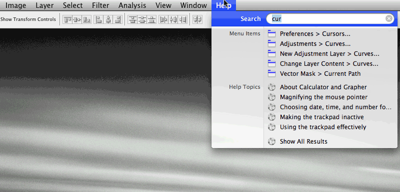
I’ve found that by assigning a global keyboard shortcut ("Cmd-?") to Help->Search via system preferences, I can now drive any Mac app’s menus via the keyboard. That’s pretty powerful: instead of having to memorize (or assign) lots of keyboard shortcuts, or having to hunt and peck through rarely-used apps’ menus, it’s now possible just to hit Cmd-?, then start typing.
Yes, I know that Quicksilver can do much more, and there’s all kinds of room to improve on the Leopard feature. That said, the latter’s simplicity makes it really appealing. I’ll be curious to see how much I (and others) end up using it day-to-day. [Update: Apparently I’m not alone: I see in the notes of this podcast that Leo Laporte has ditched Quicksilver in favor of Leopard menu search.]
* Side note: I love that it’s now possible to browse Safari’s history via the search feature. I’ve been using search in Safari 2, but the new UI exposes the capability much more readily. On a further side note, apparently the extension Safari Stand will bring Cover Flow viewing to your history.
Photoshop, as seen through Johnny Cash
In One Piece At a Time*, Johnny Cash tells the story of building a Cadillac from 20 years’ worth of evolving, mismatched parts. I’ve gotta say, I know the feeling.
Photoshop has been accreting power & users for the better part of two decades. The once-little app has proven almost endlessly adaptable to new needs and workflows, but all that morphing has a price. In many cases we’ve traded simplicity for power, and not all the pieces look like part of a cohesive whole. In fact, I sometimes joke that looking at some parts of the app is like counting the rings in a tree: you can gauge when certain features arrived by the dimensions & style of the dialog. (Cue old-timey prospector voice: "Oh, Lighting Effects–you can see the scorch marks from the great fire of ’43…")
This isn’t exactly a news flash–far from it. So, the question is, What exactly are we gonna do about it? No one wants to work with–or work on–some shambling, bloated monster of a program.
The good news is that we’ve been plotting the solutions for a number of years, chipping away at the problem. Good stuff comes to the surface in bits and pieces, but we haven’t quite turned the corner–yet. A few thoughts:
- We must make Photoshop "everything you need, nothing you don’t." Presenting the same user experience to a photographer as we do to a radiologist, as to a Web designer, as to a prepress guy, is kind of absurd. The new ability for users to choose between Photoshop & Photoshop Extended helps somewhat, but it’s just one step.
- With this goal in mind, we must make Photoshop dramatically more configurable. We’ve been chipping away for several cycles, enabling first workspaces, then customizable menus & shortcuts. We need to be much bolder, though, and I’ve been dropping totally unsubtle hints about this for ages.
- I don’t expect most users to customize the app–nor should they have to do so. Rather, I expect the power users–authors and experts, you and I–to tune the app to taste, then share our knowledge. Let people solve their own problems, then share the solutions.
- With the power of customizability, we can present solutions via task-oriented workspaces. Today if a user walks up to Photoshop and says, "What do I do?," the app kind of shrugs, stubs out a cigarette, and says, "I dunno–you tell me." That’s not real cool, and we can do better.
- By leading people to best practices, we can start deprecating (and later removing) outmoded functionality. ("A designer knows he has achieved perfection not when there is nothing left
to add, but when there is nothing left to take away," said Antoine de Saint-Exupery.) - Meanwhile we’ll put energy into simply polishing what’s already present. (Refine Edge is a good example from CS3.)
So, why am I telling you all this, and why do I think it’s worth reading? I’m saying it because although we can’t (and probably shouldn’t) turn the whole battleship (or Caddy, if you like) on a dime, we get the need, and we’re on the case. We’ve been toiling away beneath the surface, setting the groundwork for change. There are no magic bullets, but I feel that for the first time in my 5+ years working on this team, we’re within striking distance of some big things–and everyone reading this will play a role in making things better. Just thought you should know. 🙂
In the meantime, as we fight for each little gain, I’m reminded of a quote from Edmund Burke: "Nobody made a greater mistake than he who did nothing because he could do only a little."
[Update: I’ve posted some clarifications & responses here.]
*Lyrics, plus Johnny in a kind of Benny Hill-esque video for the song. Thanks to our friend George Reis for drawing the comparison.
Wicked-cool Wii+Flash-powered hologram-thing
The crew at BLITZ Agency created an amazing interactive video installation for Adobe MAX, using non-traditional input devices to let people paint collaboratively. As they describe it on their blog:
"Adobe Creativity Conducted" Interactive Wall Experience features a holographic-like projection system on which you can paint images and designs using a Nintendo Wii remote control. This full screen Flash application runs in HD resolution, and was premiered during the primary Adobe party of the MAX 07 Conference in Chicago. The experience ran uninterrupted for the duration of the party (4 hours), and received nonstop foot traffic resulting in 68 artistic creations submitted as images to a Flickr account.
Chek out the video of the system in action, and see some of the creations on Flickr.
I can’t tell you how much stuff like this trips my trigger. I love the way the project makes drawing and painting a full-body 3D experience, and I love the way the SWF interface synthesizes great-looking art playfully. One question, though: Why can’t I do anything like this in Photoshop or Illustrator? What if we could crack open these apps and let people leverage the power of the Flash? Hmm… Erik Natzke has an idea of what that might look like (totally fake, unfortunately, at least for now).
Trying, as ever, to cross the streams,
J.
Multitouch, holograms, & other next-gen I/O
- A team at USC has built a holographic “360° Light Field Display” using a spinning mirror, and the resulting video is pretty amazing. Note: Do not attempt to make out with images depicted this way. (I do wonder if you can sing “Iron Man” into it, as you would an oscillating fan.)
- Italian design firm V12 Design+Engineering has come up with an interesting proposal: the Canova dual-display touch-screen notebook computer. Here are additional images, including a mockup of the device running Photoshop. [Via Rob Corell]
- The Ecko LCD bus shelter is designed to let passersby scribble graffiti via Bluetooth-enabled cell phones; here’s a slightly larger image. I’m having trouble finding more on the topic, making me wonder whether it ever got out of the concept phase.
- Helsinki’s CityWall collaborative social space “is a large mutli-touch display installed in a central location in Helsinki which acts as a collaborative and playful interface,” enabling navigation of specially tags media from Flickr & YouTube. [Via]
- The crew at Minimaforms has brought SMS-driven laser writing on smoke to Bristol’s OFFLOAD festival. [Via]
- CNET has posted additional images & details on the Microsoft Surface touch-sensitive screen.
- My old colleague Noah Mittman offers a useful clarification regarding “haptic interfaces”: “For an interface to be haptic, touch must be its output”–not just the input. He points out a crazy haptic glove shown this year at SIGGRAPH. See also this CAD interface that simulates sculpting.
- For more info on how these things have evolved & where they might be going, see Robert Cravotta’s history of gesture interfaces. [Via]
TiltViewer: 3D Flash interface to Flickr
Felix Turner, creator of the all kinds of clean, lovely Flash photo displays (e.g. the Flickr Related Tag Browser, SimpleViewer, and PostcardViewer) returns with TiltViewer, an experimental interface that presents photos from Flickr’s "Interestingness" stream. Clicking the icon on any image makes it possible to flip it over, see notes, and jump to the corresponding Flickr page (which I did for this groovy shot). For details of the project, check out Felix’s blog. For another great way to peruse Flickr, check out PicLens.
KYPSKBSC: Know Your Photoshop Keyboard Shortcuts
Let your fingers do the rocking:
- Photographer/designer Trevor Morris has posted a highly detailed yet compact list of Photoshop CS3 shortcuts, in PDF form to facilitate printing as a quick reference. See also Camera Raw & Bridge shortcuts from Ian Lyons, as well as Trevor’s 50 interface tips for Photoshop.
- The Digital Photography school has posted a list of 18 Exceptionally Useful Photoshop Shortcuts. [Via]
- It’s a bit dated now, but Michael Ninness’s Photoshop Power Shortcuts book is a terrifically thorough (and–having updated the text for PS7–may I say, enormously accurate) printed reference on the topic. Bonus fact: It is (presumably) the only Photoshop shortcuts book to be illustrated using gratuitous images of my old car.
Interactive Adobe video wall comes to NYC
According to an article in today’s NYT,
Adobe will unveil an interactive wall of projected animation [see video] this morning in Union Square, along the 14th Street side of the Virgin Megastore. As pedestrians walk past the wall, infrared sensors will lock on to the person closest to the wall, who will then be able to control a projected slider button at the bottom of the wall. As the selected pedestrian continues walking and moves the slider along, the wall will start displaying colorful animation and playing music, effects that will grow or recede at the pace that the person advances or retreats.
Measuring 95 square feet, and created by Goodby Silverstein working with animators at Brand New School and video peeps Obscura Digital,
the wall is meant to offer “a single and multiuser experience simultaneously.” Gizmodo wants to see multitouch interactivity added to the project, saying “Sure, you’d probably wind up with more than a few obscene renderings, but it’s New York, people can handle it.” (Yes, but could Adobe Corporate*? ;-))
I hope to get photos and videos from the unveiling to share. If you know of any, please pass ’em along. [Update: Gothamist has posted a bit more info.]
*Then again, Bruce is from Brooklyn, so I imagine him remaining unfazed.
Multitouch, real & imagined
- MIT’s Technology Review features multi-touch UI pioneer Jeff Han in a new video. He talks about ways these screens can get around the "thin straw" of keyboard mouse input; the potential for better storyboarding applications; and more.
- Mark Coleran has carved out what seems to be a pretty cool gig, designing computer interfaces shown in movies. His design for a table in The Island resembles the Microsoft Surface concept. [Via] Mark’s work reminds me of the time we visited the set of one of the CSI shows and met the folks responsible for those Director-powered graphics–you know, the ones that convince average viewers that computers can read The Iliad reflected off the head of a pin. Thanks a lot for that, guys. 😉
- Meanwhile the interface of the iPhone I picked up on Saturday remains a completely imaginary one: thanks to AT&T, I can’t activate the damn thing with my corporate cell number, which means I can’t get past the welcome screen. Note to self: the whole sequence of
- Get all excited, buy lovely, seductive gizmo
- Figure out whether said gizmo can actually be used with phone number, work email, etc.
should actually be reversed. Gah. This would be that bleeding edge I’ve heard so much about. (It does feel great in one’s hand, however. ;-P)
A great quote on software
As I’ve been thinking about the future of user interfaces, I stopped by the Web site of noted UI designer Bill Buxton. There I saw this remark:
A Personal Mantra: Ultimately, we are deluding ourselves if we think that the products that we design are the "things" that we sell, rather than the individual, social and cultural experience that they engender, and the value and impact that they have. Design that ignores this is not worthy of the name.
Right on, sir. I tell anyone who’ll listen (and many who won’t) about the "Photoshop Nation," the power of connecting people, and the importance of giving a damn and getting things right.
A small number multiplied by a big number is still a big number, and some little improvement* may help only a small percentage of users, but that works out to a large number of people. The social impact of doing so can be significant. (It all reminds me of Steve Jobs equating boot time improvements to lives saved.) It’s about not blocking the light.
Bonus quote, apropos of stirring things up on occasion: "Words ought to be a little wild, for they are the assault of thoughts on
the unthinking." –John Maynard Keynes
* I was pleased to hear a photographer named Brian Price comment this week on the ProDIG list that "[F]or me the clone ‘Ignore Adjustment Layers’ option in CS3 is worth the
upgrade price in itself"–a comment echoed by others. It’s one of those tweaks that shows up rarely, if ever, in marketing materials, reviews, etc., but that can have a real impact.
Multitouch: $2 or $10,000?
The folks at Medallia claim to have devised a multitouch user input device using two dollars’ worth of dye and Ziploc bags. Hmm–interesting clip, but doesn’t it seem they’ve pretty much mashed up a couple seconds of new footage (producing colored blobs) with chunks of other people’s demos (the chess demo from Tactiva, etc.)? Beyond the technology, I’m struck by the number of comments below the video that boil down to "hah hah u pwned those fat-cats lolz!!" Man are there some credulous people in the world. [Via Tom Attix]
Speaking of pwning Microsoft, however, this parody of the recently-announced, $10,000-a-pop Surface project is pretty damn funny. I can’t wait to get tanked with my friends, using a device the size of a small car. [Via]
Slick search-driven Flash UI
Given that discovering the graphical UI (specifically, MacPaint) was a life-changing event for me, it’s a little funny that I find myself so interested in search as a UI tool. But as we’ve said many times now, categorization goes only so far. Once you get beyond a certain number of things (pictures, emails, menu items, etc.), you need some form of type-to-find.
Photoshop UI designer Andrew Lin points out the site for design firm S-W-H, which features a slick, easy-to-use search function (including auto-complete). Coupled with the blazing fast transition animations*, it gives you a sense of flying through a large body of work. Bonus: Typing “foo” (and lots of other things) treats you to the sounds of people excitedly going off in Dutch.
For a counterpoint, check out the frankly terrible interface for HBO’s John From Cincinnati site (too bad, as I’m digging the new show’s tripped-out profane-cowboy-meets-longboard lingo). The site loads by promising a carousel of content, but it then immediately hides said content, making you guess about search terms (kind of hard if you’re new to the show, eh?).
Tangentially related bits:
- Inquisitor beautifully integrates predictive searching into Safari. Trust me, you want this (just like PicLens… and Saft).
- Apropos of time lapses (see recent), Andrew made quite a number during his tenure with a certain fruit company. Hypnotic, but burning cars & tail lights make me remember why I traded commutes on 280 for a 10-minute bike ride.
* With animation effects in general I’m reminded of a quote from Alan Cooper: “No matter how beautiful, no matter how cool your interface, it would be better if there were less of it.” A little goes a very long way.
PS–If you know of other cool, powerful search UIs (Flash or otherwise), please share ’em.
Command lines: Back to the future?
With the mouse turning 40, and with the number of photos, emails, and other documents ever growing, do we need a new kind of user interface? Do we need, maybe–dun dun duunnh–a return to the command line?
That’s part of what usability expert Don Norman thinks. He notes that search engines, both on the Web and on the desktop, now support commands (e.g. "define:photography" in Google), and that computer interfaces are now enhanced by, rather than dependent upon, typing in specific commands. If a command isn’t valid, modern search implementations fall back gracefully to basic searching.
This is something we’ve been discussing for quite a while at Adobe. What if, instead of hunting through menus ("Hmm, is commenting under Edit, or Format, or…?"), or having to memorize the keyboard shortcut for each command, you could simply start typing & getting a list of matching commands? The CS3 generation of tools makes some moves in this direction:
- After Effects has offered searching for filters (as it has for a while);
- Illustrator CS3 includes a new, Flash-based "knowhow" panel that can search the Web for info related to the current tool;
- InDesign CS2 introduced a "Quick Apply" capability. In CS2 it could apply styles (here’s a demo), and in CS3 it can invoke menu items as well. InDesign PM Chad Siegel explains:
"In CS3 we expanded Quick Apply to optionally include all menu items and commands within the application as well as scripts. Once the item is displayed, it can be either applied or invoked simply by selecting it from the list. [See a quick demo, under "Productivity Enhancements"]
"That’s a lot of information that could be displayed so we also provide the ability to limit your search to certain classes of items (e.g. Paragraph Styles and/or Character Styles only). We also added shortcut codes which display within the UI that can be added as a prefix to limit the scope of individual searches. For example, p: is used to limit the search to paragraph styles and m: to limit to menu commands, etc. So users can type m:print and see any command in the list that included those characters. It also searches the characters that customers enter from both left to right and right to left, giving preference to exact matches at the top of the list.
"Finally, it also displays the location of the commands so that folks can find it more easily within the UI. For example m:print shows File>Print in the list.
So, what about Photoshop? The app doesn’t presently feature built-in support for something like Quick Apply, but it’s an intriguing possibility for the future. I’m hoping we see some developments here soon (not from Adobe, so I’m not sure how much I can say just yet). On the Mac there’s also Quicksilver, the darling of power users. I’ve found a beginner’s guide; some tips for searching menus; and Merlin Mann’s podcast on the subject… but damn if I’ve yet had the patience to configure my copy (it’s death by options). I may get there yet.
In any case, I think we’ll see plenty of interesting app-searching developments in the future.
Multi-touch photo editing demo
I don’t have much context for this video, but I’m passing it along as it’s an interesting demo of image editing using a multi-touch screen. The pie menus look useful (is that a Healing Brush icon I see?), though to compete against a keyboard and mouse, I think it would need to be much faster and more fluid.
Sidenote: I like imagining that the choice of bloopy, electro-spacey music may not just be a video editing choice, and that it’s actually emitted by the multi-touch monitors themselves (see also the Jeff Han origin of the genre). "Hey man, cool screen, but why does it keep playing the pseudo-Moby?"
Sound in AE + Flash; rethinking UI; more on Design Center
The Adobe Design Center unfurls a swath of new content:
New Dialog Box:
- Interface surgery: Converting an implementation-model design into a mental-model design by Robert Hoekman, Jr.
New Gallery:
- Words at Play by Devicq.com and Mucca.com
New Tutorials:
- Anchor objects to text in InDesign by John Cruise, Kelly Kordes Anton
- Create a web gallery in minutes using Photoshop Lightroom by
Matt Kloskowski - Creating dynamic sound controls in Flash by
Russell Chun, Paul Robertson - Discover the difference between live and traditional filters in Fireworks by
Abigail Rudner - Using the Three Way Color Corrector in Premiere Pro by
Jeff Schell - The fundamentals of working with sound in After Effects and Flash by
Tom Green, Tiago Dias
And don’t forget to check out the Adobe links on del.icio.us. Info on how to contribute links is here. [Via]
Lightroom Podcast #28: Phil Clevenger, Grace Kim and Mark Hamburg
"I think pretty much any software has a personality," says Mark Hamburg, "but a lot of times it’s something that one sort of stumbles into, and people don’t think about that as part of the design process. When I started the project, I wanted to do something that was more visually interesting, for example, than Photoshop, and tried some directions in that regard. And I did bad KPT imitations."
Mark sat down with Lightroom UI designer Phil Clevenger, user researcher Grace Kim, and photography evangelist George Jardine on Dec. 11th. George writes,
In this podcast, we take a retrospective look at the entire design process of Shadowland, and how personality played a role in the final look and feel of the software. Phil discusses the efforts that went into designing Shadowland to help keep your photography the focus of attention, and visually more important on the screen than the user interface.
"I think the exercise really brought to light people’s implicit assumptions about what they thought the Shadowland personality was, or should be. Things that were kind of hard to articulate, but people just had them as working assumptions." – Grace Kim
"While people in different parts of the country may have different notions of what sleek or stylish may mean, I think everybody knows what butter is." – Phil "Butter" Clevenger
The podcast is available as an MP3 file via George’s iDisk (under "1211 Podcast – Phil Clevenger, Grace Kim and Mark Hamburg"). It’ll also be available via the Lightroom podcasts RSS feed, and by searching for "Lightroom" in iTunes.
Interviews with Photoshop founders
- The blog since1968.com features an interesting interview with Mark Hamburg (photo), founder and engineering manager of the new Photoshop Lightroom product (not to mention a driving force behind Photoshop itself for more than a decade). In it Mark discusses the gestation of the product, some of the concepts behind its user interface, reasons they abandoned things like a free-form light table, and more. I’m looking forward to part 2 of the interview, due to be posted soon on the site. [For more on the history of Lightroom development, check out Jeff Schewe’s behind-the-scenes overview. For more interviews with Mark, check out some of the Lightroom podcasts.]
- CNET has been featuring some of the creative forces at ILM this week, highlighting the work of John Knoll (who co-wrote Photoshop with his older brother Thomas). Now they’ve posted a 4-minute video in which John discusses those early days. [For more info, photos, and clips from ILM’s Pirates work, see the mini-site they created. For more on the Knoll brothers & the creation of Photoshop, check out this piece on PhotoshopNews.]
Side note: I love that Hal Hickel, now an effects whiz at ILM, saved the rejection letter he received when, at age 12 in 1978, he proposed a sequel to Star Wars. It reminds me of the note I got from LEGO 20 years ago, when I proposed camouflage bricks–a notion they rejected as being too war-like. Yeah, and now they make a Lego Death Star… 😉
Also, speaking of that “small moon,” how brilliant is this video, re-enacting the Star Wars Death Star battle using ony disembodied hands? [Via]
Multi-touch UI: New video & interview
Jefferson Han is the NYU researcher whose research into multi-touch interfaces–and accompanying super-cool video–exploded onto the Web this time last year. He’s been on many folks’ brains since last week, when Apple demoed multi-touch features on the forthcoming iPhone. Now Fast Company has posted a feature on Jeff, along with an new video. The profile is just a tad breathless ("The scope of the projects he’s involved in is a testament to the sheer wattage of his brain" makes me think there’s a Trapper Keeper with "I [Heart] JH!!!" on it), but it’s fun to learn about a very bright dude with a huge passion for just getting it done. (Hey, how many 12-year-olds build a laser?)
Lightroom Podcast #25: Mark Hamburg & Phil Clevenger
“We started from a supposition of content being king, and we wanted to move the interface out of the way of the content. And that was a real rallying point when we all found a model for the UI, where we could dedicate up to 95% of the screen to image content and have the UI politely get out of the way, or be invoked as needed.” So says Phil Clevenger,
user interface designer on Lightroom. George Jardine chatted recently with Phil & engineering manager Mark Hamburg:
Phil and Mark sit down with George to talk about Phil’s role on the team and the user interface that he’s designed for Lightroom. The conversation quickly begins to wander and turn (as these conversations frequently do take on a life of their own…) to some of the broader questions surrounding Lightroom, and ends up touching on the core story and original vision for the project. This podcast also includes a description by Mark of some of his original thinking behind Lightroom’s modular design.
The podcast is available as an MP3 file via George’s iDisk (under "1127 Podcast – Phil Clevenger and Mark Hamburg"). It’s also be available via the Lightroom podcasts RSS feed, and by searching for "Lightroom" in iTunes.
Photoshop & Macs: The new shuffleboard?
This week C|NET published findings from MetaFacts indicating that "nearly half of Mac owners are 55 and older–almost double the share for average home PC users." Apple disputes this claim, though I’d take it as a compliment that my tools can be used by a generation not raised by Grand Theft Auto.
As it happens, the registered base* of Photoshop customers has skewed older in recent years, due to the exploding popularity of digital photography. The same folks who in previous generations might’ve sprung for a home darkroom now tend to buy a really nice digital SLR, computer, and the best software to go with it. These trends prompted my colleague Ashley to quip, "Photoshop & Macs: The new shuffleboard?"
This demographic trend has some practical implications. Most obviously, we need to make a user interface that’s easy to navigate with older eyes. Given the 20- and 30-something demographics of many visual designers, this isn’t always easy to remember, but we’re working on it. The emergence of scalable, resolution-independent will be essential here, and in the meantime Photoshop CS2 added the ability to adjust the font size of the interface (a small thing, literally, but a step in the right direction).
*Note: This of course way undercounts all the five-finger-discounting little l33t-speak haxxor-kiddies. (“im in ur base, stealin ur ‘Shop…”)