I love the blend old-school puppetry, 3D animation, Gemini Omni, and the latest experimental video tools that went into creating TPU Training Day, the short film that debuted during Google I/O 2026.
I know you’ve heard it a million times, but it bears repeating: AI isn’t a substitute for human creativity, or in many cases even for traditional techniques. It’s just a whole new toolbox that can multiply our expressive powers.
Although I can’t say I remember enjoying the film much, I’m always a sucker for looks into the craft of visual storytelling. Here’s how craftspeople worked 17 (!!) years ago:
As generative imaging models like Nano Banana get increasingly adept at rendering text-heavy layouts, the ability to convert those layouts into native text/image compositions is of course hugely valuable for editing. Check out Canva’s new Magic Layers feature:
Tus Posters con GPT Images 2.0 por fin son 100% editables
Con Canva puedes separar las capas y personalizar cada texto o imagen. Se acabó el conformarse con lo que te dé la IA: ahora el diseño es 100% tuyo
My mom and her sisters (all with the skin tone 255/255/255) spent way too many days turning themselves into rotisserie chickens here over the years. That’s one of millions of stories, ranging from shipwrecks to chicanery, plucky birds to an African American rodeo scene, that have unfolded along Chicago’s amazing lakefront. Having grown up in Illinois & visited hundreds of times over the years, I really enjoyed this tour from WTTW & Geoffrey Baer:
The last time I visited Industrial Light & Magic, Russell Brown & I grabbed lunch with Photoshop co-creator John Knoll. As they’d just retired a bunch of bulky rendering hardware, John was busily removing the fascia (adorned with Imperial logos) and adding decorative blinkenlights, creating some pretty exceptional décor for his office.
I was reminded of this seeing Russell share this 1-minute history of how John’s work at ILM proved to be crucial in his & Thomas’s creation of Photoshop:
00:00 Cold Open — AI, Creativity & The Big Question 00:50 Welcome to Creative Outsiders 01:09 Introducing Russell Brown (“Doc”) 02:00 Photoshop Origins: ILM, Star Wars & The Abyss 06:55 The “Holy Sh*t Moment” — Taking Control of Images 11:10 From Rub-Down Type to Digital Creativity 12:05 Where Creativity Comes From 16:00 Becoming the Best at What You Love 18:15 Enter AI — Tool or Threat? 24:00 The Future of Photography & AI Workflows 30:15 Creating Films with AI & Storyboarding 34:00 The Ethics of AI in Photography 37:00 AI for Pre-Visualization (Not Replacement) 43:00 From Photoshop Fear to AI Fear 44:30 Why Russell Shoots on iPhone 48:00 Simplicity, Constraints & Creativity
And just in case you’re curious, here’s John recreating the first demo of Photoshop, some 20 years after the fact (which is itself now 16 years ago, OMG…):
I love love love the attention to detail that Phil Lord and Christopher Miller brought to the film. Check out the lengths they & their crew went to on everything from devising rotating lights for the inter-ship tunnel (conveying constant rotation) to nailing film grain. And I love the exuberance & generosity of creators in sharing so many insights into design & process.
“Wow, that’s some really sharp After Effects work,” I thought last year, when my wife showed me some animation her Airbnb colleague had created. But nope—the work came straight out of Canva.
Not content to chill with their surprisingly capable foundation, Canva is continuing to build out the “Creative Operating System” and has announced the acquisition of up-and-coming 2D animation tool Cavalry:
In their blog post they seem pretty adamant that the acquisition won’t result in dumbing down the core app:
Built for professional motion designers
Cavalry earned its place in the motion design world by doing something different. Its procedural, systems-based approach prioritises flexibility, repeatability, and performance. It wasn’t built as a simplified alternative; it was built specifically for professional motion designers and the complex workflows they rely on. That professional focus remains central.
We’ve invested in Cavalry because of its depth as a professional-grade motion tool. The goal isn’t to simplify what makes it powerful, but to support and strengthen it. Professional motion design demands precision, flexibility, and tools that can scale across complex projects.
Much as with their acquisition of Affinity, however, I’d fully expect Canva to integrate underlying tech into the core design platform, radically simplifying the interface to it—including by providing agentic and chat-based touchpoints.
As with the myriad node-based systems that sprung up last year, I wouldn’t expect most people to ever see or touch the underlying data structures. Rather, what’s essential is that the main tool can understand & modify them, so that it can deliver brilliant results at scale. That necessitates a very approachable, and totally complementary, UX.
I got into the Mac scene just a touch too late to have interacted with Aldus (acquired by Adobe in 1994), and I’m sorry not to have known the late Paul Brainerd, who passed away a couple of weeks ago. To mark the occasion, some friends have been resharing this video, created when the company became part of the Big Red A. It’s fun to see a few familiar faces & to remember the tech vibe of those early days:
I had no idea that the ol’ girl had it in (er, on) her—but this is too odd & thus interesting not to pass along:
Meanwhile, speaking of odd: Having just visited the Mojave aircraft boneyard (see pics) and Spaceport, from which the weird creations of Burt Rutan & co. operate, I couldn’t resist trying this silliness:
I asked Nano Banana to imagine legendary aircraft designer Burt Rutan rocking the sort of canard wings he loves including on planes.
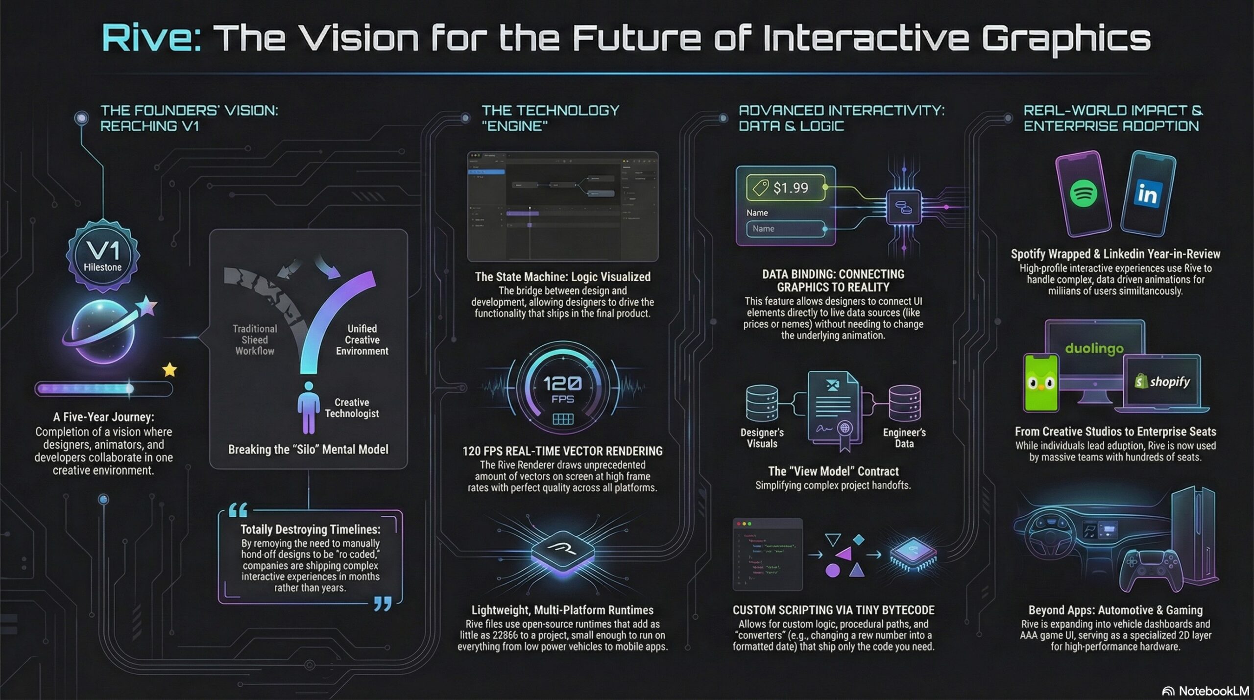
Having gotten my start in Flash 2.0 (!), and having joined Adobe in 2000 specifically to make a Flash/SVG authoring tool that didn’t make me want to walk into the ocean, I felt my cold, ancient Grinch-heart grow three sizes listening to Guido and Luigi Rosso—the brother founders behind Rive—on the School of Motion podcast:
[They] dig into what makes this platform different, where it’s headed, and why teams at Spotify, Duolingo, and LinkedIn are building entire interactive experiences with it!
Here’s a NotebookLM-made visualization of the key ideas:
Table of contents:
Reflecting on 2025: A Year of Milestones 00:24 The Challenges of a Three-Sided Marketplace 02:58 Adoption Across Designers, Developers, and Companies 04:11 The Evolution of Design and Development Collaboration 05:46 The Power of Data Binding and Scripting 07:01 Rive’s Impact on Product Teams and Large Enterprises 09:18 The Future of Interactive Experiences with Rive 12:36 Understanding Rive’s Mental Model and Scripting 24:32 Comparing Rive’s Scripting to After Effects and Flash The Vision for Rive in Game Development 31:30 Real-Time Data Integration and Future Possibilities 40:26 Spotify Wrapped: A Showcase of Rive’s Potential 42:08 Breaking Down Complex Experiences 46:18 Creative Technologists and Their Impact 51:07 The Future of Rive: 3D and Beyond 59:30 Opportunities for Motion Designers with Rive 1:11:38
There’s almost no limit to my insane love of practical animal puppetry (usually the sillier, the better—e.g. Triumph, The Falconer), so I naturally loved this peek behind the scenes of Apple’s new spot:
Puppeteers dressed like blueberries. Individually placed whiskers. An entire forest built 3 feet off the ground. And so much more.
Bonus: Check out this look into the making of a similarly great Portland tourism commercial:
Passion is contagious, and I love when people deeply care what they’re bringing into the world. I had no idea I could find the details of fast-food chicken so interesting, but dang if founder Todd Graves’s enthusiasm doesn’t jump right off the screen. Seriously, give it a watch!
Nice clip for any product maker.
(also highlights how every business is complex when you get into the details – it is useful to remember this because many in tech give the excuse “oh, my product is complex and special” – EVERYTHING is complex and it’s your job to deal with that) https://t.co/zgd4uAsGsl
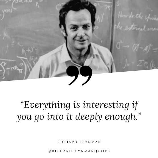
I’m reminded of Richard Feynman’s keen observation:
More tangentially, this gets me thinking back to my actor friends’ appreciation of Don Cheadle’s craft in this scene from Boogie Nights. “I could watch that guy pick out donuts all day!” And even though I can’t grok the work nearly as deeply as they do, I love how much they love it.
“A few weeks ago,” writes John Gruber, “designer James Barnard made this TikTok video about what seemed to be a few mistakes in HBO’s logo. He got a bunch of crap from commenters arguing that they weren’t mistakes at all. Then he heard from the designer of the original version of the logo, from the 1970s.”
Check out these surprisingly interesting three minutes of logo design history:
@barnardco “Who. Cares? Unfollowed” This is how a *lot* of people responded to my post about the mistake in the HBO logo. For those that didn’t see it, the H and the B of the logo don’t line up at the top of the official vector version from the website. Not only that, but the original designer @Gerard Huerta700 got in touch! Long story short, we’re all good, and Designerrrs™ community members can watch my interview with Gerard Huerta where we talk about this and his illustrious career! #hbo#typography#logodesign#logo#designtok original sound – James Barnard
“If you’re into weird cars, forgotten history, and stories that don’t end well, hit that subscribe button.”
I found this piece really interesting, not least because my wife & I are headed to Africa for the first time next week, and I’m eager to learn what kinds of vehicles & roads we’ll experience. Seems like something like the Africar would make a ton of sense in many places:
I’ll note the fact of AI having been involved only because at this point who cares whether AI was involved? We’re happily reaching a plane of maturity where the particular mix of tooling is much less interesting than the vision & vibe.
John Gruber recently linked back to this clip in which designer Neven Mrgan highlights what feels like an important consideration in the age of mass-generated AI “designs”:
I think that was what mattered is that they looked rich, they looked like a lot of work had been put into them. That’s what people latch onto. It seems it’s something that, yes, they should have spent money on, and they should be spending time on right now.
Regardless of what tools were used in the making of a piece, does it feel rich, crafted, thoughtfully made? Does it have a point, and a point of view? As production gets faster, those qualities will become all the more critical for anything—and anyone—wishing to stand out.
Splice (2D/3D design in your browser) has added support for progressive blur & gradients, and the results look awesome.
I haven’t seen anything advance like this in Adobe‘s core apps in maybe 20 years— maybe 25, since Illustrator & Acrobat added support for transparency.
We are adding Progressive Blur + Gradients to Hana! All interactive, all real-time.
On an aesthetically similar note, check out the launch video for the new version of Sketch (still very much alive & kicking in an age of Figma, it seems):
Remember when we said auto layout was coming to Sketch? It’s here. It’s called Stacks, and it’s part of our biggest release ever — out now.
There’s a lot to cover, so buckle up and we’ll give you a tour.
Also, stick around for a surprise at the end of the thread
Director John Likens and FX Supervisor Tomas Slancik dissect existential collapse in Your Friends & Neighbors’ haunting opener, blending Jon Hamm’s live-action gravitas with a symphony of digital decay. […]
Shot across two days and polished by world-class VFX artists, the title sequence mirrors Hamm’s crumbling protagonist, juxtaposing his stoic performance against hyper-detailed destruction.
I really hope that the makers of traditional vector-editing apps are paying attention to rich, modern, GPU-friendly techniques like this one. (If not—and I somewhat cynically expect that it’s not—it won’t be for my lack of trying to put it onto their radar. ¯\_(ツ)_/¯)
Introducing Vector Feathering — a new way to create vector glow and shadow effects. Vector Feathering is a technique we invented at Rive that can soften the edge of vector paths without the typical performance impact of traditional blur effects. (Audio on) pic.twitter.com/39kfjmFsTJ
Wow—I marvel at the insane, loving attention to detail in this shot-for-shot re-creation of a scene from Interstellar:
The creator writes,
I started working on this project in mid-2023, and it has been an incredible challenge, from modeling and animation to rendering and post-production. Every detail, from the explosive detachment of the Ranger to the rotation of the Endurance, the space suits of the minifigures, the insides of the Lander, and even the planet in the background, was carefully recreated in 3D.
Interstellar is one of the films that has moved me the most. Its story, visuals, and soundtrack left a lasting impact on me, and this video is my personal love letter to the movie—and to cinema in general. I wanted to capture the intensity and emotion of this scene in LEGO form, as a tribute to the power of storytelling through film.
Oh man, this vid from Aaron Draplin—stalwart hoarder of obsolete removable media—gave me all the feels, and if you’re a creative of a certain age, it might give you them, too:
Is it for me? Dunno: lately the only thing that justifies shooting with something other than my phone is a big, fast zoom lens, and I don’t know whether pairing such a thing with this slim beauty would kinda defeat the purpose. Still, I must know more…
Here’s a nice early look at the cam plus a couple of newly announced lenses:
Building on the strong work from the previous season,
Berlin’s Extraweg have created… a full-blown motion design masterpiece that takes you on a wild ride through Mark’s fractured psyche. Think trippy CGI, hypnotic 3D animations, and a surreal vibe that’ll leave you questioning reality. It’s like Inception met a kaleidoscope, and they decided to throw a rave in your brain. [more]
I really love the way the visual medium (simply black & white dots) enriches & evolves right alongside its subject matter in this ad for ChatGPT, and I hope we get to hear more soon from the creative team behind it.
I hope you’ve been able to spend at least some warm times with friends & family this holiday season, and here’s to a great new year of crackling creativity:
If you or folks you know might be a good fit for one or more of these roles, please check ’em out & pass along info. Here’s some context from design director Mike Davidson.
————
These positions are United States only, Redmond-preferred, but we’ll also consider the Bay Area and other locations:
“Tell me about a product you hate that you use regularly.” I asked this question of hundreds of Google PM candidates I interviewed, and it was always a great bozo detector. Most people don’t have much of an answer—no real passion or perspective. I want to know not just what sucks, but why it sucks.
If I were asked the same question, I’d immediately say “Every car infotainment system ever made.” As Tolstoy might say, “Each one is unhappy in its own way.” The most interesting thing, I think, isn’t just to talk about the crappy mismatched & competing experiences, but rather about why every system I’ve ever used sucks. The answer can’t be “Every person at every company is a moron”—so what is it?
So much comes down to the structure of the industry, with hardware & software being made by a mishmash of corporate frenemies, all contending with a soup of regulations, risk aversion (one recall can destroy the profitability of a whole product line), and surprisingly bargain-bin electronics.
Despite all that, talented folks continue to fight the good fight, and I enjoyed John LePore’s speculative designs that reinterpret the instrument clusters of classic cars (from Corvettes to DeLoreans) through Apple’s latest CarPlay framework: