- “Heineken…!?” Blue Velvet, Lost in Translation, and more: Great postcards to great characters.
- Old-timey:
- I do love me some retro illustrations by Matthew Lyons.
- “Yea, Verily Doth This Look Tapestryshopp’d…”
- Check out this do-it-yourself Piet Mondrian painting with movable pieces & changeable colors. [Via]
Category Archives: From Twitter
(rt) Illustration: Space, beautiful & laughable
- JoeJesus creates some beautiful space-scape artworks (and some cheeky ones, too). [Via]
- I like this proposed NASA logo redesign, though it’s evidently polarizing. [Via]
- “Fancy, your pants are”: Fun Victorian-style Star Wars portraits from Greg Peltz.
- Colt .45 for all! “I, Lobot: A Day In The Life of Lando Calrissian’s Assistant.” [Via]
(rt) Illustration: Infographics, disappearing rugs, & more
- The gorgeous design for utility app Kaleidoscope may take the cake for maximum marriage of aesthetics and geekiness.
- What do you do after drawing a dry-erase Persian rug? (Who’s buried in Grant’s Tomb?)
- Infographics:
- Art Lebedev provides an interesting peek inside the making of the Moscow Metro map. [Via]
- I dig this handsome, if now dated, World Cup radial bracket poster.
- I could get behind this mid-century-styled Wooden PC by Design Hara.
(rt) Photos & Illustration: Tetris everywhere, the Hand of God, & more
- Don’t hate the game:
- “Tetris Tetris everywhere“: real-world objects that resemble the falling blocks.
- What if popular gaming consoles were buildings, as imagined by Joseph Ford. [Via]
- Interesting media:
- “A Matter of Taste”: Photographer Fulvio Bonavia recreates luxury goods from food. [Via Lynn Grillo]
- Maradona’s “Hand of God” goal, rendered in Legos. [Via Steve Guilhamet]
(rt) Photography: Utterly non-Fourth-related miscellany
- Matt Kloskowski has created Lightroom iPad export settings for easy portfolio sharing. [Via]
- Photos + Photoshop – Wires = Anti-Gravity. [Via Jeff Chien]
- Moodiness:
- Matt Mawson’s foggy beach photography makes me feel damp. [Via]
- Dig these dark, atmospheric photos from Garmonique.
- “How on earth does one acquire that many dead birds, and why would one want to?” Macabre museum-keeping.
In any case, despite the thematic disconnect, Happy Fourth of July!
(rt) Type: Comic friggin' Sans, World Cup type, & more
- “I’m Comic Sans, and I’m the best thing to happen to typography since Johannes f*ing Gutenberg!” [Via]
- The New Lens Flare: Typographical hotness courtesy of CSS3.
- Whating them in all night? The perils of careless font choices. [Via]
- Typographic World Cup t-shirts.
- “Ship It!” Check out this groovy pixel-paper card for Panic’s Transmit 4 launch.
(rt) Illustration: Goals, gorgeous cars, & more
- Athletic:
- Retro Infographic: What happens in your head when you shout “Goal!” [Via]
- Illustrations created entirely of handmade shoeprints for the Chicago Marathon. [Via]
- Automotive:
- Jeff Koons has designed the new BMW art car. Bold as hell.
- Stunning: the 1948 Buick Streamliner. [Via]
- Buzzcuts as illustration: an NYT slideshow.
- Heh–here’s a sort of MacGyver-style iPad drawing aid. (Obviously a software solution is needed, but still neat.)
(rt) Illustration: Vintage computer art, vector vehicles, & more
- Funky design book idea: The Geometry of Pasta.
- Spirographs can’t be killed. Check out this computer art from the 1950’s.
- Vectortuts features a set of Hot Vector Vehicles.
- “Get Your Mom Off Facebook“: 19 various coupons for tech nerds and web enthusiasts.
- Compare: Spongebob, age 50 vs. real-world Homer Simpson & Mario. [Via]
(rt) Illustration: Peeling faces, physical Photoshops, and more
- “Hipsters, Start Your Photocopiers.” I’m loving The Big Caption. (Sometimes I identify a little too closely with the Thai guy in the helmet.) [Via]
- Real-world Photoshop:
- Heh: “Photopaddles physically ‘Photoshop’ your pics.”: [Via]
- Had to happen: A literal adobe photo-shop. [Via]
- Cool: Creating a peeling Escher-style face in Photoshop.
- What if our money weren’t grossly ugly? Check out a proposed U.S. Currency Redesign by Michael Tyznik.
- Video demo: Drawing pixel art on iPad using Sprite Something.
(rt) Motion: Killer movie titles & more
- The Art of the Title Sequence features the great “Up in the Air” opening title sequence plus an interview w/its creators. [Via]
- The same site shows the beautiful, illustrative Sherlock Holmes end credit sequence. [Via]
- Check out some fascinating slow-motion launch footage from Apollo 11.
- “The Empire Strikes Back” gets re-imagined as an old-timey movie serial from 1950. [Via]
- Buck has created a terrific animation of a world made from paint chips. [Via]
(rt) Type: Never Gonna Give You Up edition
- “Jonas & Francois” make some seriously custom typographical footwear. [Via]
- Typographical Rickroll: you’ve been warned. [Via]
- “Kinetic typography” is often pointless and clichéd, but this Ten Commandments bit is nicely done.
- San Francisco is home to a calligraphic treasure trove? Who knew? [Via]
- “No.” is a blog purely of groovy numerals. [Via]
(rt) Type: Asian excellence, Hebrew remixes, & more
- Luscious type & more: “100 Artworks From the Top Digital Artists in Asia.”
- “Cutting libraries in a recession is like cutting hospitals in a plague.” Well said.
- Neat: Hebrew Translations of Latin Logos. (My Hebrew-speaking friends promise I’m not being punked! :-)) [Via]
- What possible need could the Adobe Seattle shuttle bus have for this??
(rt) Photography: Lightroom layouts, photographic history, & more
- Halina Veratsennik has created a set of handy free collage templates for Lightroom 3.
- History:
- Cool: Squeezing digital camera guts into a classic AE-1 film SLR. (The AE-1 was my first real camera.) [Via]
- 19th-century “photochroms” look weirdly (retro-) contemporary.
- I dig the otherness of Spencer Murphy‘s photography. [Via]
- Olympics bits (that I somehow never got around to posting earlier):
- As you’d imagine, there’s an excellent Olympics photo collection on The Big Picture.
- Even more amazing are the photos from the 2010 Winter Paralympics. Hard core. [Via]
(rt) Illustration: The UIs of Iron Man, vintage ads, & more
- Atomic age:
- A Flickr set rounds up beautiful science and tech ads from the 50s/60s. (via @iso50)
- Animation house Perception has a great in-depth piece about how they created the interfaces, PDAs, presentations, and more in Iron Man 2, including some faux-vintage work. [Via]
- Graphic design history: Here’s an incredibly detailed history of the iconic fallout shelter symbol.
- “Beautifully Banal”: classified ads turned into graphic design. (I love “Poodle: All Colors”) [Via]
- I really enjoy the lovely colors & palettes from illustrator Lotta Nieminen. [Via]
(rt) Miscellany: Vintage space suits & more
- This vintage space suit design featured an “inexplicable crotch window” & nose-picking capability.
- Check out some lovely fake-grass bookmarks (cooler than you’d think).
- If you want Adobe TV on your iPad/iPhone, try its YouTube channel.
- Williams-Sonoma is pimping “Fire Wire Flexible Grilling Skewers“. Can I plug them into my Mac? Will deliciousness ensue?
(rt) Illustration: Posters, old-school Mac art, & more
- Check out this set of great travel posters from Heads of State.
- Mac bits:
- Master digital painter Bert Monroy recently showed me his Escher tribute self portrait done in 1987 using MacPaint.
- “Make it so.” Sebastiaan de With says, “This 21st century motivational poster sure makes me work harder.”
- “Happy To Serve You“: RIP, creator of NY’s Greek-themed coffee cup.
- Interesting video: The Art Behind Google’s Doodles. [Via]
- Walking Men is a collage of 99 pedestrian traffic-light icons from around the world. [Via]
- Are these photos or paintings? Living still lifes. [Via]
(rt) Photography: The Sistine Chapel, Darth Vader, & more
- Check out the beautiful B&W photography of Chuck Kimmerle. [Via]
- Neat “Laptopograms”: Making photos with a laptop screen.
- Heh: “Stages of a photographer.” (Beware HDR.) [Via]
- Fun, cryptic photo: “Sad Vader.”
- Here’s a terrific panorama taken inside the Sistine Chapel. [Via]
- Apparently Content-Aware Fill will not blow ladies’ clothes off.
- Here’s some deep nerdery on DNG spec updates, for those who like such things.
(rt) Photography: Historic NYC, war, & more
- Flickr hosts a set of gorgeous photos of New York from the 1940’s. [Via]
- Same city, different era: check out Allan Tannenbaum’s “Dirty, Dangerous, and Destitute: New York in the 70s.”
- “Iwo Jima without Marines… but filled with content awareness,” says Thorsten Wulff
- Neat project: Lining up past & present photos. [Via]
- A cry for Photoshop, if ever there was one: Eastern European album covers of the ’70s. [Via]
(rt) Nature Photography: Apocalyptic vulcanism & more
- “Real wrath-of-God-type stuff…” Insanely beautiful and terrifying volcano photos. See also this & this. [Via]
- “Hey, let’s go to Africa and bolt a DSLR + flashes to an RC car & drive it up to lions & elephants!” Meet the BeetleCam. [Via]
- Christies selects the Top 40 Nature Photographs. [Via Franz Lanting]
- Seems like polar bears would be effective against Imperial probe droids. Polar bear steals tripod.
(rt) Absolute Miscellany: Go Baby Go & Mo'
- After 42 years, the Heinz ketchup packet finally gets a re-design.
- Sculpture:
- Ji Yong-Ho’s tire creatures are steel-belted radness. [Via]
- Gershon Elber has added to his series of models from a 3D printer, “Escher for Real.” [Via]
- Color Picker: Scan objects with a pen, then draw with their colors. [Via]
- “Rock On!”: Crazy rock-balancing tricks. [Via Simon Chen]
- Gonna be one of those days. (I have no real idea what this means, but I still love it.) [Via]
- I *must* arm my car with this thing.
(rt) Miscellany: Photoshop performance & Adobe ephemera
- Speediness:
- DIGLLOYD & OWC are offering a Photoshop/photography-optimized Mac Pro workstation.
- Big solid state hard drives make Photoshop very happy on large jobs.
- Adobe ephemera:
- Rad: The tool palette from Photoshop 1.0 is now available as hangable wall art: 30″ tall for US$70. [Via]
- Also fun/deeply nerdy: Adobe File Format Extension Necklaces. (.PSD FTW)
- New Photoshop-based slang on Urban Dictionary: “‘shopped” http://bit.ly/9PMZgF Adobe Legal winces. (via Will Eisley)
- Adobe India: Made from LEGOs (right?). [Via]
(rt) Illustration: Literature as cigarettes, Krakens, & more
- Flame is a gorgeous online drawing app. [Via]
- Great literature gets rendered as cigarette packs; well executed. [Via]
- Photoshop joins Bar Mitzvahs, Quinceañeras, and other rites of passage. [Via]
- Mikal Reich & team have crafted some beautiful packaging for Kraken rum. Elsewhere, here’s a round-up of Krakens as portrayed across movies & games.
(rt) Photography: Shooting wars, giant waves, & more
- Conflict:
- The Shooting War features a small but excellent set of intense images from conflict photographers.
- The iPhone is combat photojournalist David Guttenfelder’s tool in Afghanistan. Note the final shot of his dust-covered traditional photo gear. [Via]
- The NY Times features What the Still Photo Still Does Best–namely, freezing moments in our shared life, often rendering them iconic. The article features gripping civil rights photos from the late Charles Moore. [Via]
- Crazy high-speed photo: Bullet vs. cigarette. See the rest of the gallery for more fast action.
- Wild blue:
- I dig the screen-filling presentation of Jay Watson’s high-res gallery from the Mavericks surfing contest. (The booming action shots start on p7.) [Via]
- Penguins parade in a gorgeous photo from near the South Pole. (But seriously, there’s a National Penguin Awareness Day?)
(rt) Photographic Extremes: Giant panos, putrid water, & more
<ul
(rt) Infographics: Space, violence, & more
- Michael Paukner makes beautiful space schematics & more.
- Excellent & eye-opening: The Mariana Trench To Scale. [Via]
- FlowingData renders famous movie quotes as charts and graphs. On the Waterfront is my favorite. [Via]
- Fernanda Viégas and Martin Wattenberg created a beautiful visualization of Boston Common over the seasons, made by querying Flickr.
- Here’s the gruesome, functional graphic design o’ the day, which my son and I found while cavorting on heavy machinery.
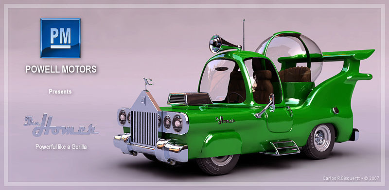
(rt) Illustration: Bond posters, Homer Simpson's car, & more
- Cinematic:
- Graphic design history: Posters for all the Bond films. [Via]
- Abduzeedo rounds up great old spaghetti western posters (originally charmingly mislabeled “western spaghetti;” nice idea for a restaurant name.)
- “Suck It, Dreamworks!” Funny movie posters: Honest Movie Titles: Oscars 2010. [Via]
- Automotive:
- Dig this weird vintage car ad. “I love the little bicycle basket between the jet engines,” says Roger Ebert.
- Visualize the Difference Between Firefox, Opera, Explorer & Safari. (Firefox looks very Homer Simpson-positive.) [Via]
(rt) Photography: Darkness, distant underpants, & more
- Alberto Seveso has created some amazing images by dropping varnish into a fishbowl. The shots take me back to playing with Lego boats + food coloring in the bathtub years ago.
- Canon cannons:
- “I See London, I See France, I See Your Underpants from 32 Miles Away With The Canon 5200mm Ultra Telephoto” [Via Zalman Stern]
- Canon’s limited edition coffee mug swag resembles a lens that resembles a coffee mug. [Via]
- Panasonic brings touchscreens to SLRs: Via the live view, tap a person to focus on/shoot him or her. That strikes me as very cool, given that I’m always pressing halfway to meter/focus, then recomposing and firing. That’s pretty tedious/error-prone with kids.
- Tenebrae:
- Check out the Space Shuttle in colorful bands of atmosphere.
- The Big Picture features Jason Hawkes’s night photography of New York City & Las Vegas from above. It’s cool, though for some reason I don’t find it as compelling as his earlier work over London.
(rt) Photography: Stormtroopers, deer-skipping, and more
- Ever wonder what Stormtroopers do on their days off? [Via]
- Is this a painting or a photo? You might be surprised. [Via]
- Nice photographic pun: “How genetics works.”
- From National Geographic: I’ve heard of skipping stones, but skipping a deer? [Via]
- Nice, and news to me: To reset a crop in Lightroom, use Cmd+Opt+R/Ctrl+Alt+R. [Via]
- Wall of Sound: A record groove gets magnified 1000x. [Via]
(rt) Illustration: Danger, Dismemberment, & Adobe Tips
- Adobe tips & info:
- Thorough & useful: All About Transformations in Adobe Illustrator. (Applying transform effects, especially to strokes, isn’t nearly well known enough.)
- Nice, quick tip on painting dotted lines in Photoshop.
- International Icons:
- The NY Times hosts an interesting short video covering Olympic Pictograms Through the Ages. (Sometimes the “Genius!/Garbage!” tenor of critiques like this strikes me as a little excessive. I did like our two-year-old son’s observation on the classic pictographic idiom: “Head popping off.”) [Via]
- Speaking of pictograms + Finn, he and I found this gruesome, functional graphic design yesterday while traipsing around a piece of unattended heavy machinery.
- No Exit: On Slate Julie Turner offers a nice overview of the battle of the green running man vs. the red EXIT sign. [Via]
- “What is HTML5 good for?” Funny, coarse, and concise. [Via]
(rt) Photography: Curves, Frankencameras, & more
- Nikki Graziano takes photographs of curves found in nature & the graphs and functions that go with them. [Via]
- Medical imaging pic o’ the day: “Buddy Sneaks Into Chest X-Ray.”
- Eric Curry makes cool, somewhat surreal photos.
- Peeps at Gizmodo have fun with photographic action sequences.
- Check out a DIY 3D camera rig at the Olympics: Two Nikons lashed together. Looks kludgy but sophisticated. [Via]
- The Boston Globe’s The Big Picture tackles Chile’s quake in photos. Stunning, heartbreaking. [Via]
(rt) Illustration: Terrific posters, race cars as graphic art, & more
- Dear God these are good: Tavis Coburn illustrates the BAFTA Nominees.
- Glenn Jones makes excellently droll illustrations. (Our two-year-old is still trying to process Thomas the Tank Engine as a Transformer.) Vectortuts interviews him.
- Zoom zoom:
- Apple sponsored a race team in the 70’s? Check out the images & short video accompanying “Go Faster: The Graphic Design of Racing Cars” I love the Porsche-as-cuts-of-meat design. [Via]
- Check out this elegantly simple Mini Cooper convertible ad.
(rt) Infographics: Hot Pockets, transmogrifiers, & more
- All the ingredients in a ham & cheese Hot Pocket get laid out in a rad typographic poster. [Via]
- From XKCD: “Kid with Transmogrifier” FTW! [Via]
- Linzie Hunter makes fun, funky map illustrations. [Via]
- Massive infographic: Google facts & figures.
- This infographic “describes 95% of films, 40% of best picture nominees,” says Roger Ebert.
(rt) Type: Obsessions, apologies, and "little cows"
- Obsessive/productive:
- Et tu…? It’s “300&65 Ampersands.” [Via]
- CreativePro rounds up Jessica Hische’s full set of drop cap letters, from A to Z. Check out her site for higher-res glory.
- “Bestiary” features lovely type & color palettes.
- Letters as a war machine. (Gerwalk much?)
- The Panic guys cleverly used Helvetica slashes to emulate the look of air mail in email.
- Dig this letterpress “Ctrl Z” apology card; nerdy & sweet. (And yes, I too would prefer “Cmd-Z.” FWIW, our toddler calls the Cmd/Apple cloverleaf shapes “little cows.” Go figure.) [Via]
(rt) Illustration: Ingenious negative space, beautiful patterns, & more
- “Is that a Riding Hood in your mouth, or…?” Check out some ingenious negative space illustrations by Noma Bar.
- Chopping Blocked:
- Viva old school: Photoshop “Filter Heroes” poster.
- Behold, Nerd Rider!
- Check out the beautifully complex patterns that Tatiana Plakhova creates. [Via]
- Star Wars-related:
- I dig the weirdly offbeat acrylic paintings of Ryan Jacob Smith.
- These minimalist Star Wars tourism posters are great, but I’d still like to see one for Mos Eisley. (Maybe “Wretched hive of scum & villainy” is too long to be “minimalist.”) [Via]
(rt) Type: Beasts, non-sequiturs, and more
- LAIKA is an interactive typeface, changing orientation and weight as its observers move. Check out the demo. [Via Craig McKibbin]
- Yours truly:
- Awesome: Mike Rankin makes a wordcloud from responses to my “Sympathy for the Devil” piece [Via]
- My old résumé site (c.1997) featured non-sequiturs flashing by above the text. Apologies to Douglas Coupland, Jenny Holzer, and anyone else whose text I ripped off. And no, I’m not going to show you the execrable rest of the site.
- Dearly departed:
- RIP Bob Noorda, designer of the classic NYC subway signs. (I’ve got an enamel “Bklyn Bridge” original hanging in my office. I used to change trains there when I first moved to NYC.)
- A headstone mourns the “soon-to-be-forgotten hyphen.”
(rt) Photography: Plane crashes, laser-eyed babies, & more
- The wearable 360-degree yellowBird camera rig is sort of like Google Street View for your head. [Via]
- War & remembrance:
- Painful new 9/11 aerial images show the World Trade Center collapse.
- The Online Photographer linked to a striking WWII plane crash image from Iwo Jima. More are here.
- Cleared for Weird:
- Filed under “Things You Wish You Could Un-See,” here’s some deeply weird Photoshop action: Celebrities Upside Down. [Via]
- In a related vein, here’s a collection of upside down faces presented as if they were right side up. [Via]
- Weirdest photoblog ever? Babies with laser eyes. [Via]
(rt) Illustration: "Defeat the World!," great logos, & more
- “Defeat the World!!” Stephen Colbert + Shepard Fairey = Awesome Olympic Poster.
- Logos
- MTV’s logo, like its aging viewers, has chubbed out. [Via]
- Abduzeedo rounds up The Best Google Custom Logos.
- Infographics:
- Nice infographic satire: “Data Underload.” [Via]
- I’m loving Ward Shelley’s intricate, painted timeline infographics, chronicling the histories of things & people like Frank Zappa & Andy Warhol. [Via]
- Danny Jones has put together a handsome if not terribly data-heavy Death Valley Sailing Stones Infographic.
- “In case of emergency, open door with dirty look.” — Jim Gaffigan
(rt) Photography: Volcanoes, Olympians, lasers, & more
- Scientific:
- Martin Rietze captured some beautiful volcanic lightning. (“I’d be charged, too, if I were shot out of the center of the earth,” says my wife.)
- No sci fi: Infrared photos of a 747 shooting down a missile with a laser. (Can ill-tempered sea bass be far behind?) Apparently it happened not far from where I’m typing this.
- “If you are intrigued by physics and love photography,” says Katrin Eismann, check out the work of Caleb Charland.
- Olympics:
- Ryan McGinley brings a fresh eye & fresh palettes to photographing Olympians. [Via]
- The Big Picture features a high res gallery showing the Olympic opening ceremonies. [Via]
- Oddly compelling: “Vans and the places where they were.” (As long as “lingering outside my house” isn’t featured, we’re cool.) [Via]
(rt) Random Interestingness: Music for stupid clients & more
- Cool: Find out what other designers are listening to & sort music by job types (e.g. “Stupid Client Revisions,” “IE6 Debugging”). [Via]
- Speaking of dumb (or at least crushingly uninformed): “What is a browser?” Fewer than 8% of respondents in Times Square knew. It’s also fascinating to see that people keep trying to log into things that aren’t Facebook, not knowing the difference. Neven Mrgan writes, “The degree of faith people put in Google’s top result makes Catholics look like hippies.”
- Behold: “Overwhelming evidence that a 30″ MacBook will be debuted this year. It’s irrefutable.” [Via]
- Hah–it’s my persona, boiled down to a URL: CrankyPM.com. (“I swear because I care…”) [Via Michael Ninness]
- Nice: “It’s a clock” for iPhone. [Via]
- Creepiest Sand Castle Ever? Dead Michael Jackson eulogized in silica.
(rt) Illustration: Planets, pushpins, & more
- Check out these gorgeous planetary posters from Ross Berens. [Via]
- “Shaped by War” is a gripping 4-min audio slideshow featuring photojournalist Don McCullin.
- Great linework & palettes populate the retro illustrations of Brent Couchman. [Via]
- Outrageous numbers of pushpins go into Eric Daigh’s detailed photo reproductions.
- I dig the colors & shapes of Marc Kolle’s illustrations.
(rt) Photography: Everest 360 & more
- Check out this 360-degree panorama from the summit of Everest. [Via]
- Camera acronym o’ the day: EVIL (for small SLR alternatives). [Via]
- “Worst stock photos of the decade.” Not good, but there’s gotta be worse, right? [Via]
- Beautiful HD time lapses of Vancouver. (via Rob Galbraith)
- Chromoscope provides views of the Milky Way galaxy in x-ray, visible, microwave, & other wavelengths [Via]
(rt) Illustration: Bananas, evil, & more
- Dig this super fun Chiquita banana redesign. I want the luchador sticker! [Via]
- Here’s a high-res set of 60 Recent Movie Posters. It’s a bit of a mixed bag, but there’s some solid Photoshop action here. (I like the Crank 2 and Terminator Salvation pieces in particular–more than the corresponding flicks themselves.)
- Newsweek features “Unattainable Beauty: The Decade’s Biggest Airbrushing Scandals.”
- Infographics:
- “My Heart is Divided“–fun schematic shirt from the Chopping Block.
- Meet The Milky Way Transit Authority: our galaxy as tube map. [Via Ellis Vener]
- Man, does Japan have fast broadband. This and other stats get visualized via the State of the Internet Explained In One Giant Infographic.
- “Evil and Lazy” shirt. How nice. (Couldn’t get the Adobe font right, though.)
(rt) Illustration: Fake UIs in movies, solid caricatures, and more
- “What you need, my friend, is an Internet Online Website!” Clever tool for educating newbie clients. [Via]
- UI designer Mark Coleran appeared on NPR, talking about creating fictional computer UIs for movies. [Via]
- Depression Press serves up a tasty carnival of retro logos & illustrations.
- I dig these groovy caricatures from Fernando Vicente. [Via]
- Heh–here’s a wry comment on the excessive comping of screens in Photoshop.
- 50 cars or 1 bus? Here’s a vivid visualization of the impact of mass transit.
(rt) Random Interestingness Redux
- Six Revisions rounds up 22 Awesome Adobe AIR Applications for Designers. [Via]
- Mobile telephony:
- Brilliant: Mobile phone history as nesting dolls. (Gordon Gekko just called again.)
- Here’s a stylish concept for a solar-powered iPhone charger.
- The $0.99, “recession-style” cardboard iPhone case is my speed.
- Photoshop:
- Photoshop* around your neck: Icon as neckwear (neckware?). (*or MacPaint) [Via Marc Pawliger]
- A lightweight, $129 mini monitor to house your Photoshop panels? It even offers touch sensitivity (for a bit more dough). [Via]
- Speaking of monitors, as I recall the first color Mac 640×480 display cost $3,000. Now that resolution can be smaller than a dime. (Similarly old school: A 15MB hard drive for $2495. Go, march of progress, go!
- Check out the trippy, Tim Burton-esque metal sculptures from Stephane Halleux.
- Apropos of nothing, here’s the actual speech that would have been given if Apollo 11 had not returned. [Via]
(rt) Random interestingness
- Spacey:
- From ’77: The Making of the Computer Graphics for Star Wars. (LaaaaaaBORIOUS.)
- A helpful note for those attaching a Space Shuttle to a 747.
- “Burning corpses sold separately”: Star Wars toys that never made it. [Via]
- Sculpture: “Fossils” of now-outdated tech (cassettes, GameBoys, etc.). [Via]
- This ’72 BMW supercar is flatter than my mom’s Chicago “A’s.”
- Objects:
- Slick, if slightly obvious, maple syrup bottle design. [Via]
- “What would Jesus read by?” The Jesus Lamp offers a “saint-like halo.”
- New term for “OK” on too-frequent “Are you sure…?” dialog boxes: “The ‘yeah, whatever’ button.”
(rt) Illustration: "Crayola's Law," Photoshop, & the Beatles
<ul
- Fun: “Crayola’s Law” shows a doubling of colors every 28 years. [Via]
- Micheal Deal is exploring the Beatles through lovely infographics. [Via]
- Anatoly Zenkov traced mouse usage in a Photoshop project over time. See the comments here for links to the tool he used. [Via]
[Update: Speaking of Atari, welcome the newborn & excellently named Leo Atari Pitaru, son of the very talented Amit Pitaru.]
(rt) Photography: JPEGging the hell out of things, grenade tennis, & more
- The American Pixels project uses excessive JPEG compression for artistic effect. [Via]
- “The Moon on Earth.” Vincent Fournier has created compelling artistic photos of astronaut training. Higher res versions are on his site. [Via]
- Tennis with a grenade, anyone? Intense, incredible imagery in The Big Picture’s 2009 in Photos (Part 2).
- Here’s a set of thrilling motorsports shots from the Dakar Rally. (I’m having flashbacks of getting a certain huge RV stuck in the sand in Death Valley, hours from cell phone service. But that’s another story.)
(rt) Photography: Life & death from above, & more
- “We are experts in the application of violence…” Intense war photography, shot with a Canon 5D Mk II. [Via]
- Check out some winter gorgeousness (plus weirdness) from The Big Picture. I can’t wait to teach our boys to sled (though living in California, I certainly must).
- Aerial history:
- From the Iconic Photos blog comes a a photo of the Pearl Harbor attack in progress, taken from a Japanese plane. [Via]
- Lovely B&W of an American airship under construction. [Via]
- Nocturnal:
- Night photography from atop the world’s tallest building.
- I love the beams of light criscrossing Kevin Cooley’s photos. [Via]
(rt) Illustration: Best & Worst Logos of '09, more
- Logos:
- Brand New collects The Best and Worst Identities of 2009. [Via]
- I dig the logo for Colossal Pictures.
- The Museum of Flight features a wealth of classic, vintage airline logos. [Via]
- Ouch: it’s a tongue-in-cheek TSA logo design contest. [Via]
- Distressed zest: the Mister Retro “Machine Wash Deluxe” filter has been updated. [Via]
- Infographics:
- Dollars spent vs. life expectancy around the world: US = WTF? [Via]
- Enjoy some beautiful Victorian infographics. [Via]
(rt) Illustration: Classic letterheads, the retro future, & more
- “Batgirl Is Now Prince”: Classic album covers get reinterpreted via superheroes. [Via]
- “V is for Vanish”: Robert Samuel Hanson makes beautifully clean, simple illustrations. [Via]
- Dig these rather spectacular Japanese-flavored vector art from Sheena Aw.
- Printing:
- Letterheady.com features the custom letterheads of everyone from Einstein to Hitler to Johnny Cash.
- Maggie Frost has created a tasty papercraft-flavored concert poster.
- The future of the past:
- The year 2010, as seen from a kids’ book in 1972. [Via]
- Matthew Lyons illustrates with a retro sci-fi kick. [Via]