- Logos:
- The NYT features some great alternate logo designs for the Superbowl. [Via]
- Brand New rounds up the Best & Worst Logos of 2008.
- I dig Ben Pieratt’s Oil Slick logo, among many, many others.
- A2Detail:
- Alex Trochut creates wonderfully intricate images. (His site’s navigation is clever, though I wished I could just flip through his work more easily.)
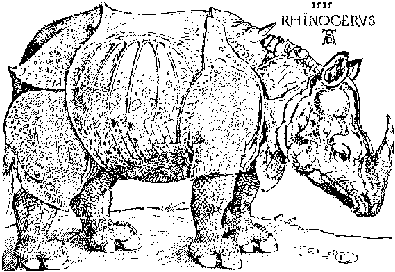
- The WWF has commissioned some beautifully detailed illustrations from Ogilvy & Mather India. Commenters point out the similarity to Albrecht Dürer’s rhino.
- PSDTUTS has some cool ideas for How to Simulate Fractals in Photoshop.
Regarding Alex’s site… I have to say that it’s navigation frustrates me. I am not a fan of things that jump around while I am looking at them, turn dark and light depending on where my mouse it, or require me to close each section manually. To me, displaying the large number of examples he does call for a separation of navigation from actual artwork. Minimally, close the previous example and don’t make me scroll around so much. Just me 2 cents.
David
Pieratt’s work shows that his is the work of a designer.
The othes two look like they were byproducts of committee in the large part.
Love your blog, I’ll visit it regularly ;]
But the work … is great.
I agree about the manual closing of items viewed. Alex should have just set the “work” up the way he did his “shop.” That way one would show up and give arrows to go to the next or back to the previous. I like that type of navigation. That was the only problem I had with the site. I thought the rest of it was clean and easy, but I don’t mind color-changing buttons. I really like this guy’s work, and that is as critical as I’m going to get because it’s still early in the morning.