Call that logo Shai-Hulud, ’cause it’s one enormous worm.
NASA reintroduced its iconic 1975 ‘worm’ logo back in 2020, cool to see it in full glory on the side of an Artemis II rocket booster. Each letter is 6 ft 10” tall and altogether 25 ft long. The Exploration Ground Systems Team use a laser projector to tape off, then paint by hand. pic.twitter.com/JMIQUcApWw
Structuring your prompt well turns out to be key in avoiding garbled text. As the presenter says, “It’s not about writing more. It’s about writing in the right order.” Check out this brief overview.
In this tutorial, you’ll see how to use Nano Banana Pro and Kling 3.0 Omni together to solve one of the most common pain points in AI product video: text that blurs, warps, or drifts mid-motion. We’ll walk through a practical workflow for maintaining legibility and visual consistency in product shots, so your labels, logos, and copy stay clean from the first frame to the last.
I’m pleased to see that as promised back in May, Photoshop has added a “Dynamic Text” toggle that automatically resizes the size of the letters in each line to produce a visually “packed” look:
Results can be really cool, but because the model has no knowledge of the meaning and importance of each word, they can sometimes look pretty dumb. Here’s my canonical example, which visually emphasizes exactly the wrong thing:
I continue to want to see the best of both worlds, with a layout engine taking into account the meaning & thus visual importance of words—like what my team shipped last year:
I’m absolutely confident that this can be done. I mean, just look at the kind of complex layouts I was knocking out in Ideogram a year ago.
The missing ingredient is just the link between image layouts & editability—provided either by bitmap->native conversion (often hard, but doable in some cases), or by in-place editing (e.g. change “Merry Christmas” to “Happy New Year” on a sign, then regenerate the image using the same style & dimensions)—or both.
Bonus points go to the app & model that enable generation with transparency (for easy compositing), or conversion to vectors—or, again, ¿porque no los dos? 🙂
“A few weeks ago,” writes John Gruber, “designer James Barnard made this TikTok video about what seemed to be a few mistakes in HBO’s logo. He got a bunch of crap from commenters arguing that they weren’t mistakes at all. Then he heard from the designer of the original version of the logo, from the 1970s.”
Check out these surprisingly interesting three minutes of logo design history:
@barnardco “Who. Cares? Unfollowed” This is how a *lot* of people responded to my post about the mistake in the HBO logo. For those that didn’t see it, the H and the B of the logo don’t line up at the top of the official vector version from the website. Not only that, but the original designer @Gerard Huerta700 got in touch! Long story short, we’re all good, and Designerrrs™ community members can watch my interview with Gerard Huerta where we talk about this and his illustrious career! #hbo#typography#logodesign#logo#designtok original sound – James Barnard
Several years ago, my old teammates shared some promising research on how to facilitate more interesting typesetting. Check out this 1-minute overview:
Ever since the work landed in Adobe Express a while back, I’ve wondered why it hadn’t yet made its way to Photoshop or Illustrator. Now, at least, it looks like it’s on its way to PS:
The feature looks cool, and I’m eager to try it out, but I hope that Adobe will keep trying to offer something more semantically grounded (i.e. where word size is tied to actual semantic importance, not just rectangular shape bounds)—like what we shipped last year:
What if your design tool could understand the meaning & importance of words, then help you style them accordingly?
I’m delighted to say that for what I believe is the first time ever, that’s now possible. For the last 40 years of design software, apps have of course provided all kinds of fonts, styles, and tools for manual typesetting. What they’ve lacked is an understanding of what words actually mean, and consequently of how they should be styled in order to map visual emphasis to semantic importance.
In Microsoft Designer, you can now create a new text object, then apply hierarchical styling (primary, secondary, tertiary) based on AI analysis of word importance:
I’d love to hear what you think. You can go to designer.microsoft.com, create a new document, and add some text. Note: The feature hasn’t yet been rolled out to 100% of users, so it may not yet be available to you—but even in that case it’d be great to hear your thoughts on Designer in general.
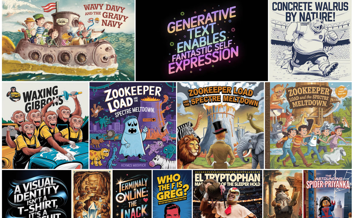
This feature came about in response to noticing that text-to-image models are not only learning to spell well (check out some examples I’ve gathered on Pinterest), but can also set text with varied size, position, and styling that’s appropriate to the importance of each word. Check out some of my Ideogram creations (which you can click on & remix using the included prompts):
These results of course incredible (imagine seeing any of this even three years ago!), but they’re just flat images, not editable text. Our new feature, by contrast, leverages semantic understanding and applies it to normal text objects.
What we’ve shipped now is just the absolute tip of the iceberg: to start we’re simply applying preset values based on word hierarchy, but you can readily imagine richer layouts, smart adaptive styling, and much more. Stay tuned—and let us know what you’d like to see!
It’s a real joy to see my 15yo son Henry’s interest in design & photography blossom, and last night he fell asleep perusing the giant book of vintage logos we scored at the Chicago Art Institute. I’m looking forward to acquainting him with the groundbreaking work of Saul Bass & figured we’d start here:
And if that headline makes no sense, it probably just means your not terminally AI-pilled, and I’m caught flipping a grunt. 😉 Anyway, the tiny but mighty crew at Krea have brought the new Flux text-to-image model—including its ability to spell—to their realtime creation tool:
Flux now in Realtime.
available in Krea with hundreds of styles included.
I’m really digging the simple joy in this little experiment, powered by Imagen:
1 Prompt. 26 letters. Any kind of alphabet you can imagine. #GenType empowers you to craft, refine, and download one-of-a-kind AI generated type, building from A-Z with just your imagination.
Founded by ex-Google Imagen engineers, Ideogram has just launched version 1.0 widely. It’s said to offer new levels of fidelity in the traditionally challenging domain of type rendering:
Introducing Ideogram 1.0: the most advanced text-to-image model, now available on https://t.co/Xtv2rRbQXI!
This offers state-of-the-art text rendering, unprecedented photorealism, exceptional prompt adherence, and a new feature called Magic Prompt to help with prompting. pic.twitter.com/VOjjulOAJU
Historically, AI-generated text within images has been inaccurate. Ideogram 1.0 addresses this with reliable text rendering capabilities, making it possible to effortlessly create personalized messages, memes, posters, T-shirt designs, birthday cards, logos and more. Our systematic evaluation shows that Ideogram 1.0 is the state-of-the-art in the accuracy of rendered text, reducing error rates by almost 2x compared to existing models.
Paint Anything 3D with Lighting-Less Texture Diffusion Models: “Paint3D is a novel coarse-to-fine generative framework that is capable of producing high-resolution, lighting-less, and diverse 2K UV texture maps for untextured 3D meshes conditioned on text or image inputs.”
Retro-futuristic alphabet rendered with Midjourney V6: “Just swapped out the letter and kept everything else the same. Prompt: Letter “A”, cyberpunk style, metal, retro-futuristic, star wars, intrinsic details, plain black background. Just change the letter only. Not all renders are perfect, some I had to do a few times to get a good match. Try this strategy for any type of cool alphabet!”
As many others have noted, Midjourney is now good at type. Find more here.
Project Glyph Ease uses generative AI to create stylized and customized letters in vector format, which can later be used and edited. All a designer needs to do is create three reference letters in a chosen style from existing vector shapes or ones they hand draw on paper, and this technology automatically create the remaining letters in a consistent style. Once created, designers have flexibility to edit the new font since the letters will appear as live text that can be scaled, rotated or moved in the project.
Adobe Illustrator has this feature called Retype (beta). With it you can select an image in Illustrator and enter Retype (beta) to determine the fonts that were used (at least close matches) in the JPG! It will also do the same for text that has been outlined. It’s amazing!
To start, we’re exploring a range of concepts, including:
Text to color enhancements: Change color schemes, time of day, or even the seasons in already-recorded videos, instantly altering the mood and setting to evoke a specific tone and feel. With a simple prompt like “Make this scene feel warm and inviting,” the time between imagination and final product can all but disappear.
Advanced music and sound effects: Creators can easily generate royalty-free custom sounds and music to reflect a certain feeling or scene for both temporary and final tracks.
Stunning fonts, text effects, graphics, and logos: With a few simple words and in a matter of minutes, creators can generate subtitles, logos and title cards and custom contextual animations.
Powerful script and B-roll capabilities: Creators can dramatically accelerate pre-production, production and post-production workflows using AI analysis of script to text to automatically create storyboards and previsualizations, as well as recommending b-roll clips for rough or final cuts.
Creative assistants and co-pilots: With personalized generative AI-powered “how-tos,” users can master new skills and accelerate processes from initial vision to creation and editing.
This new capability in Stable Diffusion (think image-to-image, but far more powerful) produces some real magic. Check out what I got with some simple line art:
I’m not working on such efforts & am not making an explicit link between the two—but broadly speaking, I find the intersection of such primitives/techniques to be really promising.
As I may have mentioned, my 13yo son Henry—lover of all things vintage & (often) arcane—has recently taken a real interest in typography. We both enjoyed this short love letter to the craft of typesetting & printing:
Generative AI incorporated into Adobe Express will help less experienced creators achieve their unique goals. Rather than having to find a pre-made template to start a project with, Express users could generate a template through a prompt, and use Generative AI to add an object to the scene, or create a unique font based on their description. But they still will have full control — they can use all of the Adobe Express tools for editing images, changing colors, and adding fonts to create the flyer, poster, or social media post they imagine.
The replies led me to discover Emdash.fan, an entire site devoted to providing you, the gentle visitor, with exactly one (1) delicious em dash for your clipboard. Insane & thus amazing. 😌
2 new classes this summer on Machine Learning Art for Designers w/@dvsch – 8 weekly online classes on Thursday evenings starting June 23 & a short workshop June 20 Generating Images from Text (on campus & online) @cooperunionhttps://t.co/MYUeXE0fAmpic.twitter.com/nrvJZvKk3f
Each week we’ll cover a different aspect of machine learning. A short lecture covering theories and practices will be followed by demoes using open source web tools and a web-browser tool called Google Colab. The last 3 weeks of class you’ll be given the chance to create your own project using the skills you’ve learned. Topics will include selecting the right model for your use case, gathering and manipulating datasets, and connecting your models to data sources such as audio, text, or numerical data. We’ll also talk a little ethics, because we can’t teach machine learning without a little ethics.
I’ve long loved the weird mechanical purring of those flappy-letter signs one sees (or at least used to see) in train stations & similar venues, but I haven’t felt like throwing down the better part of three grand to own a Vestaboard. Now maker Scott Bezek is working on an open-source project for making such signs at home, combining simple materials and code. In case you’d never peeked inside such a mechanism (and really, why would you have?) and are curious, here’s how they work:
And here, for some reason, are six oddly satisfying minutes of a sign spelling out four-letter words:
Having a train-obsessed 11yo son who enjoys exclaiming things like, “Hey, that’s Cooper Black!,” this tour of railroad typography is 💯 up our family’s alley. (Tangential, but as it’s already on my clipboard: we’re keeping a running album of our train-related explorations along Route 66, and Henry’s been adding things like an atomic train tour to his YouTube channel.)
From the typesetting video description:
Ever since the first train services, a wide variety of guides have helped passengers understand the railways; supplementing the text with timetables, maps, views, and diagrams. Typographically speaking, the linear nature of railways and the modular nature of trains meant that successful diagrams could be designed economically by using typographic sorts. Various typographic trains and railways from the 1830s to present-day will be evaluated in terms of data visualization, decoration, and the economics of reproduction. Bringing things up to date, techniques for typesetting emoji and CSS trains are explored, and a railway-inspired layout model will be proposed for wider application in the typography of data visualization and ornamentation.
<Old Man Nack voice> In my day, it cost $2,500 to buy the Adobe Font Folio—but Kids These Days™ (and the rest of us) get fonts on demand, right through the air. I enjoyed the type & illustrations in this little promo piece:
“The world’s first typeface you can hear and play” sounds (heh) interesting. Per DesignTaxi,
Visualizing the brilliance of Amadeus Mozart, branding agency Happy People Project has created a typeface to front communications for Peter Shaffer’s play, Amadeus, in Turkey. […]
14 numbers and letters were created in line with notes and octaves on the staff, so you could listen to them. In total, though, a massive font family of 574 characters was designed for the project.
While camping at the funky Sierra Circles sculpture garden/pottery studio/winery, this past weekend, we came across an old Linotype machine hanging out in a field—one of 40+ presses that once existed there, before most were sold to China for scrap. Here’s a tiny gallery I captured:
I’ve long, long been a fan of using brush strokes on paths to create interesting glyphs & lettering. I used to contort all kinds of vectors into Illustrator brushes, and as it happens, 11 years ago today I was sharing an interesting tutorial on creating smokey text:
Now Adobe engineers are looking to raise the game—a lot.
Combining users drawn stroke inputs, the choice of brush, and the typographic properties of the text object, Project Typographic Brushes brings paint style brushes and new-type families to life in seconds.
Looks like all kinds of good fun (and a steal at twenty bucks)—all the sort of thing I’d hoped we could enable via Photoshop’s 3D features:
Funny, just a couple of days ago I was reminded of the heartbreaking work of staggering genius I whipped up in Art Text in the wee hours of a morning three years ago:
Man, who knew just how much cultural identity could be wrapped up in a style of printing?
This excellent 99% Invisible episode covers the origins of blackletter printing (faster & more reliable for medieval scribes), the culture wars (from Luther to Napoleon) in which it battled Roman faces, its association with (and revilement by!) Nazis, and more.
Bonus: stick around for a discussion of revanchist, Trumpian mandates around government architecture, featuring that delightful term of art, CHUD. *chef’s kiss*
The primary innovation in Sononym is something called “similarity search”, which enable users to find similar-sounding samples in their sample collection based on any source sound. Essentially, a bit like how Google’s reverse image search works, but with audio.
The initial release focuses strictly on the core functionality of the software. That is, to offer similarity search that work with large collections of samples. Technically, our approach is a combination of feature extraction, machine learning and modern web technologies.
Not entirely dissimilar: Font Map helps you see relationships across more than 750 web fonts.
“Material Theming” effectively fixes a core gripe of the original “Material Design”: that virtually every Android app looks the “same,” or made by Google, which isn’t ideal for brands.
The tool is currently available on Sketch, and you can use it by downloading the “Material” plugin on the app. Google aims to expand the system regularly, and will roll out new options such as animations, depth controls, and textures, next.