- Here’s an awesome “Oakland AT-AT” t-shirt. I love those things (both kinds). (via @5tu)
- Vandelay Design rounds up 30 Text Effect Tutorials for Illustrator. Lots of neat ideas here, and I especially like the “Vibrant 3D Pixel Type Treatment.”
- The Daily Mail shows a set of garage doors as optical illusions. (I’m a sucker for folding-wing F/A-18’s myself.) Get ’em here. [Via]
- What’s on Earth Tonight? If extraterrestrials are monitoring our TV broadcasts, here’s what they’re seeing. [Via]
- RT @khoi: Illustrator S. Britt’s homepage violates all rules of good Web navigation-but it’s so good.
- Fast Food Mafia presents mascots as gangsters. (Click for the higher-res version.) [Via]
- What Apple’s web site would have looked like if the Internet existed in 1984. (via @davecross)
- Teehan + Lax have created a new PSD to facilitate designing for Palm Pre. (They’re the same guys who made the iPhone GUI PSD.)
Category Archives: Illustration
(rt) Illustration: Amazing light paintings & more
- Jan Wöllert and Jörg Miedza create amazing long-exposure light paintings.
- Creative Suite icons done via human pixels from Italy. (via @jdowdell)
- Free 3D models from NASA; can be loaded into Photoshop Extended. (via Pete Falco)
- Finally an Illustrator tutorial that takes advantage of warping tools + blending modes, not just c1990-era stuff: Creating an MRE package.
- “404 Humor Not Found”: fun error pages. More here. (via @gridirondaniel & @inspiredm)
- A personal ad in infographic form: My kind of girl!
- Nicknames for famous corporate logos. (My fave: “Two and a Half Hotdogs”)
- Simple, powerful book cover design for “Busted.”
Quick Illustrator tips: Create a ribbon; batch convert
A few Adobe technical folks bounced around some ideas last week, responding to a question about how one would create a pink ribbon-style illustration. Stéphane Baril made some great suggestions in this very brief, five-step tutorial (PDF). (Live Paint is your friend!)
Elsewhere, developer Richard Bates has created a free utility & notes on Batch SWF Conversion with AIR and Illustrator CS4. [Via David Macy]
Saturday Illustrations: Paper madness, Grassfitti, & more
- Interesting surfaces:
- Frank Chimero makes nifty laser-etched wood panels featuring his work.
- “[Screw] Round-Up. Grassfitti can’t be stopped.” [Via]
- Insane paper contraptions:
- Wataru Itou’s paper castle took four years to construct & features electrical lights and a moving train.
- Far less involved, but OCD in its own way, is this lined paper created using red & blue thread.
- Sipho Mabona creates amazingly intricate origami pieces.
(rt) Illustration: Man vs. tank, Pixar vs. Dreamworks, & more
- Can one commission Chinese artists to batch-paint the Tiananmen “tank man”? One man tries.
- The iPhone GUI PSD has been updated for iPhone 3.0. Way to go, guys! [Via Mark Coleran]
- I like the idea of a Lego Remote: The cartoon is similar in spirit to Adobe Configurator.
- “There is bad taste and then there is this“–the new MSFT Bing logo. [Via Mark Coleran]
- Oof–a probably unfair but funny Pixar vs. Dreamworks smackdown. (via @5tu)
- I had a little weekend fun with Illustrator’s Live Trace feature.
Illustrations: Creepshows
- Winkler & Noah’s The Puppet Show is a collection of photos of real children modified to look like puppets. So, um, they’ve got that going for them. [Via]
- RetroComedy has picked out the “15 Creepiest Vintage Ads of All Time.” [Via]
(rt) Illustration: PS Playboy, World War III, and more
- Photoshop named Playboy’s “Employee of the Month.” [Via Michael Ninness]
- Optical illusion pavement art: giant hole in bike path. [Via Stephen Shankland]
- Killer hair-based illustration o’ the day [Via Mordy Golding]
- “Someone Tweeted!” Check out these WWIII Propaganda Posters.
- Would you trust this man to draw on your face? If so, that makes one of us. (And yes, the girl turned out to be lying.)
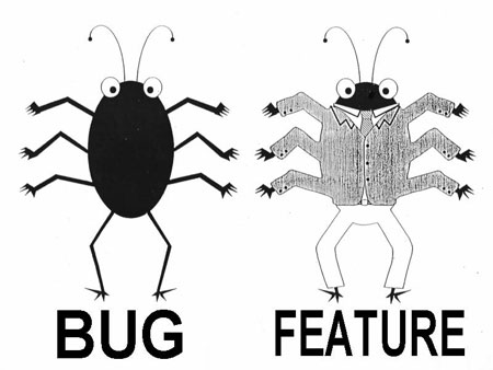
- What’s the difference between a bug and a feature?
Wednesday Illustrations: Geekery, skating, & more
- Browser-related:
- One seriously excellent error message: Hatin’ on IE6.
- Sub Pop celebrates horrible, horrible 1996-era Web design with a new promo page. [Via]
- Skate & create:
- Smashing Magazine rounds up 40 Beautiful Skateboard Designs.
- Adobe & Nike folks talk about the behind-the-scenes process of creating & streaming the Nike Skateboarding Debacle HD video. [Via]
- I spied this Joel Tudor board in Santa Cruz the other day, chuckled, and had to snap a pic.
- Core77 reviews New Skateboard Graphics.
- I’m not sure what’s up with John MacConnell’s head, but he might want to have it looked into.
Tuesday Infographics
- White Glove Tracking “asked internet users to help isolate Michael Jackson’s white glove in all 10,060 frames of his nationally televised landmark performance of Billy Jean,” producing all sorts of creative visualizations of the resulting data. [Via]
- “A love of baseball plus a love of infographics equals Flip Flop Fly Ball.” Fascinating & beautifully executed stuff. [Via]
- Narcissism + Stalking + ADHD = Twitter! It’s the Social Media Venn Diagram Tee.
- Ben Fry’s All Streets is an image of the US comprised of “26 million individual road segments.” [Via]
Monday Illustrations: Snacks + Chroma
- Chow:
- I love Louise Fili’s intricate, stamp-themed design for the Bedford Post cafe.
- Lunch gets a whole lot weirder through Ginou Choueiri’s Potato Portraits.
- Color:
- ColourLovers hosts a collection of beautiful vintage circus posters. (A Ringling Bros. poster hung over my childhood bed for years, and I’d endlessly pour over the details of trains receding into infinity.)
- Dig Comex paint’s cartoon-themed ad for their color-matching prowess.
- This Cube’s for you, print geeks: Ignacio Pilotto’s Pantone-themed Rubitone Rubik’s Cube.
Saturday Illustrations: From subways to space
- Happy Fourth:
- Crackerpacks.com wraps an enormous set of fireworks packaging art in some eye-wateringly ghetto “vintage” Web design.
- Rosemarie Fiore creates drawings by containing and controlling firework explosions.
- These Tokyo “subway manner posters”, designed by Bunpei Yorifuji, manage to inform & entertain without condescension. [Via]
- Brushes & patterns:
- If you think Illustrator can do only crisp vectors, look again. Think Design has shared 15 paintstroke Illustrator paint brushes. I’ve taken them for a spin & found them quite nice.
- Handy when the moment arises: Susan Libertiny has created a free set of passport stamp & postmark Photoshop brushes. [Via]
- YouWorkForThem is selling sets of intricate line patterns of the sort that appear on currency.
- Wipe your feet on this great, nerdy doormat. [Via]
- Mischa McLachlan has created a slick 2001: A Space Odyssey icon set. [Via]
Infographics in motion
- Hot Rocks: The NYT presents an interesting 2:30 overview on the dangers of drilling deep to tap geothermal power.
- Realtime 3D Airtraffic Network Simulation: Lufthansa’s Brand Academy features “a 14-meter-wide, 180-degree projection [that] lets the visitors dive into the fully navigable, realtime 3D visualization of 16,000 daily Lufthansa and Star Alliance flights.” Check out the video. [Via]
Update: Looks like the links have been pulled, at least for the moment. Check out alternate links (courtesy of Ken Beegle) in comments.
Assorted Pixar Awesomeness
- Former Pixar production artist Lou Romano has posted a wealth of materials (videos, photos, paintings, and more) showing how the art of UP came to be. He shows how everything from gouache & miniatures to Photoshop & After Effects come together to explore & prototype the work.
- In a follow-up post, Lou has shared higher-res images of the complete color script for UP. [Via]
- The Art of the Title Sequence celebrates the wonderful end titles from WALL-E, interviewing director Jim Capobianco and animator Alexander Woo. [Via]
- Amazon lists Tim Hauser’s The Art of UP and The Art of WALL-E.
Monday Illustrations: All tutes, all the time
- Veerle Pieters offers up some nice Illustrator tutorials:
- First up is using Illustrator swatches & blends to make a quantized gradient background.
- She then puts Illustrator’s blending modes & masks to good use in creating a lovely poster, step by step.
- From Layers Mag:
- Corey Barker shows how to get some slick results using Illustrator’s Live Trace, symbols, and brushes.
- Dave Cross maps a vector logo onto a t-shirt, keeping it scalable & editable even when rippled via the Displace filter.
Thursday Infographics: From Rambo to D&D
- How does Rambo’s shirtlessness affect his per-minute killing prowess? Flowing Data has the answer! [Tangentially related: Five terrible fake Sylvester Stallone franchise revivals. Even more tangential: My wife has ancestors named Rambo, but strangely she won’t sign up for using “Rambo” as our forthcoming son’s middle name.]
- “Effing Hail!” It’s infographics as a game. [Via]
- Crossing a couple of nerd-streams, check out these D&D-style maps of the C++ programming language.
- Wikipedia shows the mean center of United States population as it has evolved throughout the years. [Via]
- oobject collects maps of 12 of the world’s most fascinating tunnel networks. [Via]
Cool recent infographics
- “Dustin Curtis is a Statistic,” presenting his life as a series of data points. [Via]
- The GOOD Transparencies Archive offers a terrific set of infographics. [Via]
- NYC
- Horizonless New York presents a really unique take on city topography.
- iPhone app UpNext NYC is an interactive 3D map to explore Manhattan.
- The Joy of Tech has a funny take on How Apple Approves iPhone Apps. [Via]
- Oh yes–this is American Apparel in a nutshell.
Monday Illustrations: Monsters, luchadores, and more
- Jon Hicks creates Daniel’s Daily Monster for his son. “Every morning when making his lunch, I give myself 5 minutes to draw a monster on paper from one of those memo pad things, give it a name and quickly photograph it with the iPhone.” Awesome.
- I love Steve Bonner’s intricate take on the classic Stormtrooper.
- Paper:
- Jen Stark makes beautiful, incredibly intricate cut-paper sculptures. She even animates them in kaleidoscopic blooms.
- StarWars.com features Star Wars lucha libre masks. (Our little guy will go nuts for these in a year or two.) [Via]
- Logos:
- “Get Excited and Make Things” is a nice riff on “Keep Calm and Carry On” (a WWII-era poster that’s hung on Adobe’s West 9 for quite some time).
- Killed Productions; heh.
Logos a-Go-Go
- Alex Faaborg & his Mozilla crew really, really sweat the details of Firefox icon design. [Via John Dowdell]
- “…no one knows you’re a dog.” I dig the ID for the Internet Identity Workshop. [Via]
- Colour Lovers features a great collection of vintage airline logos.
- “There is bad taste and then there is this:” the new Microsoft Bing logo. [Via Mark Coleran]
- tschka-tschka-“Trends“ (Demitri Martin-style)
- Bill Gardner rounds up dozens of current examples in exploring logo trends. [Via]
- Bill Marsh examines before & after versions of “warmer, fuzzier” logos.
- Jane Sample uses logos to create a “brand timeline portrait,” showing the different brands she uses and interacts with during the course of a typical day. [Via]
Wednesday Illustrations: Lines, holes, & more
- Line Art:
- Air Lines is “an art project showing worldwide airliner routes. Every single scheduled flight on any given day is reresented by a fine line from its point of origin to its port of destination, thereby forming a net of thousands of lines.” [Via]
- Simplicity rules these ads for the Ikea Assembly Service. (I wonder if they have a service for gluing all that shattered MDF back together again.)
- On the street
- Love the juxtaposition of big diver, little girl.
- Makita drilled over 20,000 holes to create one large image.
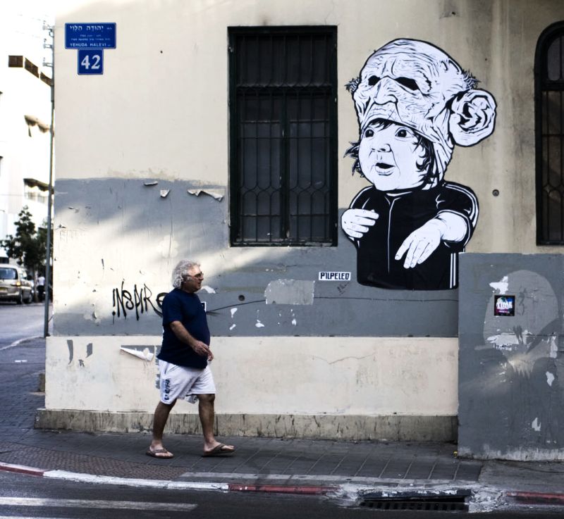
- No explanation of this Tel Aviv wall art from Pilpeled, but I dig it anyway. More from the artist is here.
Illusions & explorations
- Richard Russell created “The Illusion of Sex” by using only image contrast to affect our perceptions of masculinity & femininity in a face. [Via Nicolas Chaunu]
- WebExhibits uses a simple Flash viewer to demonstrate some of the magic behind Monet’s Impression: Sunrise. [Via Todor Georgiev]
- Mark Frauenfelder points out some optical illusions you can explore using by Photoshop to check real color values.
Friday Illustrations: iPhone art, Mao, & mo'
- In case you’ve somehow missed coverage elsewhere: Jorge Colombo drew this week’s New Yorker cover using an iPhone while standing for an hour outside Madame Tussaud’s Wax Museum in Times Square. His site features more of his work.
- What the hell, exactly, is going on with this Spanish kids’ game and its morbid illustrations? [Via]
- Elliot Weaver makes illustrations from spam subject lines. [Via]
- Ian Wright has made an awesome Mao mosaic using silk-covered buttons.
- I really likes me some shark-mouth illustrations, and this custom USS Enterprise from House Industries answers the mail.
Keepin' it real… hostile
- Flickr user 9000 just doesn’t like marketers. At all.
- What possible search terms would produce this stock photo? [Via Mark Coleran]
Video game art, 8 bits at a time
- The 8-Bit Fatalities project presents the killing in pixelated video games as realistic illustrations. [Via]
- Mario scores magic mushrooms, thanks to t-shirt illustrator Ian Summers.
- In tangentially related news, Video-Game Character Feeling Healthier After Eating Turkey Leg Off Ground.
- I dig Sean Mort’s Gaming Revolution T-shirt [Via]
- Not entirely sure I want to know what’s going on here.
Saturday Illustrations: DIY Terminator, useful AI scripts, and more
- Planet Photoshop’s Corey Barker shows how to turn a human skull into a Terminator face.
- Sato Hiroyuki has created a bunch of useful scripts for Illustrator. (“Downloading these scripts is like jumping through a magic portal to awesome-land,” enthuses designer Adam O’Hern.)
- Paul Hollingsworth gives a peek into the development of his CS4 launch illustration. [Via Rufus Deuchler]
- I’m enjoying Mark Weaver’s sometimes freaky collages. Much more is on his site.
- Sweller than Swell: Gene Gable rounds up unintentionally absurd vintage advertising.
Wednesday Illustrations: Swine flu, Gang bangers, & more
- Illustrated masks:
- The Vader Project features “100 reimagined helmets.”
- Gizmodo rounds up some awesomely illustrated anti-flu masks from Mexico.
- Chicago’s gang cards of the ’70s are a particularly odd form of folk art. I imagine my uncle cracking these thugs’ heads back in the day.
- The Rare Book Room site “has been constructed as an educational site intended to allow the visitor to examine and read some of the great books of the world.”
- Paper Moon brings beautiful monochrome illustration to 2D gaming.
- Urban infrastructure:
- Subway systems of the world, presented on the same scale.
- Triptrop creates slick heat maps on the fly to show how far by subway any point in New York is from any other.
- Perpetual Kid offers manhole cover coasters.
Monday motion goodness: Waves in HD, bearded hippies, and more
- BBC cinematographers captured waves from under the surface in gorgeous high-def slow-mo. [Via]
- Lucinda Schreiber and Yanni Kronenberg used chalkboard drawings to produce the Autumn Story music video for Firekites. [Via]
- Now witness the firepower of this fully armed and operational early-70’s Scanimate demo. Some part of me kind of wishes that Adobe tools involved more retro levers, switches, cable splicing, etc.–and of course that their use was accompanied by funky 70’s horn sections.
- Infographics:
- Melih Bilgil’s The History of the Internet tells, well, you know, using minimal lines but loads of attention to detail. (The fly-over of Cuba is terrific.) Adobe designer Ethan Eismann writes, “My new personal mission in life is to bring this level or higher of engaging instruction to an Adobe welcome screen near you.”
- Slagsmålsklubben would be cool just for its name.
Infographic comedy jams
- I love Jessica Hagy’s clever, minimal index card diagrams. [Via]
- The Photographer’s Math blog consists of nothing but snarky little equations. [Via Bryan O’Neil Hughes]
- Artist “lunchbreath” nails the creative design process. His Flickr stream is full of great stuff (e.g. fun with Bluetooth).
Tuesday Illustrations: Terminators, Punx, & more
- Invisible Skoda! Artist Sara Watson (“a dead ringer for a healthy, human Lindsay Lohan”) has pimped her ride right out of existence (or visibility, anyway). [Via Bryan O’Neil Hughes]
- Simon Schubert creates ghostly 2-D scenes by folding paper slightly. [Via]
- In Apocalypse How, designer Martin Laing narrates his team’s process for creating the world of Terminator: Salvation.
- With Springfield Punx, illustrator Dean Fraser renders famous faces Simpsons-style. [Via Adrian Such]
- Barnaby Ward uses Twitter to show his sketching process in Photoshop.
Tuesday Illustrations: Paper, pantslessness, & more
- Alberto Cerriteño offers great illustrations as laptop-skin decals. (My wife says this skin is more up my alley, though.) Peep his whole portfolio for more excellence.
- Paper:
- Noriko Ambe cuts shapes into books and stacks of paper.
- Jill Sylvia creates incredibly intricate structures from ledger paper. [Via]
- Jacquet Fritz Junior makes sculptures from toilet paper rolls.
- “Watch your favorite artists live today.” Deeply weird illustrations promote Tzabar ticket services. (Fortunately Danny Gans was not included in the list.)
- Uhh…
- Pantsless, by Laura George
- It hurts when I pee. Yes, I’d imagine so. Lots more here.
Illustrator 1.0 – The complete video
Last year I uploaded the first ten or so minutes of the instructional video that accompanied Illustrator 1.0, hosted by Adobe co-founder/Illustrator developer John Warnock. I received some requests for the full recording, and now Adobe evangelist Rufus Deuchler has tuned up the audio & posted the entire video, split into five segments.
Seeing the video, and remembering that Dr. Warnock was (as I recall) one of just four names on the Illustrator splash screen, I can’t help but think of videos posted now by the developers/founders/executives/chief bottle-washers of various Twitter-related startups. (Here’s a good one for Birdhouse.) 20 years from now, will we be passing around one of these links, remembering when so-and-so got her start?
Wednesday Logos
- I love Google’s salute to The Very Hungry Caterpillar.
- “Chicago Bulls logo + upside down + some color = robot reading the bible on a bench!? Ahh logo ruined.” You be the judge.
- Hidden Meaning–nicely done.
- Iron Man Ironing Service makes clothes maintenance look pretty butch.
- HelloLED is a bright little guy.
Monday illustration tips, tutorials
- Scott Hansen has created a tutorial (with source files) demoing the techniques used to create a Dylan poster homage.
- Heh–I had no idea that it’s possible to designate a “key object” in Illustrator & align objects to it. Check out Terry Hemphill’s quick tip to learn more.
- The Chopping Block does symmetry with these Illustrator reflection templates. (Illustrator’s combo of live effects + the ability to target anything from individual paths to groups to layers is enormously powerful–and woefully underused. The Appearance panel in CS4 makes things much easier, but I find that many artists just won’t make the cognitive leaps necessary to harness this power.)
- PSDTUTS shows how to create insectoid 3D text using Photoshop + Cinema 4D.
Business card excellence (and horror)
- “Screw die-cutting. Forget about foil, popups, or UV spot lamination. THESE business cards have two ingredients: MEAT AND LASERS.” Oh, hell yeah. [Via]
- Equally aggro, far less cool: “Your business card is crap.” (Is this guy for real? Hard to tell.)
- Assorted kickassery is on display in Francesco Muganai’s round-up of “the best 65 business cards of the year.”
- More than meets the eye:
- Dan Ross, publisher/apparent vintage Nissan fan, invites you to cruise off with his card.
- Core77’s latest 1-Hour Design Challenge features a business card that transforms into 3D glasses.
- Not overwhelmed yet? Card Observer will soon solve that problem.
Saturday Illustrations: Lucky teens, giant walkers, & more
- Striking Empire:
- Best Tattoo Ever? An AT-AT goes Dalí.
- Similarly excellent: the AT-AT Anatomy t-shirt. [Via]
- Fortunate Teens Party With Morrissey, 1994. Sometime I’ll have to tell you about Bryan Hughes driving by the Mozzer’s house and getting invited in for a “choco-milk.”
- Josh Poehlein’s Modern History project is “a series of collages assembled exclusively from screen grabs of Youtube videos.” [Via]
- I’m really enjoying Jon Klassen‘s beautiful palettes & delicate linework. Animated pieces & more appear on his site.
- Looking at once totally annoying & like a technical tour-de-force: the Toyota Venza takeover. [Via]
Friday Science: All space, all the time
- Wanderingspace has created 19 fetching Planetary iPhone Wallpapers.
- An old chart illustrates the “Unbelievable Time Required to Cover Immense Distances of Space.” [Via]
- 40 hours of exposure time were required to create this composite of the night sky. [Via]
- Ministry of Type highlights some great science and technology ads from the 50s and 60s, found in a much larger Flickr set of the same.
- In a short & interesting slideshow/audio piece on the NYT, “The Hubble Repairman” John Grunsfeld talks about his arduous missions to the space telescope.
- Moonshot: The Flight of Apollo 11 looks like a groovy kids book.
Tuesday Illustrations: Creeps, guns, & more
- I’m Creepin’ While You’re Sleepin’: I have no idea what’s going on with this giant Neckface mural, and I’m pretty sure I want to keep it that way.
- Al Farrow’s gun-based sculptures mix the sacred & propellant, creating reliquaries made from guns n’ ammo. [Via Margot Nack]
- Emilie Chollat‘s site encourages & rewards exploration. Dig those fun photo montages. [Via]
- For no particular reason:
- Class up your grip tape with some oil-painted nudes on skateboard decks. [Via]
Saturday Illustrations: All autos, all the time
Cue the Gary Newman…
- Jalopnik profiles master car cutaway artist Yoshihiro Inomoto.
- Bavarian propellerheads:
- Robin Rhode used a BMW Z4 as a giant paint brush. See it in action on the BMW site.
- Coincidentally, the NYT features a slideshow accompanying its piece about the BMW art cars being displayed at Grand Central Station. (The Jenny Holzer ride will likely always be my fave.)
- Speaking of BMW, it’s tangential, but this computer prototype BMW Group Designworks USA is pretty stylin’.
- GM is seeking to attach some cachet to their design efforts with their Inside Chevy site.
Friday Illustrations
- Famed pop artist David Hockney has started using Photoshop as his new medium. Apparently Russell Brown & co. had him out for a visit to Adobe nearly 20 years ago to introduce Photoshop; looks like the seed has finally sprouted.
- Emma McNally’s pencil drawings feature a “borderline OCD” level of detail.
- Liquify, anyone? I like the subtlety of this Bosch ad.
- Get yer geek on with a set of Nerd Merit Badges.
- Kuler:
- PSDTUTS offers pointers for Using Adobe Kuler to Enhance Your Photoshop Color Workflow.
- This isn’t just theoretical hand-waving, either: kickass illustrator Nick La uses Kuler in his design process. Check out his portfolio to see some beautiful pieces. [Via]
Sunday Logos
- Spacesick has fun doing a little Evil movie megacorporation rebranding. (With all the bad news coming out of Detroit, I wonder how long it’ll be until OCP actually does step in.)
- The “Web 2.0” aesthetic makes me think of this set of Web logos as origami. [Via]
- Abduzeedo collects a set of clever logos. (The “Eight” piece is up my alley.)
- The endlessly popular Helvetica anchors at least 40 well-known logos.
- I can hear buzzing out the window in the Insomnia Entertainment identity.
- The Closing Logos wiki rounds up an overwhelming set of movie company logos modified to fit the film at hand.
Saturday Illustrations: Fast cars, skiing toilets, & more
- I dig Sam Weber‘s soft palettes & surreal imagery.
- Poster designs:
- A White-Hot Juggernaut At 200 Miles Per Hour! PSDTUTS hosts 50 Brilliantly Photoshopped Movie Posters. I especially dig the Death Proof & Lord of War pieces.
- COLOURlovers rounds up a great set of Mid-20th c. Euro Poster Art.
- I could try to describe this crazy Japanese ski-bathroom, but you’d better just see it yourself.
- In Matt Silber’s series of floating logos, “Elimination of the support structure in the photographs allows the signs to literally float above the earth.” More photos appear in part 2 of the series. [Via]
- Illustrator:
- Matt Kloskowski has a great idea: raid Illustrator’s library for art to use in Photoshop.
- Abduzeedo features some great ideas for using scatter brushes in Illustrator. (Man, there’s so much underused power in that app.)
New Illustrator team blog launches
I’m happy to see that the Illustrator team has launched Infinite Resolution, their new blog. On it they’re looking forward to “sharing knowledge about Illustrator and vector graphics in general as well as linking to and discussing some of the things we see going on in the world of vectors.” I’m expecting some good give-and-take between passionate customers & app-builders.
Wednesday Illustrations: Super Mario, free textures, & more
- I love this crafty little Super Mario riff from NYC.
- Omid Sadri made himself some awesome multi-functional businesscards: “There are three different cards within the set. One which suggests to use portion a of the card as a dental floss, one for cleaning under nails, and one for chewing gum.”
- I’m digging Paul Lee’s crazy characters & punchy palettes.
- Speaking of punchy, check out the colors & images in Jimmy Roberts and Brian Christopher’s collaborative project Exquisite Corpse. [Via]
- Free resources:
- There’s a big free texture archive on Flickr. [Via]
- Sketchory hosts more than a quarter million Creative Commons-licensed sketches. (You largely get what you pay for, of course.) [Via]
Tuesday Illustrations: Crayons as pixels, tutorials, & more
- Squared Eye brings lovely illustrations & color choices to their work. [Via]
- Tutorials:
- Veerle shows how to create a beautiful diamond flower in Illustrator.
- FlashEnabled links to good resources in their Illustrator Tutorials Roundup.
- Low res:
- Chritian Faur uses crayons as pixels. [Via]
- OMGif amasses numerous animated GIFs. I dig the total lack of rhyme or reason.
- Historic bits:
- COLOURlovers hosts a great collection of vintage Israeli postage stamps.
- General Mills is trotting out retro cereal boxes. [Via]
Covers, best & worst
The CD Cover Meme is pretty terrific, challenging you to combine randomly selected Wikipedia topics, quotations, and images from Flickr into album covers. Check out some of the results. (Here’s my personal fave of the moment.) [Via Kent Christiansen]
Elsewhere in cover-land:
- Joseph Sullivan from the NY Times shares his Favorite Book Covers of 2008.
- Pitchfork offers a funny take on The 20 Worst Album Covers of 2008. (Hey man, I like the Death Cab piece.)
- Sans value judgements, The Book Cover Archive offers up a trove of inspiration.
- Cedillas + Op Art = 60’s & 70’s Brazilian Album Covers
- There’s tons to love in this Ode To Criterion Box Art.
Friday Illin': Edgiest quilts ever & more
- Quiltsrÿche promises to let you “bark at the moon in the coziness of a hard-rocking, handcrafted heirloom.”
- MoMA’s The Printed Picture is “an exhibition of physical specimens made using all the different ways that type and image can be printed on paper, metal, glass, etc, with a special emphasis on dozens of photography techniques, from albumen prints to dagguereotypes to color photography.” [Via]
- I like the ghostly simplicity of Levi van Veluw’s ‘Light’ Portraits. (To spare you any suspense, nothing really happens in the videos.)
- You can view now extremely high-res presentations of famous artwork, courtesy of Google Earth.
- These brand-name ripoffs seem like dyslexic Photoshop jobs, but they’re apparently real. [Via]
Wednesday Illustrations: Excellent Photoshoppery, scary logos, & more
- Strength in numbers:
- PSDTUTS hosts a collection of 40 Brilliantly Photoshopped Print Ads. (Roygalan shows the downside of eating too much Cadbury.)
- Smashing Magazine collects 100 (Really) Beautiful iPhone Wallpapers.
- Toxel rounds up 24 Creative Business Card Designs. The printed peanuts look informative and delicious. [Via reader Trace]
- Andrew Lindstrom’s collection of 45 vintage space age illustrations makes me want to play polo on a jet ski. Or not. [Via]
- Logos:
- Tell me you’ll ever look at the new Pepsi logo again and not see this. [Via]
- This Horror Films logo is “so simple it’s scary.”
- The imagery on the Mobiado 105GMT is very JNack-blog-positive, wouldn’t you say?
Friday Illin'
- Maira Kalman is back on the NYT (yeah!). “The Inauguration. At Last” is packed with great color, brushwork, and observations.
- The laser-cut grip tape in Core77’s 1-hour design challenge is pretty rad. (Man, how much did I love Powell-Peralta, VSW, and Jim Phillips/Santa Cruz skate art back in the day?)
- Speaking of that, Powell has created The Ripper Art Show, celebrating their most iconic image. (I had a huge poster of it hanging over my bed.) Some 58 artists created their own interpretations. [Via]
- Janine Rewell makes much vectory goodness. (Dig “Helsinki in Berlin.”) [Via]
- Monochrome:
- Having grown up on David Macaulay, I’m a sucker for good B&W detail like that found in this piece from The London Police.
- I love the simplicity of Core77’s welcome from ’08 to ’09.
- Chroma has no place in the new Good Housekeeping logo.
- Is there anything not to like about this animated GIF of a magical little deer? (Answer: no.) [Via]
Friday Illustrations: Painting as a game & more
- Paint your way out of this: The Unfinished Swan is “a first-person painting game set in an entirely white world. Players can splatter paint to help them find their way through an unusual garden.” [Via]
- I’m digging Pablo Perra’s work–especially the funky “Detector Series.” (Click images for a larger view.) [Via]
- Mark Verhaagen’s portfolio showcases some rich vector stylings. [Via]
- Flix:
- Movie Poster Floating Heads guy takes his job a little too seriously.
- Neatorama’s brief history of movie studio logos offers some entertaining details. [Via]
- Save gas & save space with cutely smushed cars.
Recent infographics
- The NYT shows Twitter Chatter During the Super Bowl organized by time & geography.
- The paper also charts the grim state of print advertising.
- Queens of InfoVis: “Ever see an awesome graphic or visualization in the New York Times and wonder who did it?” asks MetaFilter. “Chances are it’s either Amanda Cox or Megan Jaegerman.” The site links to some notable examples. [Via]
- Andreas Nicolas Fischer has turned financial charts converted to computer-generated 3D wooden sculptures. [Via]
- A poster from Very Small Array graphs the genre of #1 hit songs in the USA, 1950-present, though unfortunately it’s not possible to zoom in on the design.
Lego NYC
Christoph Niemann’s Lego renderings of NYC ephemera are so totally great that they deserve a post all of their own. (The rest of his portfolio is well worth a look, too.)