- Dolla dolla bill:
- “Boom–Head Shot!!” 30 Bizarre Examples of Defacing Money. [Via]
- I stumbled randomly upon the history of the “hobo nickel,” an art form I’d never heard of.
- Justin Van Genderen makes fresh, sometimes edgy Photoshop illustrations. Impressive stuff. [Via]
- Fame:
- Ghost in the Machine: Musicians’ portraits done using cassette tape. [Via]
- Nicely done: Illustrated Celebrity Tweets. (I really dig this Shaq weirdness.) [Via]
- Bullet the blue sky–a highly diggable little illustration. See the rest of the collection for other good ones. [Via]
- iPod as bird & more: Fun illustrations from Romain Mennetrier.
Category Archives: Illustration
(rt) Infographics: Space, violence, & more
- Michael Paukner makes beautiful space schematics & more.
- Excellent & eye-opening: The Mariana Trench To Scale. [Via]
- FlowingData renders famous movie quotes as charts and graphs. On the Waterfront is my favorite. [Via]
- Fernanda Viégas and Martin Wattenberg created a beautiful visualization of Boston Common over the seasons, made by querying Flickr.
- Here’s the gruesome, functional graphic design o’ the day, which my son and I found while cavorting on heavy machinery.
(rt) Illustration: Bond posters, Homer Simpson's car, & more
- Cinematic:
- Graphic design history: Posters for all the Bond films. [Via]
- Abduzeedo rounds up great old spaghetti western posters (originally charmingly mislabeled “western spaghetti;” nice idea for a restaurant name.)
- “Suck It, Dreamworks!” Funny movie posters: Honest Movie Titles: Oscars 2010. [Via]
- Automotive:
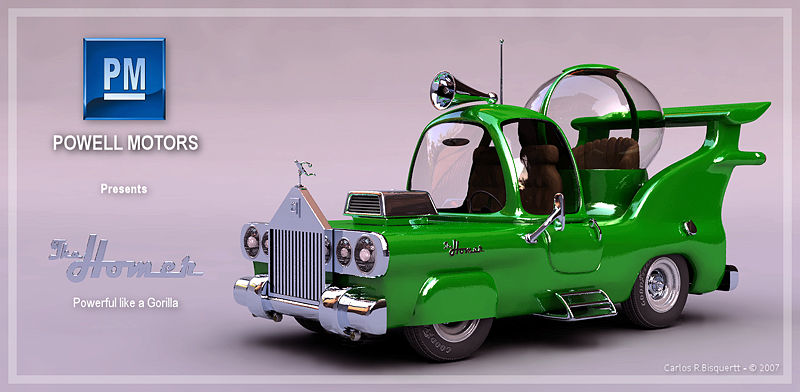
- Dig this weird vintage car ad. “I love the little bicycle basket between the jet engines,” says Roger Ebert.
- Visualize the Difference Between Firefox, Opera, Explorer & Safari. (Firefox looks very Homer Simpson-positive.) [Via]
(rt) Illustration: Danger, Dismemberment, & Adobe Tips
- Adobe tips & info:
- Thorough & useful: All About Transformations in Adobe Illustrator. (Applying transform effects, especially to strokes, isn’t nearly well known enough.)
- Nice, quick tip on painting dotted lines in Photoshop.
- International Icons:
- The NY Times hosts an interesting short video covering Olympic Pictograms Through the Ages. (Sometimes the “Genius!/Garbage!” tenor of critiques like this strikes me as a little excessive. I did like our two-year-old son’s observation on the classic pictographic idiom: “Head popping off.”) [Via]
- Speaking of pictograms + Finn, he and I found this gruesome, functional graphic design yesterday while traipsing around a piece of unattended heavy machinery.
- No Exit: On Slate Julie Turner offers a nice overview of the battle of the green running man vs. the red EXIT sign. [Via]
- “What is HTML5 good for?” Funny, coarse, and concise. [Via]
Illustration: Fun with Google Maps
- Christoph Niemann has excellent fun riffing on the visual language of Google Maps.

- Neven Mrgan asks, “What’s next for Google Maps now that they’ve added Bicycling Directions?,” providing some tongue-in-cheek answers.
[Previously: See Niemann’s great Lego NYC illustrations.]
Colosseo: A letterpress rendering of the Roman Coliseum
You don’t need to be a type nerd to enjoy Cameron Moll’s new Colosseo letterpress project, a year-long labor of love:
The video starts a bit slowly, so if you’re pressed for time you can jump to the 4-minute mark where Cameron starts describing the project. Around the 6-minute mark you can see a time lapse of Illustrator being used to create some of the intricate textures on the building’s facade. Amazing stuff.
(rt) Illustration: Terrific posters, race cars as graphic art, & more
- Dear God these are good: Tavis Coburn illustrates the BAFTA Nominees.
- Glenn Jones makes excellently droll illustrations. (Our two-year-old is still trying to process Thomas the Tank Engine as a Transformer.) Vectortuts interviews him.
- Zoom zoom:
- Apple sponsored a race team in the 70’s? Check out the images & short video accompanying “Go Faster: The Graphic Design of Racing Cars” I love the Porsche-as-cuts-of-meat design. [Via]
- Check out this elegantly simple Mini Cooper convertible ad.
(rt) Infographics: Hot Pockets, transmogrifiers, & more
- All the ingredients in a ham & cheese Hot Pocket get laid out in a rad typographic poster. [Via]
- From XKCD: “Kid with Transmogrifier” FTW! [Via]
- Linzie Hunter makes fun, funky map illustrations. [Via]
- Massive infographic: Google facts & figures.
- This infographic “describes 95% of films, 40% of best picture nominees,” says Roger Ebert.
(rt) Illustration: Ingenious negative space, beautiful patterns, & more
- “Is that a Riding Hood in your mouth, or…?” Check out some ingenious negative space illustrations by Noma Bar.
- Chopping Blocked:
- Viva old school: Photoshop “Filter Heroes” poster.
- Behold, Nerd Rider!
- Check out the beautifully complex patterns that Tatiana Plakhova creates. [Via]
- Star Wars-related:
- I dig the weirdly offbeat acrylic paintings of Ryan Jacob Smith.
- These minimalist Star Wars tourism posters are great, but I’d still like to see one for Mos Eisley. (Maybe “Wretched hive of scum & villainy” is too long to be “minimalist.”) [Via]
(rt) Illustration: "Defeat the World!," great logos, & more
- “Defeat the World!!” Stephen Colbert + Shepard Fairey = Awesome Olympic Poster.
- Logos
- MTV’s logo, like its aging viewers, has chubbed out. [Via]
- Abduzeedo rounds up The Best Google Custom Logos.
- Infographics:
- Nice infographic satire: “Data Underload.” [Via]
- I’m loving Ward Shelley’s intricate, painted timeline infographics, chronicling the histories of things & people like Frank Zappa & Andy Warhol. [Via]
- Danny Jones has put together a handsome if not terribly data-heavy Death Valley Sailing Stones Infographic.
- “In case of emergency, open door with dirty look.” — Jim Gaffigan
(rt) Illustration: Planets, pushpins, & more
- Check out these gorgeous planetary posters from Ross Berens. [Via]
- “Shaped by War” is a gripping 4-min audio slideshow featuring photojournalist Don McCullin.
- Great linework & palettes populate the retro illustrations of Brent Couchman. [Via]
- Outrageous numbers of pushpins go into Eric Daigh’s detailed photo reproductions.
- I dig the colors & shapes of Marc Kolle’s illustrations.
(rt) Illustration: Bananas, evil, & more
- Dig this super fun Chiquita banana redesign. I want the luchador sticker! [Via]
- Here’s a high-res set of 60 Recent Movie Posters. It’s a bit of a mixed bag, but there’s some solid Photoshop action here. (I like the Crank 2 and Terminator Salvation pieces in particular–more than the corresponding flicks themselves.)
- Newsweek features “Unattainable Beauty: The Decade’s Biggest Airbrushing Scandals.”
- Infographics:
- “My Heart is Divided“–fun schematic shirt from the Chopping Block.
- Meet The Milky Way Transit Authority: our galaxy as tube map. [Via Ellis Vener]
- Man, does Japan have fast broadband. This and other stats get visualized via the State of the Internet Explained In One Giant Infographic.
- “Evil and Lazy” shirt. How nice. (Couldn’t get the Adobe font right, though.)
(rt) Illustration: Fake UIs in movies, solid caricatures, and more
- “What you need, my friend, is an Internet Online Website!” Clever tool for educating newbie clients. [Via]
- UI designer Mark Coleran appeared on NPR, talking about creating fictional computer UIs for movies. [Via]
- Depression Press serves up a tasty carnival of retro logos & illustrations.
- I dig these groovy caricatures from Fernando Vicente. [Via]
- Heh–here’s a wry comment on the excessive comping of screens in Photoshop.
- 50 cars or 1 bus? Here’s a vivid visualization of the impact of mass transit.
(rt) Illustration: "Crayola's Law," Photoshop, & the Beatles
<ul
- Fun: “Crayola’s Law” shows a doubling of colors every 28 years. [Via]
- Micheal Deal is exploring the Beatles through lovely infographics. [Via]
- Anatoly Zenkov traced mouse usage in a Photoshop project over time. See the comments here for links to the tool he used. [Via]
[Update: Speaking of Atari, welcome the newborn & excellently named Leo Atari Pitaru, son of the very talented Amit Pitaru.]
(rt) Illustration: Best & Worst Logos of '09, more
- Logos:
- Brand New collects The Best and Worst Identities of 2009. [Via]
- I dig the logo for Colossal Pictures.
- The Museum of Flight features a wealth of classic, vintage airline logos. [Via]
- Ouch: it’s a tongue-in-cheek TSA logo design contest. [Via]
- Distressed zest: the Mister Retro “Machine Wash Deluxe” filter has been updated. [Via]
- Infographics:
- Dollars spent vs. life expectancy around the world: US = WTF? [Via]
- Enjoy some beautiful Victorian infographics. [Via]
(rt) Illustration: Classic letterheads, the retro future, & more
- “Batgirl Is Now Prince”: Classic album covers get reinterpreted via superheroes. [Via]
- “V is for Vanish”: Robert Samuel Hanson makes beautifully clean, simple illustrations. [Via]
- Dig these rather spectacular Japanese-flavored vector art from Sheena Aw.
- Printing:
- Letterheady.com features the custom letterheads of everyone from Einstein to Hitler to Johnny Cash.
- Maggie Frost has created a tasty papercraft-flavored concert poster.
- The future of the past:
- The year 2010, as seen from a kids’ book in 1972. [Via]
- Matthew Lyons illustrates with a retro sci-fi kick. [Via]
(rt) Illustration: Killer posters, plus Nic Cage everywhere
- Kings of the road:
- Here’s a cool large-scale Photoshop job: “Snakes on a Bus.” [Via]
- Okay, I’m reaching in calling this illustration, but I dig Art Lebedev’s concept for a “transparent” semi truck. [Via]
- VectorTuts has some great ideas/techniques for building a face from typography.
- Posters:
- Brandon Schaefer makes terrific minimalist movie poster designs. [Via]
- Check out these cool poster designs for Slaughterhouse Five, Moby Dick, & more.
- Cinematic hacks:
- “Photoshopped Movies“: kind of speaks for itself. [Via]
- Photoshop, what hath ye wrought? There’s a whole blog of Nic Cage as Everyone.
"Gee, I wish I were a man…": Vintage ads & posters
- “Attack Attack Attack!” VectorTuts features 80+ Amazing WWII Allied Propaganda Posters. (Seems they really wanted to muzzle the Al Gore of antiquity.)
- The Vintage Ad Browser offers “100,000+ vintage advertisements to explore.” Dig the old-school computer ads in particular. (64kb of RAM for a mere $1495 in 70’s dollars? Make it so!) [Via Marc Pawliger]
(rt) Infographics: Cereal selection, nukes, & killer jellyfish
- “Are you Chuck Norris? Are you high?” Here’s a hilarious cereal-choosing infographic. [Via]
- Solid old cutaways: Nuclear Reactor Wall Charts
- Just about every designer will recognize The Dreaded Killer Jellyfish of Graphic Design Favors!
(rt) Illustration: Negative space, minimalism, & more
- I dig these beautiful minimalist renderings of TV shows from Albert Exergian. See also his excellent portfolio site.
- The Web Design Ledger showcases clever negative space in logo design. [Via]
- Crazy, often beautiful: Matt Kish is doing one drawing for every page of Moby-Dick.
- True copy & paste: Billboard hacking with Doom’s HUD. Solid. [Via] Reminds me of Photoshop “adbusting” in Berlin.
- How to make dotted borders in Photoshop. (Not hard, but we should simplify the process.) [Via]
- Amazing–EyeWriter: Physically Paralyzed Artist Draws Graffiti on Buildings w/His Eyes.
(rt) Illustration: Top 10 Book Covers, Man-hunger, & more
- Book design:
- “Man Hungry!” Gotta love vintage pulp novel covers. [Via]
- The Book Cover Archive rounds up the Top Ten Book Covers of the ’00s. Some good stuff, but somehow I’m not quite as blown away as I’d hoped to be. [Via]
- Impediments:
- Inspired set of “Ideas & their enemies.” (But come on, marketing managers are the Big Bad Wolf? That’s giving ’em too much credit.)
- “Four Obstacles to Writing“–funny illustration from Tom Gauld.
- Violence Illustrated:
- I dig “The Ancient Circle of Mutual Aggression” & other illustrations from Juan Molinet. [Via]
- “Theatre of Cruelty“: Medieval peeps really did get medieval.
- The “Aqualta” project presents visions of New York & Tokyo under water. [Via]
(rt) Illustration: Accidental geography, Expressionist video games, & more
- “Accidental Geography” consists of photos of objects weirdly resembling recognizable landmasses. (via @kottke)
- Superfly Wi-Fi:
- “Ernie & Birch”: Christoph Niemann illustrates with nothing but leaves. (Love the “wireless ginko.”) [Via]
- Check out this beautifully simple ad for Wi-Fi at Mickey D’s.
- Toddler-vision:
- Our lad Finnegan sees the Champion sportswear logo and says “Mailbox!” He just might be onto something.
- Finn + Marker + Kix Box = A.M. “art” lesson w/Dad. “Unicorn lady… beard… tattoo!”
- Distilled to the limit: “Expressionist” renderings of classic arcade games. [Via]
(rt) Infographics: Megafonzies, mind mapping, & more
- Megafonzies, Kilowarhols, & more: Wired lists some fun units of geeky measure. (“1 Warhol equals 15 minutes of fame, so if you’ve been famous for three years, that’s just over 105 kilowarhols.”) [Via]
- “Create Random Acronyms Pointlessly”: Core77 features a funny beatdown of “mind mapping” cliches.
- The Onion’s infographic take on Jim Brown: “The good kind of crazy, but just barely.” (Love the bit about his empty uniform carrying on after his retirement.)
- Visual Aid: Cool infographics available as posters. (Dig the spacecraft size comparison.)
- Interesting infographic: “Tokyo vs Cairo”: Using word analysis to compare Obama’s foreign policy speeches.
(rt) Illustration: Great business card designs, laser-etched Macs, & more
- DesignrFix rounds up 40 solid business card designs. Dig the illustrated characters in particular, plus the obsessive behavior of Marian Bantjes. [Via]
- Physical graffiti:
- Peep some sweet hand bags made using book cover illustrations. [Via]
- Laser-etch art onto your MacBook, Moleskine, etc. [Via]
- Photoshop CS4 wins over an industrial designer for concept sketching. Adam O’Hern shares his findings and tips.
- Europa:
- Dig the detailed vintage style on display in this “Caricature map of Europe, 1914.” [Via]
- See Bibliodyssey’s “Theatre of Cruelty“: Medieval peeps really did get medieval.
- Heh–fun poster for the Jewish Film Festival. [Via]
(rt) Illustration: Edgy ads, clean vectors, and more
- “Nothing Really Mattress…” Creative, often edgy ads from around the world. [Via]
- Eastern Bloc:
- Cyrillic lettering Яocks. More cool Russian posters. (Just don’t try to match drinks with this guy.)
- Abduzeedo hosts a fun collection of modern Constructivist-style posters & illustrations.
- Artists interpret literary figures at Hey Oscar Wilde. (Love the Chekov, Lord of the Flies pieces.)
- Simplicity:
- I dig the flat, clean illustrations of Katie Kirk. [Via]
- Nice, simple vector/raster animal art from Ty Wilkins. (“‘Vector/raster’ = Illustrator/Photoshop,” he notes in reply.) [Via]
Animation: Visualizing the fall of empires
Here’s a rather fascinating animated infographic from Pedro M. Cruz. Stick around for those late-20th-century fireworks:
Here’s some behind-the-scenes info on the project. [Via]
Fascinating slow motion water drops
Trippy!
[Via]
Coincidentally, here’s a cool tutorial on milk-drop typography using Photoshop.
(rt) Infographics: Violent death, Hey Jude, & more
- Brutal: “In my Swedish elevator i discovered one of the worst ways to die.” [Via]
- This excellent interactive infographic shows the relative size of objects, from coffee beans to atoms.
- “Hey Jude” as a flowchart. [Via]
- I love this set of fanciful theme park maps. (As a kid I used to pore over my posters of Great America & Brookfield Zoo.) [Via]
(rt) Illustration: Amazing concept art, Vintage VDubs, & more
- Check out some incredible concept art from Rodolfo Damaggio.
- I love these automotive manual cutaway drawings turned into giant wall art. If the imagery trips your trigger, Bryan Hughes suggests How To Keep Your Volkswagen Alive. [Via]
- Cool map to the LA Olympics… of 1932: (More info is here.)
- Tutorials:
- Slick–How to Create Smoky Brushes and Type In Illustrator CS4.
- Halloween+Photoshop: Russell Brown shows how to turn people into monsters.
(rt) Illustration: Japanese monsters, skulls, beer, and more
- Seasonal creepiness:
- I love these bizarre illustrations: Anatomy of Japanese Folk Monsters. [Via]
- “I want your skulls…” Lots of cool illustrations.
- Oh, this heart doesn’t look healthy, does it? Here’s more such weirdness. [Via]
- Abduzeedo rounds up great Guinness ads past & present.
- The Chopping Block crew has posted tips on using Photoshop to Prep & Color Scanned Drawings.
(rt) Illustration: Friday Infographics
- Man, what a gorgeous space infographic. See also the lovely Race to the Moon.
- A three-year-old’s view of the NYC subway. (I have to get my illustration mojo back & start doing things like this for our boys. I keep wanting to do a diagram of baby Henry scootching around his crib, a la the sailing stones of the Racetrack Playa.)
- A Graphic History of Newspaper Circulation Over the Last Two Decades. [Via]
- Map of how long it takes to get to a ‘major’ city (+50k people). [Via]
How goes the war?
- The Big Picture’s Afghanistan, September 2009 gallery is full of striking, often heartbreaking images.
- Matthew Cook filters the Iraq war through a hazy, watercolor prism. [Via]
(rt) Illustration: Martians, killers, and more
- Infographics:
- A lovely, highly readable, one-image history of missions to Mars. [Via]
- “A billion here, a billion there…” Gigantic expenditures visualized.
- “A Killer Among Us??” The Science News Cycle as a handy infographic. [Via]
- Cool: Sketchbook Mobile for iPhone now emails layered PSD files. [Via]
- The recent evolution of various logos (Hilton, Hertz, more).
- Chris Haines makes some amazing photo illustrations (Thom Yorke & others). (They get better as you scroll down.)
Video: The creation of the CBS Eye logo
Being ever curious about logo design, I found this brief history of the creation of the CBS Eye logo interesting:
Funny to think that the work was expected to be just a one-season item. [Via]
(rt) Illustration: Mickey D's to Decapitated KFC's
- Infographics:
- Map of the US, visualized by the distance to nearest McDonald’s. Here’s more info. [Via]
- Beautiful “Nonsensical Infographics” by Chad Hagen.
- I love the excellently simple Decibel Fest poster.
- Check out the nifty retro illustrations from Lab Partners. More are on their blog. [Via]
- The best flag in the world. [Via]
- Filed under Stuff You Were Previously Unlikely To See Today: A
dogfox eating Col. Sanders’ head, courtesy of graffiti artist Banksy. Brainstem-lickin’ good.
(rt) Illustration: Bold type, controversial covers, & more
- The original IBM ThinkPad (Spoiler: It’s an actual pad.) [Via]
- Dang–artist Eric Natzke keeps raising his game: “Is it made with Paint or Code?” [Via]
- Tutorials:
- How to Create Vintage Vector Bottle Caps In Illustrator CS4.
- Dig the bold 3D type in this poster tutorial.
- “Is God Dead?” The Most Controversial Magazine Covers of All Time. [Via Jackie Lincoln-Owyang]
- Getting clever:
- “Shoot forth thunder.” Visual plays on Shakespearian lines, as sprinkled through “Romeo + Juliet.”
- A great set of logos featuring visual puns. [Via]
Sneak peek: Illustrator + Flash + Dreamweaver -> CANVAS
Check out this demo of Illustrator handing vector art to Dreamweaver, and DW binding the artwork to data so that it can be displayed via the HTML5 CANVAS tag:
Mordy Golding summarizes the demo as follows:
[The engineer] starts by taking art drawn in Illustrator and copies it to the clipboard. Then he goes into Dreamweaver, selects a DIV and chooses a function called Smart Paste. Dreamweaver then pastes an FXG conversion of the Illustrator art directly into the page. If you aren’t familiar with FXG, it’s basically a better SVG* (you can get more information on the open source FXG spec here). In other words, you draw in Illustrator, copy and paste into Dreamweaver (which converts it to code), and the art displays as vector art in a web browser. What’s more, the engineer proceeded to actually bind XML data to the chart.
After that, the presenter copies an animation in Flash Professional as XML, then pastes it in DW as a CANVAS animation.
It’s kind of funny to see this demo now, as Illustrator could export XML vector graphics (SVG) to the Web some 10 years ago. Later people made various efforts to display & manipulate SVG using Flash. This new demo uses different tools & a different display engine to do similar things.
I think this is a key point: Adobe makes money selling tools, not distributing viewing software. Those tools must address customer needs. If Flash Player is the right choice for some projects & HTML/CANVAS for others, no problem: we get paid to help you solve problems, not to force one implementation vs. another.
* I have no idea whether FXG is “better” than SVG overall & don’t want to get into a debate on that subject. FXG is based on SVG but maps more closely to the Flash drawing model.
A little Adobe-flavored bloodletting
 Longtime InDesign PM Will Eisley has decorated his inner forearms with some bold type (larger image). Replying to my sharp-eyed wife, he says, “Yes, the marks are color and grayscale bars which are part of InDesign’s printing marks.” Hard core.
Next up, he says is “a series of 3’s in ITC Franklin Gothic Heavy. One of the best 3’s in all of typography, IMO.” Will also recommends checking out Body Type, dedicated to tattoo typography.
Previously:
[Photo courtesy of John Cornicello]
(rt) Illustration: Charlie Parker, Busted coffee, & more
- One bedtime treat is reading young Finnegan an ABC book from the amazing Charley Harper. (Reading him the marvelously weird Charlie Parker Played Be Bop is another.)
- The Photoshop team coffee pot was recently broken again–and yes, QE has graphed the impact!
- This “Tech support cheat sheet” from xkcd is spot-on funny. [Via]
- Here’s a 6-minute video on how Wired makes mag covers. One involved a 1GB (!) Transformers .PSD rendered by ILM. [Via Adam Pratt]
- Check out some impressive photo manipulations/illustrations from Erik Johansson. [Via Kirsten Harris]
(rt) Illustration: Escher, Che-on-Che, & more
- Volkswagen has created a fun MC Escher homage. (Click the images for larger versions.)
- Heh: from the Onion, the “Che Wearing Che T-shirt T-shirt.”
- Fancy a beer? Make mine a Berserker. (“Lumberjacks give them the grunt of approval.”)
- Check out the beautifully simple “Redacted Book Series” project.
- Gene Gable rounds up solid vintage Ex Libris illustrations. I like this one for Woodrow Wilson.
- Enjoy some “Dirty Prancing” with the Swayzaur–not to mention Robocop + unicorns.
Monday Illustrations: Retro-modern Coke heads
- Retro modern:
- Jonathan Haggard is dynamite. The images illustrating this interview start slow and get better as you scroll.
- Check out the badassery on tap in ColourLovers’ “retro modern” gallery.
- Coke heads:
- Brand New charts the evolution of Coca-Cola vs. Pepsi branding over more than a century.
- From 1923 come these slightly abstract brand usage guidelines for Coke. (Click for a larger image.)
(rt) Illustration: Filter Heroes, puke-inducing logos, & more
[Quick reminder: The “(rt)” in the post headline signifies that I’ve previously posted these links on my Twitter account.]
- Infographics:
- Venn diagram of mythical creatures. Pretty excellent. [Via]
- Great infographic: Caffeine vs. calories. [Via]
- Check out the Photoshop Filter Heroes t-shirt from our pals at Chopping Block.
- Eye-popping monstrous illustrated goodness from Niark1. Lots more to like at Niark1.com.
- Design Won’t Save the World. See other words of wisdom for budding designers:
- Layers for iPhone does photo compositing + natural media & exports PSDs (!).
- Awfulness:
- Ouch: YourLogoMakesMeBarf.com. (But the “Johnston County Cornhole” does richly deserve it.)
- Hard-core awesome Web design: Havenworks and uh, this thing. (“How can you even look at that without having a seizure?,” asks my wife.) [Via Sam Potts]
Wednesday Illustrations: Mosaics of waste, Pantone rainbows, & more
- I find Chris Jordan’s photo illustrations, visualizing the sheer scale of human consumption, totally fascinating.
- Basheer Graphic Books commissioned a giant rainbow made from Pantone chips (8 meters, composed of 5,000 chips).
- The Wrath of Kant: Literature as video game cartridges. [Via]
- I love Tenfold Collective’s design for Odell Brewing.
- Check out Amy Martin’s highly diggable posters (available for purchase here). [Via]
Saturday Infographics: Delicious-nasty coffee & more
- Christoph Niemann has built a Periodic Table of Metaphors–classics, clichés, and more. See the rest of his site for lots more good stuff. [Via]
- The uncanny valley of beverages? Check out the Coffee Temperature Acceptability Index.
- What if you got rid of the NYC subway? You’d need a hell of a lot of parking lots, for one thing. [Via]
- The NYT quite effectively shows the volume of music sales by medium over time (more interesting than you’d think).
(rt) Illustration: CS4 cupcakes, Orc pee, & more
- “Game over, man–game over.”: Don’t be this (8-bit) guy. The image is part of a funky “Make Something Cool Every Day” collection.
- Colour Lovers features a collection of beautiful vintage typewriter tins.
- Of new Mountain Dew, Neven Mrgan writes, “Two-word review: Orc pee.” And speaking of oddball snack products, apparently Asia features Crotch-Kick Flavor Doritos.
- CS4 icon cupcakes! (Just don’t get the icing on your Creative Suite pillows.) (via Jeff Warnock)
- Awesome URL o’ the day: http://jon.dntfckwth.us/ (Worth a click for some awesome art there, too.)
- Vegetable steamer = awesome spaceship. I *so* did that as a kid.
Vector graphics software… from 1963
JFK was in office, and yet the app Sketchpad (from then-25-year-old Ivan Sutherland) offered multitouch input, auto-correction of vector strokes, and even reusable symbols (a la Flash, Illustrator, etc.). Very cool:
Apparently Dr. Sutherland once employed–you guessed it–John Warnock, seen here introducing Adobe Illustrator in 1987. [Via]
Sunday Illustrations: Creepy ads, Fruit cannibalism, & more
- Somsara Rielly is creating a collage a day for 365 days: Art Design 3(6)5. I’m a huge sucker for this faux-Photoshop error message. [Via]
- Frank Chimero makes nifty laser-etched wood panels featuring his work.
- Off-putting:
- “Is it always illegal to kill a woman?,” asks one of The 15 Creepiest Vintage Ads Of All Time. (Who says we don’t make at least a little progress?) The self-slicing pig reminds me of SNL’s old Cluckin’ Chicken ad.
- There’s weirdness a plenty in these 30 controversial album covers. (Now I’ll look even more askance as my neighbor’s crapped-out Crown Vic with the homemade Cannibal Corpse seat covers.)
- I have no useful way to introduce the work of Joel Trussell (illustrator for Gama-Go and more), but the guy’s got skills. (Poor Mr. Wobbles…)
Neat 3D sketching tools
- According to Gizmodo, “By using a ubiquitous interface metaphor (the Etch-A-Sketch), Sketch-3D allows anyone to participate in generating stereoscopic imagery in a way that is simple and engaging.” Very cool, though what’s nerdier than an adult playing with an Etch-a-Sketch? An adult playing with an Etch-a-Sketch while wearing those glasses. [Via]
- The always intriguing Amit Pitaru created Rhonda, a 3D sketching tool that’s best understood through the short video on the site. Apparently they’re looking for beta testers as they move forward.
- I could swear I’ve blogged previously about the even more ambitious ILoveSketch, but I guess not. Developer Seok-Hyung Bae has visited Adobe to demo the app & discuss ideas for the future.
Thursday Infographics: Maps as fashion & more
- Navigate the Big Apple in style with the NYC Metro Cuff.
- The NYT offers a cool interactive graphic on How Different Groups Spend Their Day. Click various segments (age, ethnicity, job status, etc.) and then mouse around to slice the data.
- “It’s all {Greek} to me…” Yeah, but what do the Greeks say (and Swedes & Russians, for that matter)?
- From the Ukraine comes a massive outdoor crossword puzzle
Tuesday Illustrations: Pimp my warp drive & more
- The Star Trek movie site features some bitchin’ alternate USS Enterprises [Via Jerry Harris]
- ColourLovers rounds up lovely & colorful desktop images.
- Eleanor Wood makes collages the old-fashioned way. [Via]
- The Container Corp. of America commissioned some great artwork in the ’30s-’60s. (See also galleries two and three.) [Via]
- CH Workshops host super cool tape drawings.