Christoph Niemann’s Lego renderings of NYC ephemera are so totally great that they deserve a post all of their own. (The rest of his portfolio is well worth a look, too.)
Category Archives: Illustration
Drawing from sound
- "Want to try something hard?" asks Ze Frank. His sound-powered drawing toy produces some wacky results. Low volume produces counterclockwise curves, medium volume goes straight, and high volume curves clockwise. I’d love to see videos of people trying to use this thing. (I’m letting it run in a team meeting, but voices are too faint to do much interesting.) [Via]
- Johannes Kreidler fed Microsoft Songsmith with charts based on plunging stocks, deaths in Iraq, and other dismaying stats. The results are kind of depressingly awesome. [Via]
Logos n' details
- Logos:
- The NYT features some great alternate logo designs for the Superbowl. [Via]
- Brand New rounds up the Best & Worst Logos of 2008.
- I dig Ben Pieratt’s Oil Slick logo, among many, many others.
- A2Detail:
- Alex Trochut creates wonderfully intricate images. (His site’s navigation is clever, though I wished I could just flip through his work more easily.)
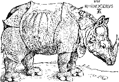
- The WWF has commissioned some beautifully detailed illustrations from Ogilvy & Mather India. Commenters point out the similarity to Albrecht Dürer’s rhino.
- PSDTUTS has some cool ideas for How to Simulate Fractals in Photoshop.
Tuesday Illustrations: Killer movie posters, RUN-DC, & more
- Retro remixes:
- Olly Moss’s Poster Remakes are pretty damn terrific. [Via]
- Same goes for Mitch Ansara’s Retro “I Can Read Movies” Book Covers. The Close Encounters and Sixteen Candles entries are especially solid. [Via]
- The continuing Obamarama:
- RUN-DC: Awesome.
- Obama painted via motor oil.
- Mac bits:
- Is the Snow Leopard UI going really, really old school? This I’d kind of love to see. [Via]
- Layers is a screenshot tool that saves your windows as a layered PSD file. Nice! [Via Michael Ninness]
Interesting Inaugural bits from the NYT
- The New York Times features an interactive photography portfolio called Obama’s People, offering portraits of key staffers. The audio commentary (via the link below the photos) is worth a listen, describing the subjects’ choices in what to bring to the shoot (e.g. a chocolate chip cookie for David Axelrod). The separate making-of piece features Kathy Ryan talking about how shooting digitally has enhanced the collaborative aspects–and maybe the time pressures–of portraiture. [Update: Ellis Vener points out a hilarious “Real Behind-the-Scenes” take on the shoot, followed by some good discussion in the comments. “Blue Steel…”]
- The paper (that term seems more than a little outmoded, doesn’t it?) also features an excellent overview of the Inauguration Day goings-on via a 3D-rendered map and timeline.
- Looking back, another piece depicts the changing configuration of the White House.
I’d love to be in DC in person, but that map triggers a memory of having gotten stuck on the Metro under the Potomac on a sweltering July 4 years ago. With Tuesday temperatures due to hover around freezing, maybe I’m okay with TV after all.
Saturday Illustrations: Stalactites, stained glass, & more
- Speak freely: I love Experimental Jetset’s Loose Lips poster. [Via]
- Stained glass gets frisky in these ads for Bishop’s Finger beer.
- Miquel Barcelo used more than 100 tons of paint on the 16,000-square-foot elliptical dome for the UN’s Geneva offices. The BBC has details. [Via]
- Jon Hicks shows the sketch-to-final-rendering evolution of his icon design for Font Explorer Pro.
- Svenska Karamel! The packaging for these Swedish candies is pretty darn cute.
- Shoot the Baddies has fun with some familiar silhouettes. (Roll over each for its name.) [Via]
- RISD is hosting a symposium on dazzle, the World War I/II camouflage technique meant to confuse enemy submarines. The site points out that a Greek billionaire recently commissioned Jeff Koons to dazzle his yacht.
Wednesday Illustrations: Presidencies to video games
- Infographics:
- Good Magazine features The First 100 Days, chronicling the early terms of various US presidents.
- The NYT shows what people spend, and on what, around the world. [Via]
- Maps:
- Milky Way Transit Authority: Samuel Arbesman has mapped our galaxy in the style of a subway map. [Via]
- Korean designers Zero Per Zero have created a beautiful heart-shaped map of the NYC subway system. They’ve likewise done Seoul as Yin-Yang, Tokyo, and more. [Via]
- Also check out the NY subway map in ASCII! [Via]
- 2D gone 3D:
- Disney gets deconstructed with the Cartoon Particles project.
- Dotter Dotter features Lego-like 3D renderings of 2D video games like Donkey Kong & Excitebike. [Via]
Photoshop Subvertising
Artist-vandals in Berlin have rather brilliantly hacked a set of subway posters, overlaying them with stickers showing the Photoshop UI. [Via Mark Stern, Serge Jespers, Jeff Lietz, and others]
I have a soft spot for the trippy impromptu public art projects that subway posters often become–everything from Van Dycks & puke lines to political commentary. I got an unreasonably big kick out of a Bourne Identity poster in the NY subway that featured three images of Matt Damon on which someone had scrawled, respectively, “Loner… gun owner… stern taskmaster.” (Told you it was unreasonable.)
[Update: Kottke links to more photos on Flickr. Apparently the project is called "Don’t Forget…" [Via]]
[Previously: Real-world Photoshop.]
Kuler adds Community Pulse
The team behind Kuler, Adobe’s color harmony creation & sharing site, has introduced a neat new feature:
Explore the Kuler global community with Community Pulse, a big picture view of color usage. This is a beta feature, using data visualization (screenshot) to show the relative popularity of colors across a sampling of countries, time periods, and tags.
To check it out,
- Sign in with your Adobe ID to play around with it
- Mouse over the histogram to see the hues on the color wheel
- Try the granularity slider to see more/less color detail
- Use the comparison icon (two circles) to compare/contrast
If you have questions, check out Kuler Help. And don’t forget to check out the Kuler panel in Photoshop, Illustrator, Flash, and InDesign CS4 (see Window->Extensions->Kuler). Here’s a couple of screenshots, plus a video demo. [Via]
Pen Zen for 2009
Mordy Golding offers 10 Illustrator Resolutions for 2009–ten great suggestions for getting more out of this amazingly powerful app. My notes:
- If you do nothing else, try double clicking your artwork to enter “isolation mode.” It’s just like editing a symbol in place in Flash. Stop doing the whole lock/unlock, group/ungroup dance. Isolation mode is your friend, particularly in CS4.
- Mordy is right on about the power of the Appearance panel. In CS4 the panel is at last just what I’d hoped it could be–namely, a killer one-stop shop for adding and editing object effects and parameters.
- My personal addition to the list? Envelope distortions. Create some artwork, then choose Object->Envelope Distort, then either Make With Warp or Make With Mesh. I like choosing the latter, then selecting the Free Transform Tool (E), clicking and dragging on one corner, and then while still moused down holding Cmd/Ctrl to do a perspective transform. Bam, instant re-editable Star Wars text.
If you really want to brush up on your fundamentals & really wrap your head around the Pen tool, I recommend a couple of great resources:
- Sharon Steuer’s Zen of the Pen PDF goes back a few releases, but it remains clear and relevant today.
- To learn more about the pen in PS, check out Ian Yates’s Photoshop’s Pen Tool: The Comprehensive Guide from PSDTUTS.
And oh yeah, Happy New Year! We’ll see whether my blogging can hold up under not one but two bambinos. Bring him/her on! 😉
Friday Illustrations: Vader, fractals, & more
- I love, love, love this Vader “Self Maintenance” drawing.
- Logopond features a terrific logo for Ed’s Electric. The one for ETA ain’t bad, either, though I’m not sure I’d have read the letters correctly without some guidance.
- PSDTUTS has a great tutorial on how to simulate fractals in Photoshop.
- Miquel Barcelo used more than 100 tons of paint on the 16,000-square-foot elliptical dome for the UN’s Geneva offices. [Via]
- These are, without question, the most deeply messed up soda ads I’ve ever seen.
Monday Illustrations: Fast cars & dirty fingers
- Beginnings & endings:
- Drink Smoke Shutchomouth: David Cole has created an excellent set of truthful title cards. [Via]
- Tom Djll has amassed “The End,” a great collection of closing title cards for movies. [Via]
- Motor speed:
- The NYT features a gallery of beautiful race car concept designs. See the accompanying article for more.
- Watch Vaughan Ling go to town in Photoshop in this 1-Hour Design Challenge
- Funky media:
- “Make Jar Jar Binks from potatoes (and hastily devour this hateful creature)” with this set of creative food manipulation. [Via]
- Repubblica.it features photographs of a series of elaborate hand paintings. [Via]
- ColourLovers features interesting overviews on The Colors Of Global Brand Identities and The Color of Money from Around the World.
Illustrator CS4: Faster launches, new scripts, & more
As I’ve noted a few times, I really like the way the Illustrator team focused on the fundamentals in CS4. Among these, they’ve made some great headway in bringing down the application’s launch time. Brenda Sutherland from Illustrator QE passed along a few benchmarks:
Win XP CS3 CS4 Cold Launch on Benchmark Machine* 21.7s 12.8s Cold Launch on User Machine** 36.4s 19.5s iMac (Leopard) Cold Launch 25.5s 16.4s
* Benchmark machine is the optimized setup machine for taking consistent launch performance numbers. It has no virus scanner and a totally defragmented hard disk.
** User machine is the one similar to user environment, having a virus scanner, fragmented hard disk with a few common applications installed.
My own unscientific tests (using Watch It on a 2.33GHz MacBook Pro) produce similar findings, knocking about 35% off the cold launch time & cutting the time for a warm launch roughly in half relative to CS3. Thanks, guys!
In other AI-related news:
- The team has posted a series of how-to guides and source files created by leading designers.
- Jack Westbrook came up with a set of scripts for exporting each AI layer as a separate PNG.
New Illustrations: Mad Men to Hot Rocks
Dept. of Mad Chops:
- Rik Oostenbroek makes some beautiful abstract pieces in Photoshop, and he’s interviewed on PSDTUTS. (Oh, and he’s 18. Man, if you saw what I did in PS at age 18, you’d have me fed to wild dogs.)
- Depthcore pulls together some terrific noirish monochrome illustrations. I especially like Karol Kolodzinski’s piece.
Illustrated misfortune:
- I’ll have the drumstick in this recent Photoshop disaster.
- Certain things about cartoon characters, you’d just really rather not know.
Self-aggrandizement:
- The pixel masters at eBoy featured yours truly among a field of ‘Dobe peeps. Thanks, guys! (Incidentally, this illustration plays ridiculously well with content-aware scaling in PSCS4.)
- At the recent party to celebrate shipping CS4, Photoshop engineer Geoff Scott took a cool shot of me that I turned into a quasi-Hot Rocks-style illustration via the new PS Pixel Bender plug-in. (I used subblue’s Droste Effect filter kernel–a free download.)
Illustrated Miscellany: Obama, the Joker, & molten wax
History & politics:
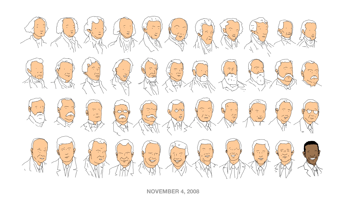
- #44: Outstanding. [Via]
- David Klein created striking images in an earlier era. [Via]
- Bat-fans might be feeling The Audacity of Joke from James Lillis. (The layers build up, with audio, on YouTube.)
Packaging & Objects:
- Veerle showcases some beautiful packaging.
- Go Media sells PSD templates that can help you drop artwork onto various wrinkly shirts.
- Virgil O. Stamps will print on just about any crazy material–duct tape, shredded targets, National Geographic pages, etc. [Via]
Cool Devices:
- The notional Virtuo virtual palette “uses sensors and light to mix digital colour and apply it to a screen.” [Via Jerry Harris]
- Man, I can’t wait for our son to get old enough to rock out with the Crayola Glow Station. (My mom used to let me paint with crayons using paper on a hot plate. Ah, the ’70s: a simpler, less safety-conscious time. ;-))
Real-world Photoshop
Straight-up awesome. 🙂 [Via Lori Grunin & Adam Jerugim]
Update: By popular demand, here’s a higher-res version, plus the making-of photo set. [Via Rob Christensen]
Update 2: According to Laughing Squid, ad agency Bates 141 created the project for Software Asli. [Via Keith Johnson]
Post-election bits
I’m finding it hard to get back into the blogging game after such a* historic election. Doesn’t blogging about megapixels and keyboard shortcuts just seem kind of… trite?
In an effort to spool back up, here are some interesting visual bits I’ve encountered:
- Oh yeah!: "The Final Endgame Go Time Alpha Action Lift-off Decide-icidal Hungry Man’s Extreme Raw Power Ultimate Voteslam Smackdown ’08 No Mercy: Judgement Day ’08." That’s what I’m talkin’ about. Peep The Daily Show’s ode to/mockery of over-the-top motion graphics.
- Jason Kottke has aggregated a huge list of election maps from around the world, from whiteboards to the Onion. I love the way various maps, including the one on the NY Times site, let you zoom into states to see a county-by-county patchwork of voting. Also check out the way the NYT map features "county bubbles" and a voting trend comparison slider.
- Mark Newman’s maps offer insight into voting patterns by geography and population. [Via]
- The Guardian features a gallery of newspaper front pages from around the world. [Via]
- In The Living Room Candidate, the Museum of the Moving Image features TV ads from US presidential races, 1952-2008.
- Typography:
- Channeling campaign fatigue into type, This [Farging] Election aggregates many of the year’s memorable phrases into a single column.
- Obama + dingbats = ObamaBats, courtesy of Jeff Domke. [Via]
* Not "an". Hah; I knew it. We’re not Cockney, for crying out loud.
A handful of Halloween art
- Goodwill Halloween–awesome. 🙂
- Obey Alfred E. Neuman! Related: A million and one Obama poster parodies.
- Calamity Coach is an Edward Gorey-esque tale of vehicular woe. [Via] For a less frightening, more nostalgic trip, see Gene Gable’s round-up of vintage Greyhound bus art.
- John McConnell shows how to turn Tom Cruise into an alien. (Isn’t that a little redundant?) [Via]
- What the hell is going on with this broccoli?? [Via Matthew Richmond]
Recent political illustrations, animations, & fruit
The US presidential election is motivating all kinds of creativity, from posters to pumpkins. (And before anyone flips out, let me say that A) I’m trying to be evenhanded in the distribution of links below, and B) I picked things to share based not on political affiliation, but based on creative/graphical interestingness.)
- Comics:
- IDW Publishing has created comic book biographies of the two presidential candidates. [Via]
- Meanwhile, in the Marvel universe, Stephen Colbert is a presidential candidate, so naturally (?) he’s teaming up with Spiderman. [Via]
- Start your day right with Cap’n McCain’s and Obamaos (and annoying jingles!).
- MC Yogi’s pro-Obama video shows skillful type chops. [Via]
- Ceremonial fruit orbs:
- Better Homes and Gardens offers downloadable pumpkin-carving stencils for creating the likenesses of the candidates, not to mention media figures from Colbert to Oprah.
- Orange State’s Yes We Carve project is all Obama, all the time.
- You may just want to tune out the politics, rocking out with Yoda, Space Invaders, and other geekery. [Via]
- Posters:
- Designers for Obama brings together graphic artists in support of the candidate. Examples feature some cool typography and color palettes. In a similar vein the Obama Art Report shows off more solid illustration & type.
- Meanwhile community-made McCain posters are on Zazzle and CafePress.
- The NY Times features an interactive presentation that tracks their editorial endorsements for president through history, including blurbs from the endorsements, links to full articles, and an indication of which candidate prevailed.
- Well, you can’t say you don’t know what to expect with this one: The Brokers With Their Hands On Faces Blog.
Monday Illustrations
A slightly random sampling for a Monday morning:
- Same actor, different role: clever, and kind of self-explanatory once clicked.
- Who needs to wait for a bank collapse when you’ve got this ATM mugger? (Lose money the old fashioned way, I say.)
- Folicular stylings (perfect for our XD group):
- Desktop facial hair contest
- I {Heart} ‘Stache
- Related/previous: this offbeat Beard font.
- Tutorials & resources:
- Veerle offers guidance on drawing Apple’s cloverleaf "Command" shape in Illustrator (or, if you prefer, call it a Swedish campground symbol).
- 40 Dark and Futuristic Photoshop Effects [Via]
- 40 Sets of Abstract Glow Brushes
- Dilbert creator Scott Adams is all over Photoshop + Wacom Cintiq. [Via many people]
Monday Illustrations: Current events to optical illusions
- Current events:
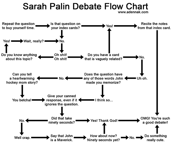
- The Sarah Palin Debate Flow Chart [Via]
- An NYT infographic shows how Congress voted, district by district, on the bailout plan (first time around) [Via]
- From the history books:
- While the Supreme Court considers tobacco company advertising practices, Contexts.org posts some vintage Marlboro ads targeted at moms. [Via]
- CreativePro’s got a roundup of strange old illustrations found by Gene Gable. (SF is so colorful and gay!)
- James White pulls together Saul Bass’s most iconic logos. [Via]
- I love Bryan Katzel’s super cool long-scrolling design. Scroll down the page to see how it mixes foreground elements with a stationary background. [Via]
- Optical tricks:
- Axel Peemoeller has crafted a parking lot signage system whose messages can be read only from certain angles.
- I have no idea how this works, but I like it: Math, art, and the Droste effect
"Dear InDesign, Illustrator…"
Continuing a bit of a theme:
- InDesign Sr. PM Michael Ninness has responded to nearly all the top 25 beefs reported on DearAdobe.com. He’s also provided another 15 responses to other gripes that they plan to address in a future blog entry. (Regarding the gripe about the lack of a color picker, although it’s not exactly what’s being requested, I’d point out that InDesign, Illustrator, Flash, and Photoshop CS4 all feature the same Kuler panel (screenshot) for color selection. We’re sharing more code, but it’s not an overnight thing.)
- Meanwhile former Illustrator PM Mordy Golding has surveyed the remarks about Illustrator, and he’s posted responses to the top 25 comments along with good points about what does–and doesn’t–constitute useful, actionable feedback.
Illustrator CS4 goodness
Among the comments on my list of details polished in Photoshop CS4, a number of people wished for a similar list for Illustrator & suggested that the Illustrator team start a blog. As it happens, my friend & former Illustrator PM Mordy Golding runs the great Real World Illustrator blog, and he’s posted some illuminating resources:
- Illustrator CS4 – The Facts is a pretty comprehensive round-up of what’s new in this release. (The Appearance panel is killer–everything I always asked that it be.)
- His interview with Illustrator PM David Macy offers good perspective on the team’s thinking & discusses other points of polish in CS4.
In the past I’ve said "I swear because I care," and caring a lot about Illustrator, I’ve directed some well-intentioned swearing in their direction over the years. I distinctly remember sitting at my desk at Agency.com some nine years ago and hearing a (long since departed) Illustrator PM dismiss my request by saying, "Oh, customers don’t want multiple pages." (At that point I started wondering, "Now, is it still murder if it wasn’t premeditated, and can I claim temporary insanity…?") That’s why I’m delighted that they’ve both addressed some eternal requests (yay, multiple pages–er, artboards!) and have polished lots of existing functionality. As Mordy writes,
In the past, Illustrator had a reputation of adding new features, but never really going back to refine them in subsequent versions (i.e.,gradient mesh, 3D, brushes, graphs). With an improved Appearance panel, more capable graphic styles, a revamped gradient feature, better clipping mask behavior, isolation mode, and Smart Guides in CS4, it’s refreshing to see the team adding much needed polish to some of these "older" features.
The more I’ve played with the new Illustrator, the more I’ve found the "little" changes to have a big impact. I think you will, too.
Friday P-shoppery
- What would happen if you applied every single filter in Photoshop to an image? Well, someone had to try. [Via]
- If you ask people on forums to edit your images, you never know what you’ll get (possibly NSFW). [Via Michael Ninness]
Political illustrations
- Photographer Jill Greenberg is under fire for doing a cover shoot with John McCain for The Atlantic Monthly, then using the outtakes to create harshly anti-McCain photo illustrations. The magazine has disavowed her actions, and Mark Tucker asks a number of questions (while linking to more commentary). Greenberg has posted her images at manipulator.com.
- On a much lighter note, I’d vote Tauntaun any time. (Not so much actual Hope, though.) [Update: Also, McCain gets the Frank Miller treatment. (Via Steven Johnson)]
Vintage Sunday
- "Dyna Moe" has produced the excellent series Mad Men illustrated. (Yes, I resisted watching that show for a long time, then gave up. You should, too.) Love Peggy, Sal, and Joan, but Don looks too generic & happy. Useful bonus: Sally Draper’s Cocktail Cheat Sheet. [Via]
- Veerle rounds up numerous classic movie title sequences. The premium-blend mentholated Thank You For Smoking would fit right in on Mad Men.
- Gene Gable’s posted a great collection of letterheads.
- Motortype: Adam Polselli rounds up a set of lovely vintage car logos.
New infographics: Hockey Moms to Wu-Tang Clan
- The NYT visually represents word usage at the Democractic & Republican conventions. Hmm, the Dems must really want "four more years" of this "Bush" character… [Via Ken Lawson]
- DIY 411: MIT’s Mycrocosm is "a Web site that makes it possible for people to use statistical graphs and other visual language tools for expressive social communication. In particular it provides an alternative to purely text based micro-blogging software." [Via]
- Reader "PW" (presumably not PW Herman) points out Pratt’s interesting mechanism for navigating classes & faculty.
- Mission Creep illustrates US troop presence worldwide by country over the last half century. [Via]
- Slate’s got a short history of information visualizations. It’s good to be reminded of beautiful work like Ben Fry’s Genome Valence (video). [Via]
- It’s not an infographic per se, but it riffs nicely on their familiar shapes: Sony’s new Walkman ads play with the forms of famous subway maps. Zooming in on the Sydney piece, you can see that station names have been replaced by bands.
P-shopped Chrome
Heh–good for a Friday laugh: Google’s Chrome browser comic gets mauled by a bunch of wiseasses. (Mocking goateed hipsters will always, always sort me out.) [Via Fergus Hammond]
Other random graffiti-ish bits:
- Big mugs: Wooster Collective turns up some very cool huge faces in Carthagena, plus even more massive faces projected in Quebec City.
- CNET talks about "Green graffiti"–using various forms of technology (lasers, LEDs) to create paint-free messaging. I love this little safetyman busting out.
Spraygun Mona Lisa, hipster anatomy, & more
Recent illustration finds:
- At the Nvision conference across from Adobe last week, the Mythbusters guys showed how to paint the Mona Lisa in 80 milliseconds. [Via]
- "Part medical and part American Apparel": Hipster anatomical drawings. [Via]
- Radiating:
- I want to run around with Dan Funderburgh’s array of sharp things, letterpressed into a poster.
- Dig Sam Winston’s pencil shavings.
- Hot cartographic action:
- National Geographic offers a map o’ the day feature, displaying high-res maps through what appears to be Zoomify. [Via]
- Adding perspective to maps: Mark Mayers demonstrates how to give flat Illustrator maps a third dimension by using the Free Transform tool and a custom perspective grid.
- Mark Simonson surveys the cartographic typography of the Indiana Jones series.
- This poop-scooping illustration doesn’t stink. [Via David Macy]
Chinese political illustration, then & now
- Ethan Persoff has gathered a collection of anti-US Chinese political cartoons c.1958-1960. Without translations or other context, many are baffling, but I find this one especially creepy. [Via]
- Drawing your own political messages in China is less welcome: James Powderly of the Graffiti Research Lab (see previous) was detained for six days for attempting to display Tibet-related protest messages during the Olympics. He tells the story in a series of interviews.
- History repeating as farce: Now you can get a hand-painted version of your face in a Chinese propaganda poster. [Via]
Friday Illustrations: Beer, bathrooms, & The Shining
-
Stay frosty:
- For the Beck’s Canvas project, "Four young artists will be selected by a panel of judges from the Royal College of Art to showcase their art on the labels of over 27 million bottles to be distributed nationwide from August 2008." [Via]
- Bryan Hughes came across a great Photoshop beer-drawing tutorial from Eren Göksel.
- How to draw anything in one step: Draw a dog covering the thing you can’t draw. (You may want to combine this with the drinking.) [Via]
- It’s the Waiting for Guffman of puzzle-making: Garson Hampfield, Crossword Inker is a subtle, insanely well observed parody of craftsmen who are just a tad too into their work.
- Love this set of paintings of families from films (the Torrances from The Shining, the Griswolds from Vacation, and more).
- Interesting bathroom decorating idea: pixels to tiles.
On-demand skate decks & more
I’m always intrigued by technologies that enable on-the-fly creation of media (print, Web, video)–what Adobe dubbed "network publishing." Recent examples I’ve found interesting:
- "MagCloud enables you to publish your own magazines. All you have to do is upload a PDF and we’ll take care of the rest: printing, mailing, subscription management, and more." (Kind of a step up from my 8th-grade experiences publishing a skate ‘zine with a friend’s Mac & my dad’s office Xerox.)
- On another skating note, Zazzle now enables creation of customized skateboard decks. [Via Bryan O’Neil Hughes]
- Faber Finds publishes out-of-print titles, generating a unique cover for each on the fly. [Via]
Recent infographic goodness
- Stefanie Posavec creates beautiful, sometimes abstract images from data in her “On the Map” project.
- The NYT renders Olympic medal counts by country, also enabling the user to navigate through time. (Tossing it around too freely, I managed to blow up Safari.)
- “UFO sighting convincibility” is on the rise, thanks to Photoshop. [Via Rob Corell]
- xach.com offers a cool way to visualize 2008 box office results. [Via]
- I think I should chart my mood on a line stretching from “Earnest” to “Scurrilous*,” as Vanity Fair does with the content of their Blogopticon. [Via Tom Hogarty] It’s similar to New York Mag’s Approval Matrix.
*Defined as “grossly or obscenely abusive… characterized by or using low buffoonery; coarsely jocular or derisive.” Hells yeah.
iPhone GUI bits
- The guys at teehan+lax have created a slick, well organized iPhone GUI PSD file. Geoff Teehan writes, "We created our own Photoshop file that has a fairly comprehensive library of assets – all fully editable." Nicely done! [Via Joel Eby]
- Felix Sockwell offers a detailed walk-through of how he developed icons for the NY Times’ iPhone app.
- Vaunted info-design expert Edward Tufte critiques iPhone interfaces in terms of their info-to-overhead ratio. [Via]
Marginally related at best, but too good not to share: the highly unique unboxing video for the Samsung Omnia. [Via Russell Williams]
Saturday drawerings, from Tron to rayguns
- I love the Chopping Block’s Tron tee. (Would the dog try to stick its head out the window of a lightcycle, too?)
- Going the other direction, Bibliodyssey points out this ancient tank design–from 1646. (Don’t mistake it for a ThinkPad.) [Via]
- Illustrator-fu:
- Veerle shows some great, simple applications of Illustrator’s underused Make with Mesh command.
- Chad Neuman has a cool idea–splashing real paint, then using Illustrator’s Live Trace feature to vectorize it.
- In Little Chicken Growing Up, scientific illustrator Mieke Roth chronicled the growth of a baby chicken through a series of lovely drawings. [Via]
- Vintage:
- Flickr features a huge mid-century illustration archive, grouped by illustrator. [Via]
- Apropos of nothing, I stumbled upon a solid raygun illustration. [Via]
Tuesday Illustration: Iron Man, lasers, and more
- If you’re feeling "cleared for weird," peep the intricate, disturbing paintings of Ryohei Hase, all painted in Photoshop.
- The UI Resource Center features a long and detailed interview with the team that designed Iron Man’s heads-up display.
- Semi-political
strangeness:- Politicians often serve as pincushions, but it’s rare that they’re actually made of pins, as in this Thumbtack Obama. [Via]
- Gene Tempest’s long but interesting essay covers the Posters of Paris ’68, talking (among other things) about how the French artists played on memories of Nazi collaboration.
- "Did United Artists doctor a photo of anti-Hitler plotter Claus von Stauffenberg to make him look more like the Top Gun actor?" asks the Guardian. [Via] (Even weirder: My wife just glanced at the image and said, "I thought that was you for a second.")
- Designer Marian Bantjes
has been producing great stuff lately:- Her Design Ignites Change is a limited-edition, laser-cut poster that dramatically changes appearance under different conditions. Proceeds benefit kids orphaned by HIV/AIDS in Kenya. [Via]
- In Love Stories she creates a riot of great type–some of it edible!
Killer animations o' the day
- Despite finding it some time ago, I’ve been avoiding blog The Art of the Title Sequence, knowing that it would likely take over my life. Sure enough, it’s loaded with good stuff. Check out the beautiful titles for El Don, whipped up by Santiago artists Smog. I saw motion graphics pioneer Kyle Cooper (SE7EN, etc.) speak years ago and remember him saying that every frame should hold up on its own as graphic design. This piece aces that test. (For unrelated goodness, see Smog’s “monkey-headed dancing guy” (or whatever “un mono bailarín” is).)
- Motion artist PES creates incredible stop-motion films using found objects. KaBoom and Western Spaghetti are particularly great (c’mon, Candy Corn as flames?). Check out his work before People for the Ethical Treatment of Upholstery shut him down. [Via John Peterson & Maria Brenny, “Because (re: KaBoom) I know what you do in the desert”]
- My Drive Thru is a new stop-motion video for Converse, produced by the team at Psyop. Behind the scenes, Pharrell Williams talks about rescuing Chuck Taylors from the taint of Punky Brewster, and Glossy interviews the Psyop crew while posting some high-res stills. [Via]
- Superfad has kicked out a trio of stylish ads for Sprint. The Hurricane Katrina spot is particularly worth a look.
*Real* Real-World Photoshop, Vitruvian Wookies, and more
- In his Tell a Lie project, Henry Hadlow "uses a camera to mimic common Photoshop effects." Killer! [Via Paul McJones]
- Vader Crossing the Delaware: On Worth1000, P-shoppers mash up Star Wars with fine art. Surveying a couple of the pieces, Bryan Hughes remarked, "Man, that is some seriously disturbing stuff. Sort of like Joe Satriani for the eyes …which is to say that, yeah, I know there’s crazy talent there… but what a way to misuse it!" [Via Dave Dobish]
- Green Patriot Posters bring kick-ass poster art to the fight against climate change. Nick Snyder writes, "Contributions from other designers will be featured in the coming months. In September, Green Patriot Posters will launch an online competition where participants may submit Green Patriot Poster designs, view other posters and vote on designs."
Walruses, Wolverine Monkeys, & mo'
- Animation:
- In 1969, 14-year-old Jerry Levitan snuck into John Lennon’s hotel room in Toronto and convinced him to do an interview. 38 years later, I Met The Walrus is the Oscar-nominated short film that resulted–5 minutes of fluid, often surreal images morphing into one another over the recording. YouTube hosts the full piece in high quality.
- I’m not sure what to say about the coffee-stirrer-based (?) Endless Not stick animation, but I can dig it. [Via]
- I love the crazy little characters made by Matthew Porter. (His Dr. Wagner portrait is staring down at me now.). Next time you need to commission a Wolverine monkey, you’ll know where to turn. [Via Margot]
- Coca-Cola’s very cool WE8 site brings together illustrators, musicians, and other artists from West & East in the spirt of friendship (well, that and of selling tasty sugar water). The site features interactive 3D Flash versions of the packaging they’ve created, downloadable desktop images and more. [Via Terri Stone]
- Peep the charming skulls of Kristina Collantes desktop wallpapers.
- Public service:
- Speed bump: $1500. Drawing of a speed bump: $80. Effectiveness: pretty comparable–at least until people catch on. [Via]
- What do the "Safetymen" on signage do all day? Signs of Life aims to shed light.
The Ocelot, in ink
 Wow–now this you don’t see every day: John Pischke, an Image Capture Manager at Quad/Graphics in Minneapolis, has used the “Ocelot Rampant” image from this blog in a tattoo on his arm. I furnished him with the original Illustrator file last year, and on Tuesday it was turned into ink. “You’ll be happy to know it was completely designed in Photoshop,” writes John P. Nice!
Tangentially related surreality:
Great #$!@!'in Type
- What the %@^! does one call those "random non-alphabet characters to indicate cursing?" Answer: Grawlix. (Bonus cutting aside: "Is that the sound of a designer waiting for Adobe Updater to complete?" Oh, from the top rope!) [Via]
- On Flickr, user "el estratografico" collects "retronomatopeya"–classic sound effects in cartoons.
- Batman may have gone all modern & hardcore, but "Las onomatopeyas o Batsigns" showcases the sound-effect renderings of his classic, corny past. [Via Rob Corell]
Wednesday Illustration: Cash money & Mo'
- Ducats:
- Weird juxtapositions rule in these money/celebrities mash-ups.
- "What Could Be More Unforgettable Than Dollar Bill Albert Einstein?" Check out Cabel Sasser’s fireworks packaging round-up.
- The Etch A Sketch has been reborn as an iPhone app! (Shake the phone to clear the screen.)
- How do Californians perceive their fellow Americans? Counterpoint: How New Yorkers see the rest of the world. (This all reminds me of the Onion t-shirt "Stereotypes are a real time-saver.")
- Mordy Golding has a solid tutorial on embossing text in Illustrator. In it he produces a pretty convincing license plate.
- Posters:
- Dig BLT‘s elegant new Batman poster.
- "You’ll gargle with fear!" I love the homage to classic poster styles in these Futurama illustrations
Wednesday Illustrations: Smoke, fire, and floods
- Put down the menthols & peep these beautifully rendered Brazilian anti-smoking ads. (I wonder what illustrator Clement Hurd would think.)
- The Paper Version of the Web takes me back to my roots as a Web designer, sketching up pages for British Airways and others. I always like being reminded that technology aside, it’s the ideas that count. [Via]
- Flooded London "depicts imaginary scenes in London in 2090, when rising sea levels have inundated the city." [Via]
- Rat finks unite in this collection of Big Daddy Roth illustrations.
Buy N’ LargeWal-Mart is getting a new logo. [Via] Here’s a timeline of their designs.- Laser-etched tattoos: hey, what’s the worst that could happen…?
Wednesday Illustrations
- The Executive Coloring Book (from 1961) will really make you want to claw your way to middle management.
- I love the slamming, superheroic quality of Evgeny Parfenov’s portraits.
- Yeondoo Jung does real-life recreations of children’s drawings. [Via]
- Photoshop UI designer Julie Meridian loves to sneak these weird vintage magician bits into her interface mockups.