- Love bacon, love the bacon flowchart. "Are you wearing pants?" (Evidently this will prove important.)
- Men’s Vogue celebrates Massimo Vignelli’s sleek 1972 New York subway map.
- The Boston Globe teaches you to nap. [Via]
- Stefanie Gray maps the area codes in which Ludacris claims to… uh, know ladies. [Via]
- Mark Rabinowitz uses the graphical language of nutrition facts to illustrate some truths about prostitution.
- How many employees does Google have? About this many. [Via]
- It’s tangentially related, maybe, but I dig these out-of-context small boat images. [Via]
Category Archives: Illustration
The Color & the Shape, in PS & AI
- Dr. Woohoo has been creating some very cool images by driving Illustrator and Photoshop from Adobe AIR. Check out Generative Painting in AI with 3D Symbols, as well as some good bits on Flickr. "For this animation," says the Adobe Design Center, "Dr. Woohoo developed an AIR app that drives the colors, brushes, and animation timeline in Photoshop CS3 via a swfPanel in Illustrator CS3."
- Veerle Pieters talks about making simple organic shapes in Photoshop. If that trips your trigger, you might also like her quick tutorials on creating a spiral ornament in Illustrator, and making light motion trails & glowing sparks in PS.
Random Saturday brilliance
Gold-plated vertically integrated batter-dipped Photoshop-rendered AJAX-flavored Flash/Flex 3D RIA workflow mash-ups: Impressive.
Also impressive: A Sharpie, a stove, and something to say. (I wonder whether any dead people read my blog.) [Via]
Elsewhere: Willie Nelson in Kiss make-up (hey, why not?).
Off to eat BBQ,
J.
Dolla Dolla Bill, Mickey D's, and more
- "Change We Can Believe In": the typography.com guys compare the new
currency designs of the UK & US. (Honestly, the giant purple Helvetica "5" is a prank… right?) [Via]
- Vintage:
- BibliOdyssey offers up a collection of knight attire.
- Frank Chimero inserted a historic map of Europe, personifying the various countries, into his set.
- Packaging:
- I really dig the skin of this Victorian-styled Mac Mini. (Wish I could find a higher-res shot of it, though.) [Via]
- Check out the great DVD packaging for Mad Men.
- The Smithsonian features an article about and small gallery of Afghan war rugs, featuring scenes of 9/11 and more. [Via]
- McDonald’s channels David Carson*? [Via] (Company spokesman R. McDonald responds with a violent outburst.)
*or "David Car-five-n," as an art director of mine used to call him due to his once-unorthodox method of substituting characters, e.g. "5" for "s"
Infographic goodness
The NYT has been kicking out the good infographic jams lately:
- Andrew Kuo created a funny, handsome infographic on why music festivals are worth skipping. For more from Andrew, see his blog + previous.
- Matthew Bloch, Shan Carter and Amanda Cox have created an interesting Flash-based infographic that totes up "All of Inflation’s Little Parts." I often find presentations like this dense, impenetrable, and/or over-designed, but this one’s an exception. [Via]
- Adobe XD guy Ethan Eismann points out a couple of video-based info presentations. In one of them, interactive voting is tied in with the content.
Elsewhere:
- Ben Terrett pulls together lots of interesting visualizations. [Via]
- Rorschach Economics: Japan’s Phillips Curve looks like Japan; cigarette consumption looks like Virginia.
- It’s been around a while, but I still dig Michal Migurski’s flashy newsmap
Monday Illustrations: In Cars
- Frank Chimero renders the various United States as objects with similar shapes. (Florida has been scrupulously omitted.) [Via]
- The cover of a recent Vice magazine featured a glowing, ghosted BMW illustration.
- Vehicular cruelty?:
- "Flower Power" isn’t just for aging first-gen iMacs anymore. Check out this drawn-upon Bentley Continental.
- "Pimped" doesn’t begin to capture the illustrated, bejewelled craziness of these Pakistani custom vehicles.
- Game theories:
- The Playstation blog talks about using Photoshop to Make Your Own PS3 Themes. [Via]
- Not to be outdone, an Xbox blog talks about paint customization features in the NASCAR ’09 game. "The online connectivity of Paint Booth allows players to download a car template from easports.com and import it into editing programs, such as Photoshop, giving users a multitude of design options."
Sunday Illustration
- Jacqueline Pytyck produces some seriously foxy work with a nice sense of depth. I especially like her self portrait. [Via]
- PingMag covers Steven Wilson’s cool Psychedelia, made using Illustrator & Photoshop.
- Right ’round like a record:
- What likes beyond The Wall? Find out in a great design challenge to extending album art.
- In Cover Stories, Old and New, Khoi Vinh surveys past & present album art from long-serving artists.
- Politcally themed:
- "God Is a Graphic Designer?" Chip Kidd plumbs the meaning of a curiously torn newspaper. (This reminds me of when I returned to my laptop once and found the "Y" key missing from the keyboard. I was convinced that my legitimately crazy and dangerous roommate was trying to send me a message. Turned out to be the work of my cat, though… I think.)
- Somewhere I stumbled upon a cool Obama illustration.
- Veerle Pieters
has been featuring some great illustrators:- She interviews Alberto Seveso, creator of a really distinctive photo-illustration style. (For a number of links to his work, see previous.)
- Elsewhere she chats with the wonderfully talented Oksana Grivina.
Miscellaneous interestingness
New fatherhood -> sleep deprivation (yeah, still) -> abandoning any pretense of categorization. That said, here are a few interesting bits I’ve seen lately:
- The New Yorker reports on the world of high-end retouching in "Pixel Perfect — Pascal Dangin’s virtual reality." (Hey, someone uses the Smudge tool!) [Via Ivan Cavero Belaunde, Clare McLean, Gary Cosimini, Claiborne Brown, and seemingly everyone else I know ;-)]
- The Times Online features "Billion-pixel panoramas — from your own camera" [Via Jeffrey Warnock]
- As I’ve said before, Logo design = Bullet magnetism. Now "OGC unveils new logo to red faces," says the Telegraph. Er, um, yes. (But hey, it’s no worse than the "Lisa Simpson" London Olympics logo.) [Via Lori Grunin]
- "Oh man… two words: Photoshop Filter," says Adobe’s Chris Arkenberg. Behold Man Babies.
Viva frilly bits
Who doesn’t like the occasional dingbat & swash?
- Cameron Moll demonstrates great attention to detail with the little embellishments on his site. In response to reader questions, he offers 25 resources for ornaments, fleurons, and "frilly bits."
- On a related note, Illene Strizver answers questions about typographic dingbats on CreativePro.com.
Illustration in motion
- The hallucinogenic visions of graffiti artist Blu play out across walls in Buenos Aires & Baden. Fascinating. For more from him, see previous. [Via]
- Chad Pugh wired his computer to take a screen capture every 5 seconds while he worked in Illustrator, resulting in this blistering condensation of a 40-hour process. Photo-sensitive pre-teens need not watch.
- Jackie A-Go-O: Illustrator Chris Ware offers up a great animation for This American Life.
- The Etch-a-Sketch clock automatically redraws time.
I say "Adobe" you say…
…what, exactly? That’s what Noah Brier’s fun Brand Tags project asks, and here’s what people have said so far. It’s kind of fun to read the small print, too: "arcane awesome bastards… stucco structure… techy teepee telefónica terrorists…" (Too bad Adobe doesn’t make people think "hot cyclone action," like Dyson does.) You can play your own word association game on the main page, and you can go backwards, playing name that brand based on what people say. [Via Mark Baltzegar & John Dowdell]
PS–Speaking of things affecting the Adobe brand, there’s always Adobe Updater, now the subject of its own music video. [Via Zalman Stern]
Calef Brown rocks
Having a wee man in the house certainly cuts into the time I’d otherwise put into scouring the Web for good bits to share; hence the dearth of illustration, photography, and type links lately. On the other hand, it exposes me to books and illustrations I’d never otherwise see (not, y’know, being in the typical Pat the Bunny demographic).
My wife Margot turned me on to the works of the wonderful Calef Brown, poet & illustrator extraordinare. Both the text and the art are hilariously loopy. Check out some samples from Polkabats and Octopus Slacks to see what I mean.
Of course, it’s fun to revisit the classics as well–Goodnight Moon especially. Each night as I read it aloud, I try to amuse Margot by sneaking in some new reference to illustrator Clement Hurd’s smoking habit–a penchant now hidden through Photoshop. A little Googling reveals that other Photoshoppers couldn’t leave that news alone, staging a "What Is Clement Holding?" contest. (Keep kids off the Soloflex!)
Next up, I need to prevail on my folks to send us my old & very well-loved set of Mercer Mayer’s A Boy, A Dog, and a Frog books–totally wonderful.
Strange Photochops
- From the "Why Do It To Yourself?" chronicles:
- Why choose when you can have a Hillary/Barack hybrid?
- Freaking News started a Photoshop contest to replace celebrities’ eyes with their own mouths. Bleaugh. [Via]
- Photoshop + pro wrestling + the South = "Nipplegate."
- People looooove the
HitlerHistory Channel and its endless exploration of WWII. Did the Germans really have an Überschwerer Kampfschreitpanzer (Superheavy Armored Walking Tank)? Scroll down to view the evidence. [Via] - Copyright this: Adobe’s Serge Jespers reports on a Belgian exhibitor looking for 100 Photoshoppers to remove a famous building from all their images. Bizarre. [Via]
- I really have no business passing this along, but knowing that our product helped land a giant Mr. T Cabbage Patch doll on SF brings a tear of pride to my eye.
Lasers, Orwell, and Mad Magazine
New illustrated biz:
- The NYT offers a great interactive presentation of Al Jaffee’s Mad Magazine fold-ins.
- "Putting the king back in stalking." Big ups to Barska binoculars for breaking some new ground with their ads. "I prefer to think of myself as a ‘stranger enthusiast’…" [Via]
- Art nerds who really want wedgies can opt for this laser-etched Moleskine unicorn notebook. I wonder whether you can read it from inside the darkened locker where you’ve been stuffed. [Via]
- Shout-outs to the Eastern Bloc:
- Shepard Fairey does George Orwell, via covers for Nineteen Eighty Four and Animal Farm.
- Peep some crisp label designs for Lovejoy Vodka [Via]
- Logos:
- Toyota offers Scion users the ability to roll their own logos.
- Apple vs. the Big Apple: Mom, Dad, don’t fight!
- The logo for the Al Gore’s Alliance for Climate Protection is a crafty little ambigram.
- I Could Tell You but Then You Would Have to Be Destroyed by Me: The NYT features a slideshow of the logos of secret US military programs, along with an accompanying article. Trevor Paglen’s book of the logos is here.
Adventures in album artwork
Back when vinyl was giving way to tapes & CDs, I heard purists bemoan the loss of a large-format way to distribute album artwork. Now with the prevalance of downloads, do you know offhand what artwork is attached to most of your music? iTunes tries to help, but it’s an uphill battle. Anyway…
- Nikolay Saveliev’s rad Pop Matters project consists of “Vinyl record sleeves with 2-sided insert featuring
faux-academic material on pop music and the state of the
record industry…
Snuck onto used& new record store shelves.” Personal fave: “Nickelback: The Recursiveness of Professional Mediocrity.” - Pitchfork picks The Worst Album Covers of 2007.
- Listropolis has translated the artwork for Rolling Stone’s Top 20 Albums into color palettes. [Via]
- Should classic album covers be redesigned every few years? Ben Wardle makes that case, with examples. [Via]
Logo trends, past and future
- The mid-70’s book The World of Logotypes features hundreds of vintage logos, now scanned and presented on Flickr. [Via Durin Gleaves]
- The peace symbol has turned 50. Apparently the shape incorporates the semaphore letters N(uclear) and D(isarmament). Here’s a brief history. [Update: More good details from the BBC.] [Via]
- Are “waves the new swooshes”? Yes, says Logorange, in predicting 10 trends that will define logo design in 2008.
- Jon Hicks, creator of the Firefox logo, provides a quick walk-through of his icon design process.
- I dig this logotype for Big Boss, as well as the little color chips of Dreamscape Design.
New Illustrated Hotness
- Goofing on cartoons:
- Garfield Minus Garfield is totally weirdly brilliant. [Via]
- Some Old Man Still Churning Out Marmaduke, reports The Onion. "’I love what I do,’ said the elderly cartoonist, his body and mind crippled by an endless and repetitive stream of doodles featuring the Great Dane."
- Know your history:
- Billboard’s got the 25 Best Rock Posters of All Time. [Via]
- Pay up, suckers! Gene Gable finds cool vintage artwork for shaking the money tree. Reminds me of Jesse James’s palm (clearer view).
- Worth1000 features excellent vintage ads for modern products. [Via]
- Fancy a Victorian DeLorean? Peep Silhouette Masterpiece Theater. [Via]
- Chroma police:
- "PixelPastry oozes fresh flavours, tastes that entice tastebuds and well fed clients." I’m inclined to agree. [Via]
- Pablo Bisoglio’s work vibrates with color. I dig this dragon in particular. [Via]
- Pedro Franz sings the eyeball electric. (Okay, that doesn’t mean anything. But you try coming up with 50 unique ways to say, "Hey, here’s a cool site I think you’ll like." ;-P)
- The Bible has been reimagined as a graphic novel.
- Dig this well crafted bit of digital imaging for San Patrignano. [Via]
From D&D to decapitations, in infographics & maps
- Sam Potts has created a hilarious infographic for Sunday’s NY Times, part of their sendoff for D&D creator Gary Gygax.
- The NYT has been posting other interesting graphics lately, including How Americans Spend Their Money and the Flash-enabled Ebb & Flow of Movies.
- In Rudimentum Novitiorum, Bibliodyssey surveys maps & other infographics of antiquity.
- With a more modern spin, Colourlovers talks about the use of color in transit maps, offering a number of cool examples.
- How about a world map made from musical notes? [Via]
- What does an hour’s worth of movement in front of the TV look like? One Flickr user endeavored to find out, using a video camera & a grid of masking tape to plot the positions of dad, kids, and cat. [Via]
- For the greater good:
- Easier voting through graphic design: Marcia Lausen is "determined to apply the highest possible standards of information design to make [voting systems] clear, accessible, easy to use and the results accurate." [Via]
- John Emerson’s Visualizing Information for Advocacy: An Introduction to Information Design offers a guide for NGOs, non-profits and advocacy groups. [Via]
- If you can’t go another day without knowing how to stage a realistic decapitation, well, consult these graphics.
Now showing: The original Photoshop icons
With Photoshop recently having celebrated a birthday, it’s fun to stumble across the original Photoshop icons. Make that "PhotoShop," as the big S was present when the application was briefly bundled by BarneyScan, before it became an Adobe product*. The original product icon, designed by Photoshop co-creator John Knoll, was replaced by the eye that served from 1990-2003. John added his perspective in the blog post’s comments. [Via]
If this is up your alley, you might also enjoy:
- Photoshop splash screens and toolbars through time
- Derrick Story’s brief history of Photoshop (as of 2000, anyway)
- Jeff Schewe’s very deep history of the first 10 years (PDF)
- A ppodcast interview with Brett Wickens of MetaDesign, who worked on the CS/CS2 icons and packaging
*Until recently, however, the spellchecker in MS Office insisted on inserting the capital S–completely annoying. I filed a bug with Microsoft, but I don’t know whether the change made it into Office ’07.
Fun with physics-based drawing
The great thing about computer-based drawing and painting tools is that they do exactly what you expect, over and over [reliability => productivity.]. That’s also what kind of sucks about them, though: happy accidents can be hard to come by.
Taking a different spin on things, Umeå University’s Phun is “an educational, entertaining and somewhat addictive piece of software for designing and exploring 2D multi-physics simulations in a cartoony fashion.” Although it’s not a drawing tool per se, Phun mixes literalness with a measure of unpredictability. Check out this video of it in action. [Via Jerry Harris & Jim Geduldick]
If that’s up your alley, take a look at Nelson Chu’s amazing MoXi watercolor simulation (details). Computer power (GPU power in particular) is starting to enable sophisticated simulations on every desktop. Look at the way an app like Little Big Planet leverages a great physics engine and redefines the process of computer-based creation (in this case using a PlayStation, but so what?).
It seems like every other day I read about some app or other using the Flash platform to partially emulate old versions of Photoshop. That’s all fine, but I’m much more excited about harnessing the platform to build much richer, more immersive, and (optionally) less predictable creation experiences. We can have the best of both worlds, and that’s what keeps me amped & in the game.
Poster Flava: eBoy on AIR & more
- Today Adobe launches Adobe AIR (read about it, I dunno, everywhere), and the always wonderful eBoy collective has created a poster for the AIR launch. [Via]
- Veerle Pieters recently kicked off a “What Is Graphic Design?” poster contest, and now she’s posted the excellent winners. (I, of course, have a soft spot for this one.)
- Steven Heller offers a brief survey of US political posters. [Via]
- Film poster John Alvin, creator of pieces for everything from Blazing Saddles to Lord of the Rings, has passed away at age 59. The NYT offers a short rememberance. (I wonder what he thought of Trajan.)
Naked saunas, 3D Flash globes, and other infographic goodness
- My wife and I are nervously quizzing each other on these expert (and very funny) baby care instructions (boosted wholesale, it would seem, from David Sopp’s Safe Baby Handling Tips). [Via]
- Wable is “a coffee table that displays a user’s web activity via physical bar graphing.” Yes, I remember pining for such a thing not ever. (Are Venn-diagram kiddie pools next?)
- Maps:
- Concentric circles are coming for us!! The Onion has fun with news infographics.
- Seeking to place events into geographical context, Yahoo has created a 3D NewsGlobe using Adobe Flex. ComputerWorld’s got background on the project. [Via]
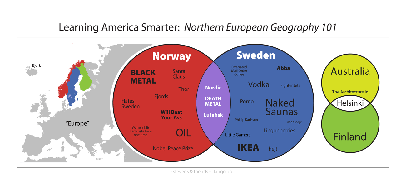
- In similar vein of “Learning America Smarter,” check out the naked saunas, black metal, and ass-beating of Scandinavia. (And you thought it was all chilling out with MDF.) [Via]
- The Gough Map is said to be the oldest accurate map of Britain, dating from around 1360.
- Signage:
- My little brother Ted let me ride along last month as he drove his garbage truck. This safeyman image (somewhat dodgy iPhone-cam quality, sorry) I snapped in his cab shows the truck really putting the “screw” back in “screw of Archimedes.”
- “Do not iron while wearing shirt (on an iron-on decal)”: more good advice from the safetyman chronicles. [Via]
- I can get behind this “Faith healing sign” at Disneyland, not to mention Serbian children escaping a triangle.[Via]
- Blogging software has made self-publishing seem simple, but beneath the covers, a whole lot’s going on. Wired has a Flash-based diagram showing what all happens when one hits “Publish.” [Via]
A history of logos, great desktops, and more
- Logos:
- Neatorama features a history of tech company logos, from Adobe to Xerox. Who knew about the 1,000-armed Canon, or Nokia and the fish?
- Google invites kids to “Doodle 4 Google.” The winner gets a $10,000 college scholarship and a $25,000 technology grant for his/her school.
- Tap some taproot with the cute Jacobs & Sons Carrots logo (diggable). I also enjoy the efficiency of the Colorado Conservation Trust mark.
- Having grown up with the illustrated genius Richard Scarry, and having just gotten some of his books at a baby shower, I’m especially charmed by this Beastie Boys Sure Shot remix. [Via Marc Pawliger]
- Veerle has posted a bunch of lovely patterns, plus plenty of links you can use for further pattern research/inspiration.
- Smashing Magazine offers up some “(Really) Stunning Desktop Wallpapers.”
- Concept art:
- io9 features a gallery of movie concept art. [Via]
- Besides being a hilarious mofo, Shaddy Safadi is a talented digital artist who’s been working on Neopets, Drake’s Fortune, and other popular video games.
- Vintage
- There’s plenty of 50’s art and illustration on Plan59.com
- For related goodness, see the I Love My Electric Appliance!! Flickr pool. “Lots of overjoyed women leaning on stuff,” notes Core77.
- Vanity Fair hosts a slideshow of classic Hollywood lobby cards from the late screenwriter Leonard Schrader’s collection.
- The Hatch Gallery offers up a sample of contemporary letterpress work. [Via]
- I enjoy the Art Deco stylings (not to mention the writing) in 1930’s The World in 2030. [Via]
- Also from the Thirties, you might like these Colliers ads and illustrations. [Via]
- Talk about dedication to a (suddenly) losing cause: a guy gets a Pats tat on the head. [Via, of all things, Wait Wait Don’t Tell Me]
Meet Adobe Illustrator (1987)
As promised a couple of weeks ago, I’ve uploaded a copy of the VHS tape that shipped in the box with Illustrator 1.0, hosted by company co-founder/president/Illustrator developer John Warnock:
Many thanks to Andrew Keith Strauss for digitizing the tape. Of the video Dr. Warnock writes, “That video demo tape was shot live, with no editing. We didn’t have video production tools at that time, and we didn’t want to pay for a professional to do it, so I did the demonstration.” It’s fun to contrast this tape with the Illustrator 88 video made just a year later.
Fun & clever recent infographics
I’m endlessly fascinated with how people display information visually. Here are some cool recent examples:
- JamPhat features a hilarious (and huge!) collection of hip hop-inspired infographics. Images are helpfully linked to YouTube vids of the related songs. It was a good day…
- Fun with Venn diagrams: I love the simplicity of this clever music elitism t-shirt. (Compare to Wu-Tang Clan.) [Via]
- What if we regarded flags as info visualizations? That’s what Brazilian designer Icaro Doria did for the magazine Grande Reportagem. [Via]
- Call it "Most Inscrutable. Karaoke Interface. Ever." Or just call it pretty. Robert from Flight404 (see previous) has used Processing to create the lovely video Solar, incorporating lyrics from Goldfrapp. [Via]
- HistoryShots sells prints of really cool infographics.
- ArmsFlow presents global arms transactions, visualized in an interactive map. Clicking individual countries shows their import/export flow for a given year. Interesting concept, but the lines overlap so densely that it’s hard to see what’s happening. I’d love to see the whole thing taken further. [Via]
- Knowing things Biblically:
- Chris Harrison pours ancient texts through graphical filters in his Visualizing the Bible project. [Via]
- In the early 20th century Clarence Larkin turned his scriptural knowledge into Biblical infographics. [Via]
- Virtual China features a Chinese diagram on how to cook chicken with beer. [Via]
Shat Shat Revolution, car cutaways, and more
“Some creators love a great sunset; some have in mind my bloodshot eyes…” So says William Shatner of The Shatner Show, a gallery presentation and now book of artwork inspired by the man, rendered in every conceivable medium (including Lego). B to the zzare. The project reminds me a bit of Naoki Mitsuse’s Elvis Paintings. (I have a particular soft spot for Tiny Elvis.)
In other illustration news:
- Juan Francisco Casas creates large-format artwork using just a ballpoint pen. In looking at the images, I could swear I just smelled that sticky, sickly Bic scent. [Via]
- The Periodic Table of Elements Printmaking Project brought together 96 artists “to produce 118 prints in any medium; woodcut, linocut, monotype, etching, lithograph, silkscreen, or any combination.” Etsy hosts an interview with the organizers. (Apparently my blog is Hassium-powered.) [Via Petra]
- 8-bit jams:
- Jimi Benedict has made a rather great Super Mario portrait. He’s also made some obligatory Obama artwork (quite the little cottage industry these days). Oh, and his riot of death-rod imagery makes me think of the recruiting poster my old friend Adam Symons created for AGENCY.COM back in the day (simply
ripping offremixing a Pietasters album cover, I believe). [Via] - On a Mario-related note, peep Sam Mullins’s Super Mario sleeve tattoo.
- Jimi Benedict has made a rather great Super Mario portrait. He’s also made some obligatory Obama artwork (quite the little cottage industry these days). Oh, and his riot of death-rod imagery makes me think of the recruiting poster my old friend Adam Symons created for AGENCY.COM back in the day (simply
- Automotive:
- General Motors CEO Bob Lutz gets into the digital manipulation game, posting a “photochopped” Corvette police car design. And if that’s up your alley check out Rafael Reston’s Chrysler ‘Cuda mockup.
- Cartype features a huge gallery of car cutaways. [Via]
- Logos:
- Get ready for 5000 Web Apps in 333 Seconds. (If you watch for more than a few seconds, try not to swallow your tongue.) [Via]
- Genius steals? Behold these Automotive logo ripoffs. [Via]
- Wilhelm Deffke was a trailblazing German identity designer. I’m guessing there’s one work he’d like to omit from his portfolio, however.
- Musical Notes
- Play “Connect the Notes” with the Berliner Philharmoniker.
- This ad seem to say, “Our jazz radio makes people puke!”
Recent illustrated goodness
- Obey Giant creator Shepard Fairey is backing Obama through his iconic posters. [Via] (I’m not trying to make this blog political, btw; just passing along interesting intersections of design & campaigning.)
- In the vein of posters and street art, Phelyx’s got a how-to on bleach-stenciling a shirt. [Via]
- Russian designer Melamed cranks out powerful work. Love these gym promotions in particular. [Via]
- Design Observer pointed out a really interesting piece on the many covers of JG Ballards’ Crash. [Via]
- "Every time I see the new [Coke] can, I cry," says Mac developer Cabel Sasser. "It took Cola-Balls…" [Via]
- The New Yorker’s been running a contest to redesign Eustace Tilly (the monocle-wielding mascot). [Via]
- Sleeveface is all about overlaying record sleeve art on the real world. SF gate’s got the story. [Via Jackie Lincoln-Owyang]
- On a related note, how about overlaying currency illustrations with celebrity photos? [Via]
- Apparently Spike Jonze is making Where The Wild Things Are, and a couple of stills from it have emerged. [Via]
- I love the simplicity of this Heinz volcano cutaway .
Back to the Future with Illustrator 88
Pass the banana clips and fire up Less Than Zero: It’s time to visit the late 80’s with the promotional video for Adobe Illustrator 88. It’s fun to see all that was possible even then, and to hear that the marketing message of “do more, and more easily, so you can focus on being creative” is eternal. Now I shudder at visions of a besweatered James Spader dropping the French curves and grabbing a mouse. [Via]
The timing is kind of spooky: for nearly a year I’ve been meaning to upload a copy of the John Warnock-hosted VHS tape that shipped in the Illustrator 1.0 box, and just last week I got serious about doing so. Of the work Dr. Warnock says, “That video demo tape was shot live, with no editing. We didn’t have video production
tools at that time, and we didn’t want to pay for a professional to do it, so I did the
demonstration.” Pretty cool that the company co-founder and CEO was not only one of four names on the product splash screen, but also the main demo man. (“Everyone sweeps the floor around here,” said Chuck Geschke of that time.)
This posting lights a fire under me, so look for the Warnock video soon. [Interim bonus retro fun: the 1987 Apple Knowledge Navigator video. Everything old is new again, and self-serious yuppies will always be with us.]
Logos a Go-Go & mo'
- “Che Guevara meets Jesus”: Proving that the corporate world can cheapen any coin, the ad campaign for the new Rambo movie features spray-painted graffiti. [Via]
- Logos:
- On the revolutionary tip, I love the RVLTN logo.
- Soothing tasteless clients everywhere, it’s Make My Logo Bigger Cream. [Via]
- Rock Band Logos is an entire blog devoted to the iconography of Black Flag, Bad Religion, and hundreds of others. [Via]
- Corey Holms has constructed a cool visual taxonomy of animals and plants used as corporate logos. [Via]
- The NYT covers the new Xerox logo. On the same topic, Armin at Brand New discusses the logo & its history. [Via]
- Bibliodyssey features Anton van Dalen’s funky logo mashups.
- Wham-O co-founder Richard Knerr recently passed away, prompting Boing Boing to post some cool old Superball packaging. Also cool and barely related: Aimee Mann’s rockin’ Superball.
- Guerrilla artist James Clar’s efforts to draw a smiley face on a Dubai tower have been ground down by The Man.
- Jesse Kaczmarek’s portfolio is loaded with strong work, and the refreshingly clean, simple, and understated Flash UI doesn’t get in the way.
Sunday Illustrations: From snowboards to Wonderbras
- Kottke proclaims Minority Kart "possibly the GAGOAT (greatest animated GIF of all time)."
- I love the beautiful simplicity of this snowboarding poster.
- It’s not often that a Web design strikes me as particularly fresh, but the punchy, hand-illustrated intro for Fray.com makes a good go of it.
- From the vaults:
- Irony & good cheer come together in this set of Old Soviet Christmas cards. [Via]
- Flickr hosts a set of classic posters. [Via]
- Yes, it’s always illegal to kill a woman: the Daily Mail hosts a collection of outrageously politically incorrect advertisements from years past. As might be said on Conan, "Not cool, Zeus–not cool." [Via]
- Wacom’s new 12" Cintiq tablet/monitor gets some serious love from Gizmodo (a four-minute video demo followed by detailed text). [Via] Adobe evangelist Terry White loves it, too.
- Life imitates art:
- Wooster Collective has made a thought balloon for the real world. [Via]
- xkcd covers the phenomenon of "Insisting that real-life objects are Photoshopped." [Via Rob Corell]
- Speaking of real-life objects, Saatchi & Saatchi makes excellent use of "The Wonderbra Hills."
- Mosaics:
- Dig these icon mosaics for Teknograd Mac Support. (They just wouldn’t be the same using the blah-looking folder icons from Leopard.)
- Michael Sporn talks about those in the New York subway. For more on that subject, see the book Along the Way: MTA Arts for Transit. I always really dug the Irresistible Romance of Travel at Grand Army Plaza. [Via]
It's not the size of your brush…
Cue “It’s In The Way That You Use It” (and good luck getting that out of your head): Illustrator Bob Stakke uses Photoshop 3.0 (no, not CS3–the one from ’94) to create some great-looking characters. In a tech-saturated, next-next-next-oriented world, it’s nice to be reminded that creativity comes from people, not from machines and other tools.
Shakespeare could have rocked out in WordStar, and heck, you can draw Scarlett Johansson using MS Paint if you’d like. That’s not to say that new tools don’t enable tons of new things, of course, and hopefully let creativity flow more freely. It’s just a reminder that a car is nothing without its driver. [Via Doug Nelson]
Speaking of Photoshop demos, “You Suck At Photoshop” returns with volume 2 of its depresso-funny PS stylings. No “shaggin’ wagon” this time, but there is some territory-marking. [Via Clare McLean]
War and rebirth, in photos & illustration
- When not driving between continents & documenting the experience, German-born, Brooklyn-dwelling photographer Christoph Bangert produces gripping photojournalism in Iraq, Darfur, and elsewhere. You can find his Iraq effort reviewed here, and on the NYT site Christoph narrates over a selection of his photos.
- Offering a different take on Iraq, Shooting War is a graphic novel written by Anthony Lappe & illustrated by Dan Goldman. You can find background & a review on MotherJones.com. According to that site, "To layer drawings and shading on top of photos, Goldman drew everything directly onto a 21-inch touch screen using an electronic, wireless pen, Adobe Illustrator, and Photoshop. Everything combined, this is a slick-looking book."
- On a rather brighter note, the NYT features a slideshow on kite flying in Kabul–a colorful pastime banned under the Taliban. See related article, with video.
Zeppelin inspires art
Given all the iconic images that Led Zeppelin has inspired over the years, a chance to add to that legacy sounds like a dream commission:
- A few weeks back I saw Led Zeppelin’s complete works being advertised on iTunes, and the graphic up top struck me as in the vein of Obey Giant auteur Shepard Fairey. Sure enough–he was asked to do the work.
- UK-based illustrator/animator Steve Scott got the nod to create an animation that would accompany the band’s recent reunion concert. "So after four weeks of hard work there I was watching Led Zeppelin play Kashmir live in front of the world’s largest monitor–a 28 x 12 meter giant–and 20,000 screaming fans." Here’s the result (B.Y.O. contact high); screenshots are on the main page of his site. See also The Society of Victorian Mutants & other solid illustrations on his site. [Via]
I got yer brains, *right here*…
The ol’ noggin provides endless inspiration for artists:
- Russian site Advertka features a neat photo composite featuring a brain made of arms.
- Cycling Australia depicts fragility via brains as vegetables.
- Artist Jun Takita has sculpted bioluminescent algae into the shape of a brain.
In other skullduggery:
- Brawndo "will make you wonder why you haven’t ever crushed a human skull with your bare hands!!" Delicious!! (I need to order a case of this stuff for the Photoshop team.)
- The Skull-a-Day blog provides just that. [Via]
- For next Halloween (or, just to be weird, maybe Valentine’s, or Arbor Day), you might hang onto these pumpkin skull templates. [Via] I still think they’d have a time beating my wife’s Dia De Los Muertos-inspired doppel-pumpkin.
- If this stuff is up your alley, see previous for lots more.
Old-school Star Wars, Lego graffiti, & more
Mo’ betta illustration:
- Star Wars goes old old school Euro in Baroque Wars. (Dig that crazy Death Star.) [Via] Coincidentally I just stumbled across this Wikipedia-hosted rendering of similar-looking Landsknechte mercenaries.
- If, like me, you’re a no-good, non-gift-buying slacker, you can try to compensate by banging out festive imagery for loved ones. These Photoshop brushes could help. [Via] (I’m doing a mid-day mall sprint after publishing this; hopefully my boss isn’t keeping up on the blog. ;-P)
- Street art :
- A graffiti artist has found Jesus in the urban landscape. [Via]
- Legos visit the Summer of Sam era with some stop-motion train-tagging. (In light of recent world history, I wouldn’t be tossing around the phrase “train bombing” myself.)
- Tyskie Beer commissioned some crafty flag renderings using its packaging as raw materials.
- Kavel Rafferty offers “A reference for vinyl geeks and graphic artists” in Record Envelope–a whole blog devoted to record sleeve art. I like the big-mouthed Knäppupp in particular. [Via]
- The opening of Mark Ovenden’s Transit Maps of the World features a groovy subway map of the world. (I take a weird pleasure in San José appearing (with accent!) on the map, but SF getting shut out.) [Via]
- Hire An Illustrator will help you… um… bury people in Grant’s Tomb? (Maybe it’ll just help you hire an illustrator.)
- Edward Hann’s Internally Displaced People ’06 attempts “to demonstrate the scale of humanitarian crisis in Western Darfur and Eastern Chad,” and a quarter of the profits from its sale go to Amnesty International. [Via] It’s too bad that the Web presentation makes it hard to see the work in detail, as I can’t really assess how it’s tackling the problem.
Friday Illustrations: Japanese cuteness, Grand Theft Auto, and more
- Illustrator Justin Gerard offers what looks like a nice set of Photoshop tools. Here you can see him putting them into action.
- Michal Tatarkiewicz creates cool life-sized subway drawings. [Via]
- Rockstar Games commissioned four mural artists to create a large version of the new Grand Theft Auto box art, hosted in a Brooklyn warehouse. Here’s a timelapse video of the 31-hour creation process. [Via]
- Logos:
- PingMag surveys cute Japanese logos for transportation companies.
- On CreativePro, Malcolm Grear reveals how to create memorable logos (featuring some cool examples).
- The Comcast logotype has undergone some rework. Blink and you’ll miss the changes, but what do you want to bet they paid a million bucks for the privilege?
- Historic bits:
- The Getty features a long, folding photomontage from master El Lissitzky. [Via]
- Cornell is hosting a gallery of some crazy historic illustrations. [Via]
- Somewhat similarly, the Trade Card Place features galleries of Victorian trade cards. [Via]
- Word to the wise: Don’t send your kids onto railroad tracks. Limb-shedding badness will ensue. [Via]
- Here’s a nice collection of Roman funerary portrait art. [Via]
Gandhi as potato, Spam as art, and more
- George Carlin points out that when considering life via license plate slogans, "Somewhere between ‘Live Free Or Die’ and ‘Famous Potatoes,’ the truth lies… I’m guessing it’s closer to ‘Famous Potatoes.’" The Pfanni company might agree, and they cheerfully offer "Only good potatoes."
- Guilherme Marconi‘s illustrations explode with color and detail. [Via]
- Christopher Lee makes super fun, retro-fab creations. Roll over the little hearts under the pieces in his illustration setup to see details & concept sketches.
- Linzie Hunter beautifully subverts junk mail with her Spam one-liners illustrations. [Via]
- "My line paintings are painted using one continuous line with a beginning, and an ending," says Geoff Slater of his line paintings. "Although it changes colour, the line never touches, or crosses itself. [Via]
- MIT’s John Maeda talks about his process for creating an illustration for the NYT.
- Creator & creation: There’s something in the water reminds me of Animator vs. Animation.
- Veer offers a rad collection of vintage sci-fi imagery. (I think I once had this guy as a gym teacher.)
Best Vector Graphics Ever, and more
- Linkinn.com amasses a collection of the "Best Vector Graphics Ever." I’d call it more of a mixed bag, and some of the images sometimes don’t load; even so, it’s worth a visit.
- Mailer for Mayor: Michael Frumin posts the poster. Hey, let’s hear it for that West Side Monorail! (See also the Capitol-shaped airplane flying in Federal cash.) [Via]
- If political posters are your bag (tube?), see also this collection of posters from the Spanish Civil War, as well as Gene Gable’s collection of Labor Day imagery. [Via]
- On another politically-themed note, The New Republic sticks it to the new US passport design. "The cover may say United States, but the design taste is pure red states."
- I love this vintage US Navy instructional artwork. [Via]
- GelaSkins offers cool stick-on designs for laptops, phones, and more. [Via Zorana Gee, who’s rocking Nanami Cowdroy‘s Kintoto Blot on her MacBook.]
- Wake up to whimsy: Susie Ghahremani makes "tiny matchbox-size paintings of little forest creatures."
Illustrations with bite
I’ve been running across examples of illustration designed to shake things up & reflect on the world, for better & for worse:
- [Note: Not for those offended by profanity] Paul Krassner’s 1963 “F Communism” bumper sticker is a an incredibly efficient little satire of politics and obscenity. Check out Kurt Vonnegut’s commentary on the work for historical context.
- On war & walls:
- The NYT features a piece on Baghdad muralists hired to beautify, or at least adorn, the city’s grim anti-suicide-bomber blast walls. “With few opportunities for work, [the artists] are delighted with the money, but are also uncomfortably aware that all they can do is paint the symptoms of a conflict that has mired their city in death squads…”
- Elsewhere in the region, elusive British street artist Banksy has decorated Israeli’s security wall.
- Back in this part of the world, online company Brickfish kicked off a contest to “Design your own border fence” for the US-Mexico frontier.
- The San José Museum of Quilts & Textiles (we have a museum of quilts & textiles?) just concluded a show cataloging the ways war is represented in traditional folk art. I was struck by the Afghan war rugs, featuring enormous craftsmanship: “Weaponry images are rendered in extreme, accurate detail, so much so that one can distinguish between a Hind Mi-24 attack helicopter and a Hip Mi-8 troop-carrying helicopter.”
- Worth1000 members have fun subverting propaganda posters. Yes, giant bloody kaiser space gorillas scare the hell out of me, too.
- In response to the Boston PD flipping out earlier this year about Lite-Brite depictions of cartoon characters, deviantART member Kalapusa has worked in the same medium with an eye towards really getting their goats. [Via]
- Ethan Persoff has dug up a creepy segregationist comic from 1962. [Via]
- Jessica Hagy offers concise political commentary by way of a Venn diagram. [Via]
Hipsters, gangstas, & unacceptable haircuts
Chart! And! Graphs!
- Maps
- “As a resident of Manhattan and an owner of a complete set of bodily organs, [Jack Anderson] knows a thing or two about subway maps and anatomy. Now you do, too.” Check out his Illustrator-designed digestive-system-as-subway-map t-shirt. [Update: See also the Metropolitan Cardiac Authority.] [Via]
- Online comic xkcd offers a map of online communities. (It somehow makes me think of a Hobbit map that spent years stuck to my childhood bedroom ceiling.)
- This Virgin Atlantic map drives home the vast number of movies available for viewing in flight.
- I love the incredible intricacy of Christa Dichgans’s maps. [Via]
- Graphs
- Artist Andrew Kuo spent the summer hitting as many NY concerts as possible, and he “obsessively charted the entire experience, from reviewing the bands to counting the number of porta-potties.” Check out the results. See also the brief accompanying article. Many more infographics live on his blog.
- Protec’ ya neck: Chris Sims lets us peer into the rigorous science of gangsta rap. [Via]
- This Australian dating ad uses infographics to make its pitch. (Only 11% of suitors have “unacceptable haircuts”? They must not be counting the vast number of Aussie dudes with fauxhawks.)
Using Illustrator to print money; more
Illustrator mensch Mordy Golding reports an interesting interaction at a recent show:
After my tutorial this week, one of the attendees approached me, telling me how much he enjoyed the session. Then he told me he’d like to present me with a gift — a quarter. No, he wasn’t trying to bribe me to lobby the Illustrator team for multiple pages. But it was a special quarter indeed, because he designed it.
Check out Mordy’s post for more info & images.
In other illustration news (no real thematic connection here, but that’s what I get for more airport blogging; the audio system has a real Harrison Bergeron effect):
- Move over, Bad Spock; it’s time for Jamar Nicholas’s Fat Wonder Woman Blog. [Via]
- Drawn.ca has uncovered a great 1981 interview with vocal legend Mel Blanc on David Letterman.
- Oh, the childhood memories: Punking the Land O’ Lakes box. [Via] It’s right up there with typing “55378008” into a calculator & looking at it upside down. (Go ahead, I’ll wait.)
- Cinematic bits:
- Something Awful pulps the hell out of flicks with the help of a little Photoshop love. [Via]
- If that’s your bag, it’s time for a healthy, Photoshop-powered Grindhouse breakfast.
- Photojojo’s got 11 Super Awesome Photoshop Movie Effects
- The Washington Post (of all places) hosts anamatics from Shoot ‘Em Up.
- Mutating Pictures uses artificial selection to create faces. “[It’s] striving to generate human likenesses out of random blobs — 1000 random pictures have been uploaded to the site… The most human-like are used to spawn 1000 new offspring, mutated from their genome, and so on, until the perfect human face emerges.” [Via]
- Dig these little sign language matchbooks. [Via]
- Mary Robinette Kowal has modified her laptop to look like a typewriter. [Via]
- Adam O’Hern has found some ridiculously cute little gymnasts on a paddle.
Tracking graffiti with help from Flash, Google
The Graffiti Archaelogy project uses a Flash interface to let visitors navigate to different heavily tagged spots (links at left), then see the work at various stages (links at bottom). Using the M & N keys to cruise back and forth in time, I’m reminded of watching time lapses of plant life exploding on a surface, dying, and being reborn. Yesterday Adobe hosted a visit from project founder Cassidy Curtis, but I had to bail in order to avoid guys driving by the building at 180mph. Fortunately Archaeology.org has the whole backstory on the crew & project. [Via]
Elsewhere you can find a Google-powered map that tracks Seattle-area graffiti tagging. The NYT talks about the way that mapping services are enabling people to plot all kinds of info, from hydrofoils around the world to yarn stores in Illinois. (No progress yet in getting yarn graffiti pioneers Knitta Please to my hometown, I see.)